Changes to Orion's Sidebar / Vertical tabs handling


- Edited
alakhpc IMO, That is not very intuitive and requires additional interaction to access frequently used UI controls. I would say it is also not per HIG as well, and I did not see any Apple app that does that. Orion is built as a native app so these things matter.
Open to hearing counter-arguments or better solutions (ther are per HIG).
https://developer.apple.com/design/human-interface-guidelines/guidelines/overview
Can you clarify what you expect to be there?
Currently arc only shows extensions up there, which imo are not frequently interacted with
going through all the popular extensions in Orion, none of them require any interaction (if you consider keyboard shortcuts for password managers)
The only times I've found myself reaching for the bar is disabling uBlock for compatibility reasons, which is infrequent enough that a 0.2s animation is perfectly acceptable
new tab can be next to the open tabs
The share/bookmark icons are here in arc, but these seem to be quite inaccessible unless you know what you're looking for so probably not a good idea
The downloads is quite neat though
Maybe a seperate "frequent extensions" row somewhere here on the sidebar could be handy? just random thoughts
alakhpc Thanks for thoughtful feedback.
That would require considerable UI work and I am not sure the solutions proposed are all that intuitive or user-friendly. They may look nice, but looking and using are two different things. HIG exists for a reason for the last 15 years.
We are open to a more user friendly solution and we are already working on a changes to our vertical sidebar to make it more powerful, while remaining native and HIG compliant.

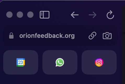
It'd be nice to have an option to move the address bar and other top bar icons into the sidebar, like Arc does it:
Saves a bit of space and looks nicer, in my humble opinion.

This is kinda nice on Arc when the sidebar automatically hides away and gives you the full window to browse (especially for normal daily use where you don't really need to know what the URL is anyway).
I don't know if the Orion team really wants to just be rebuilding Arc in Orion though (I assume not)

Yeah i dont think full URL is important to the majority of people just browsing, examplified with Safari just showing the base website URL and only reveals full when clicking in the adress window. (an aproach which could be adopted in a sidebar URL)
Im not a sidebar user myself. but would consider it if all information and functionality got moved the the left. instead of only some. instead both top and left side getting cluttered
I can also understand if the Orion team this early doesnt want to replicate the feature wich at current moment is kinda Arcs thing that seperates them.
But i think its a matter of time before there aproach gets adopted as an option by other browsers. since it gives you even more vertical space without any loss of functionality


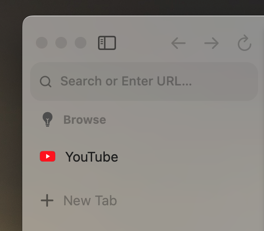
Almost there, unfortunately there's no way to remove the top toolbar and items are only allowed on the sidebar if the "sidebar" item is there. I really think think if the "sidebar" item could be removed there would easily be enough space to peep the domain name of the majority of websites while leaving extra items to the overflow menu.
GreyAsteroid How did you do that? 
Vlad If the sidebar toggle icon is added to the toolbar it makes it possible for any element to be placed on the sidebar as well. However, if you resize the sidebar to a small enough size, everything but the sidebar toggle icon will be pushed back onto the main toolbar. 

Similar to Arc browser, but not necessarily the same. Since the sidebar would have so much vertical space, the search bar, extension icons, etc. could all be put on there. It would be a great option to save vertical real estate, especially on ultra wide monitors.

Like the screenshot of Arc, where the URL bar is in the sidebar, A button and keyboard shortcut could be added to show the toolbar again.