- Edited

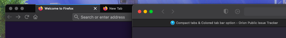
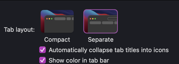
Has this been considered yet? Vertical real estate is at an exceptional premium on the Macbook 13". It also does not necesarily have to be in the way Safari exatly does it with the horrendously ugly iPad-like user interface. I have redacted this as I find that it blends into the web content with more experience using it. Perhaps a blend of Safari 14's tab bar and Safari 15's compact tab layout can be considered. Not sure with how the current tab can be done, but perhaps it can be mdae ot be having a slightly lighter color than the rest of the tabs.
A quick mockup I made is right here.
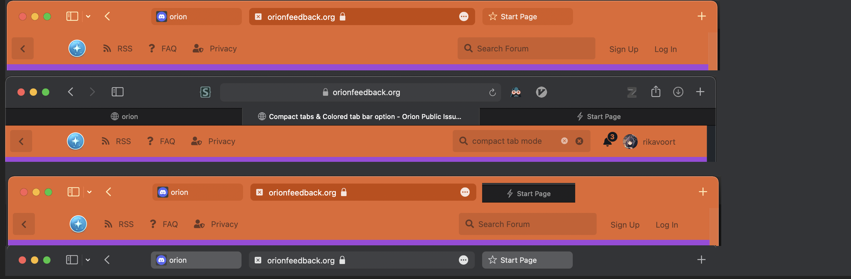
From top to bottom, 1st is Safari with these options enabled:
The third is Orion, the third is Safari with the start page replaced
The fourth is Safari with compact tabs but color disabled.
If you compare these four, I would say Safari without the color enabled is best for general web usage, and it saves much more space.

Neither do you need to sacrifice extension buttons, as Safari 15 incorporates them into the design. So in essence, what you would be doing is taking the tab bar and placing it inside of the toolbar as a button that has a dynamic width.