Changes to Orion's Sidebar / Vertical tabs handling


Vlad is it my post you were referring?
https://orionfeedback.org/d/6310-allow-me-to-change-to-other-windows-while-sidebar-is-opened-for-bookmarks

- Edited
Hey all we want to show our updated design thinking about this feature.
Note that there is also a popular request that wants address bar moved to the sidebar here
What that may look like is
Now, when we combine these two asks the result is this
and to quote our designer "it looks very overloaded and monstrous".
Your feedback about where should we take Orion's sidebar is welcome!
In my opinion, the first thing that should be implemented is the ability to horizonal scroll between tab groups. It's a small functionality change that doesn't require much, if any, design changes. Maybe I'm mistaken, but it seems that it would be relatively easy to implement as well.
- Edited
Vlad I actually love the look of the first concept in the second image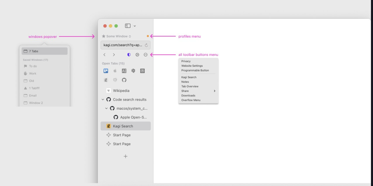
One thing that I could think of that could make things better though, would be moving the dot for profiles up next to the sidebar hide/show button. Then, it would be separated from the window selector. However, that could make it harder to shrink the sidebar at all.
The rest of the concepts with everything in them seem pretty terrible though. Having the windows, the reading list, or anything other than the tabs really just makes it way too much to look at and makes everything seem scattered and inconsistent.
- Edited
Hey all I decided to merge the three threads we have into one as I realized
a) it is impossible to look at these things in isolation
b) managing and coordinating three threads is impossible
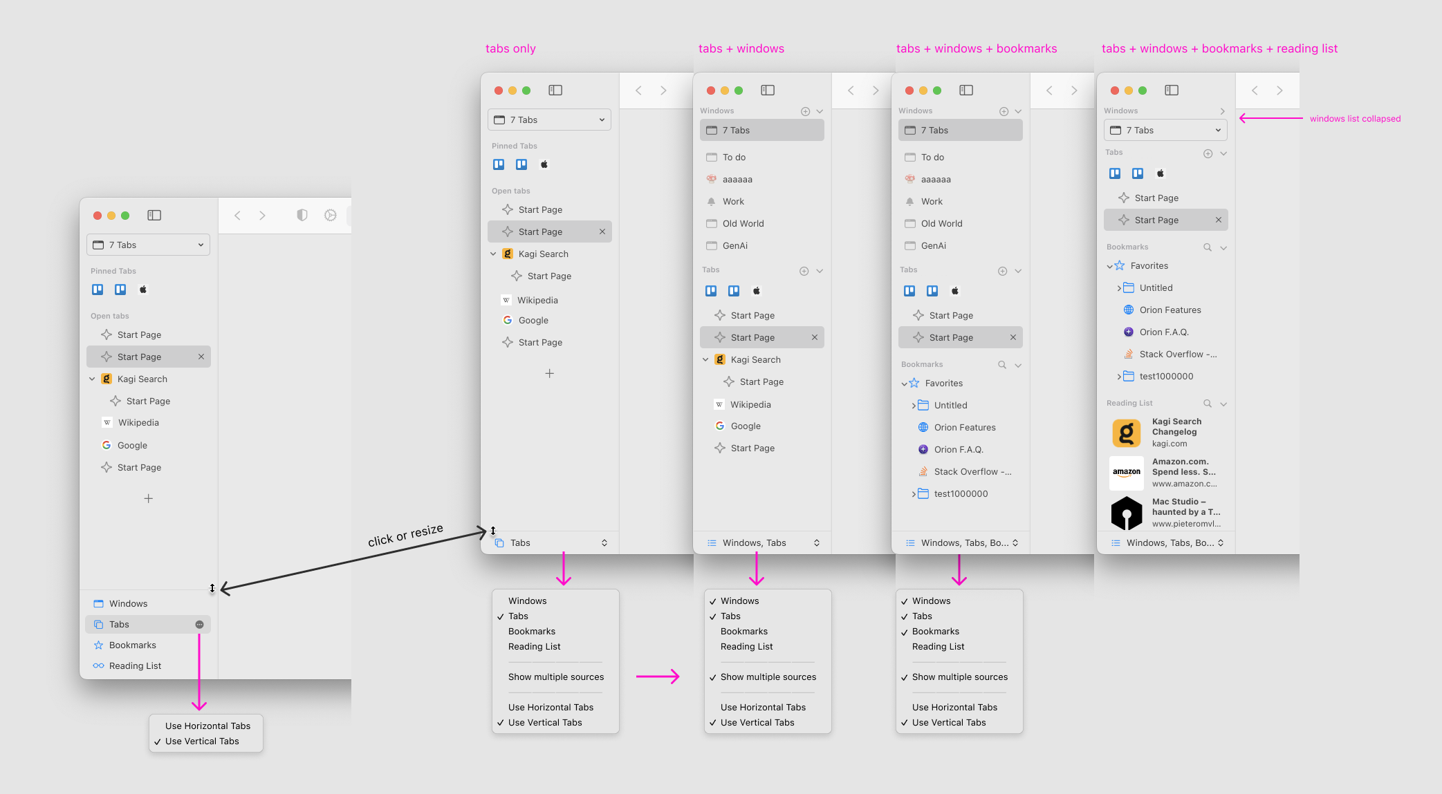
The main premise behind these three threads is that Orion's sidebar/vertical tabs/tab management need to be improved.
Our latest design thinking is this
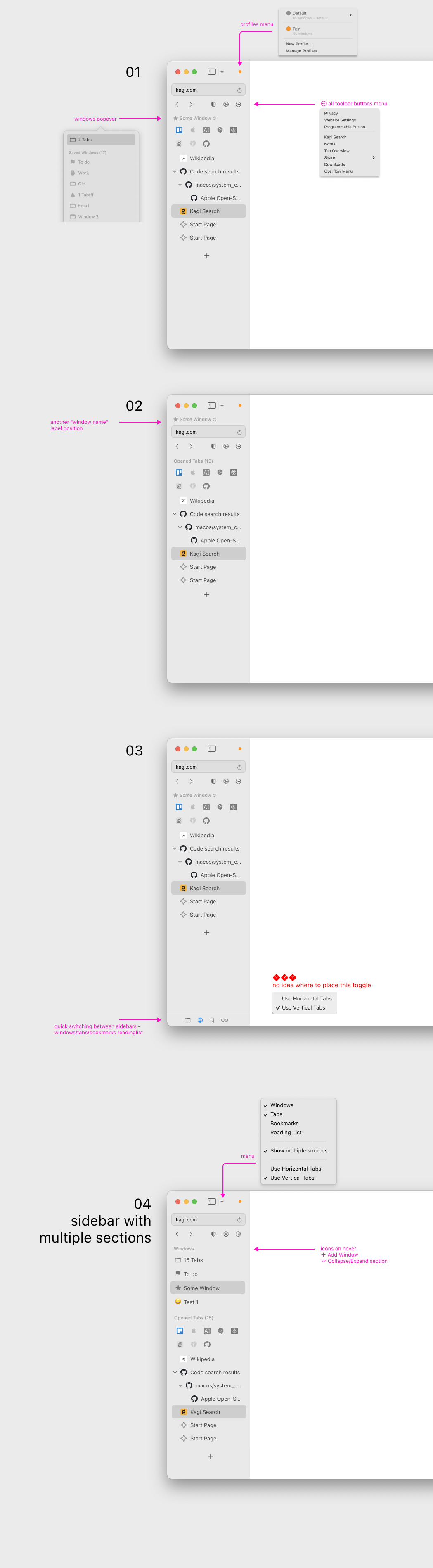
From this I think thre are couple of things I notice
- the idea of having multiple sections on the sidebar visible at the same time (ie tabs/bookmarks/reading list) is I think going nowhere - it just looks too cluttered
- if we are going to move the url bar and controls to the sidebar, I think this can not be an option so the community should agree that this is what they want in vertical tabs mode
The reason is simple - it is already difficult to maintain this. Arc effectively has one mode (fixed vertical tabs, take it or leave it). Safari has three (horizontal tabs, compact horizontal, and vertical that is half done basically as tabs are duplicated and it is a mess). Orion, already has two, with compact style safari tabs planned and if we had optional url bar in sidebar we would have 4. Of course size of Orion team is order of magnitude smaller than Arc and two orders of magnitude smaller than Safari so to put 2x-4x burden on it won't get us anywhere, especially since there are 2000 open issues already. So we need to simplify.
We ask everyone for constructive feedback, having this spirit of simplification in mind.

Vlad Option 3 is by far the best. It’s the only one that doesn’t look like a dumpster fire. The toolbar buttons, search bar, and window switcher are all present and it feels natural. All of the prior suggestions in this thread had me screaming “No Thanks!”.
The bottom bar to switch panels is genius, everything is only a click away. I would rather click once to switch between them than mess around resizing groups every time my tab list grows too long.
Allowing multiple views opens up so many UX issues and a bunch of complexity.
- The different groups would need to be resized as the number of tabs grows. Users would constantly be shuffling them around.
- There would need to be a separate UI to choose (and possibly rearrange) the groups that are displayed.
- The sidebar itself would have to be scrollable which provides a poor user experience.
- Not all users have windows open in full screen
- Every implementation I’ve seen is a crowded mess
- There’s a ton of different menus and settings related to this feature that would be difficult to develop and maintain
As for where to put the toggle for horizontal/vertical tabs, simply add it as a button in that bottom bar. There’s plenty of room. You could also put it in the (..) menu below the address bar.
Overall, option 3 is clean, compact, and clearly well thought out. None of the other suggestions come close.
ForumNinja404 I completely agree. It looks great

Vlad if we are going to move the url bar and controls to the sidebar, I think this can not be an option so the community should agree that this is what they want in vertical tabs mode
Does this mean that the URL/tool bar and would remain as it is now when in horizontal tabs mode? That it would only shift to the sidebar when you switch to vertical tabs mode?

Would you mind sharing the figma files for these concepts? I've noticed plenty of Orion's users are also decent at figma and it could help with expressing our ideas.
I agree with forumninja that 3 is the best. Some additional notes:
- I think the question of where the extension menu pops up is easily solvable, just make it appear from the (...) button.
- would the window sidebar have the modifications I mentioned (where it shows the contents of the windows)? If it doesn't, then the issue of the "workspace" being an abstract concept still remains.
- The dot for the profile should be a bit bigger
- How does it look like when the sidebar is shrunk?
I also wonder how the Arc bros would react to orion making itself look more like arc, or whether it will seem like orion is losing its originality.
TheOtherKai Sure, @bg-d can share latest iteration in Figma
would the window sidebar have the modifications I mentioned (where it shows the contents of the windows)? If it doesn't, then the issue of the "workspace" being an abstract concept still remains.
I have multiple windows with >10 tabs. Barely the content of one can fit in the sidebar let alone multiple. It looks nice in a screenshot with 2-3 tabs each but this is not how it looks in practice for anyone who uses more window.
How does it look like when the sidebar is shrunk?
Good question. Arc of course does not let you do that. And I know many of our users have requested sidebar to be even smaller. These two are conflicting unless urlbar would shrink as well
Vlad Ideally yes. Still some edge cases to solve like what if you just want bookmarks in your sidebar and not tabs (and urlbar).
That's me. I use horizontal tabs and greatly prefer url/toolbar at the top of screen like it is now. I only use the sidebar for bookmarks and reading list, and don't have it open all the time. I don't want to be forced to use the sidebar for URLs and toolbar controls.
BTW I really like the buttons at the bottom of Design #3 for switching between views. This would be much nicer than the current method of switching. And maybe you could add an option to view History there too? That would really handy.
I don't like moving the urls bar and controls to the sidebar; can we do something like what safari did on ios?
- Edited
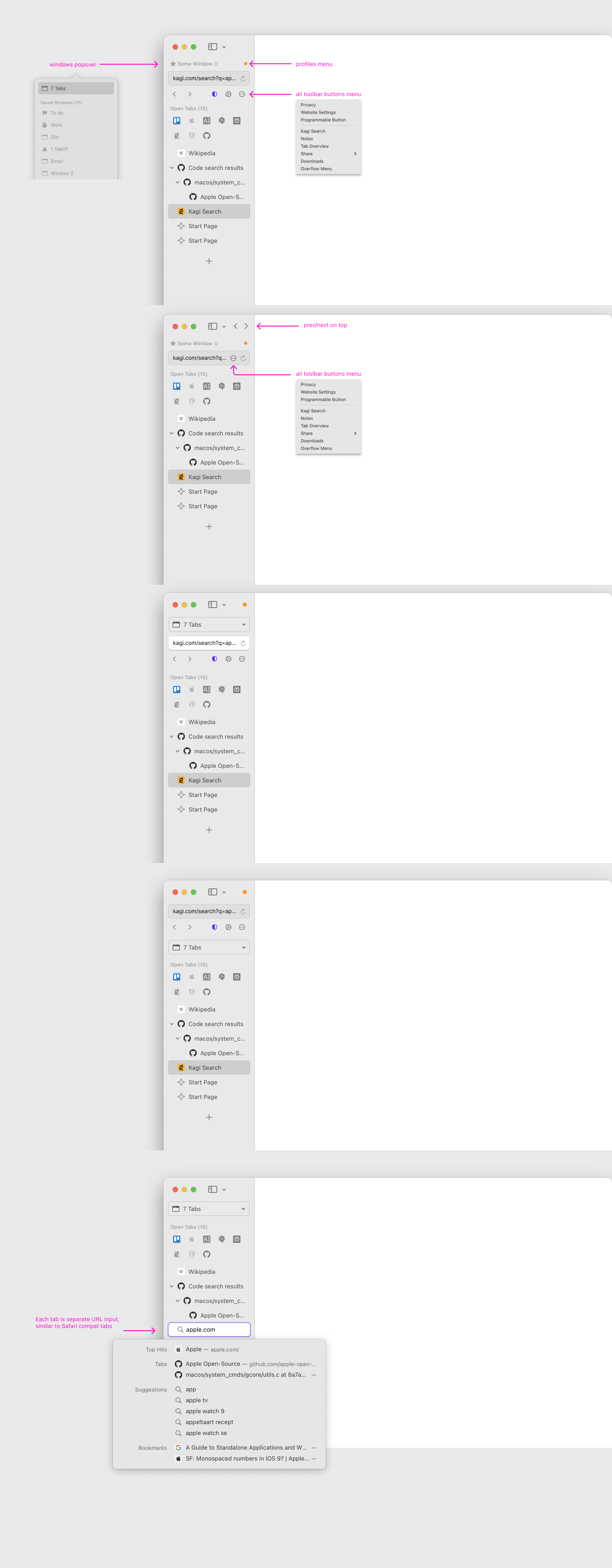
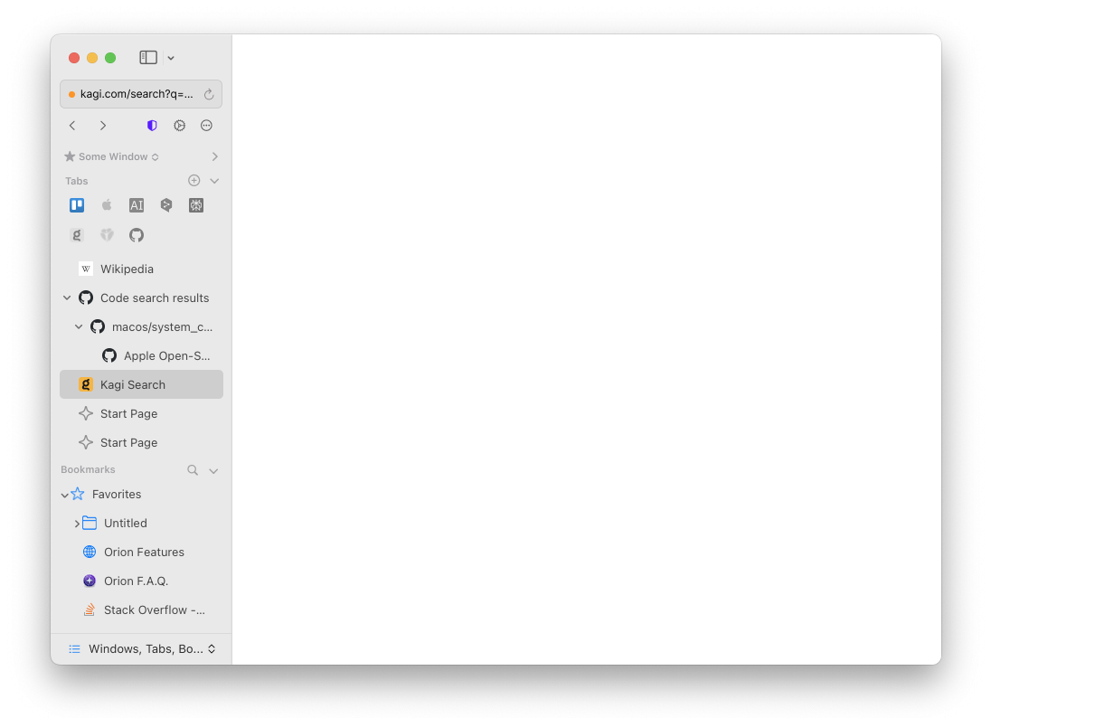
Some updated ideas -

image
and also link to figma

Regarding the sidebar size, that only matters if you have it visible all the time. I only want it to be visible when I need it, at which point I want it wide so things are not cramped. People who want the bar on the side have enough horizontal space and looking to trade it for vertical space.
Do you have data on how people are using the browser? Which settings are important to them? It may help
- Make some good defaults
- Avoid unnecessary options that makes the configuration more complex