Reducing width of vertical bar


ForumNinja404 there are no tree style tabs possible with this as there is no room. Everything is flattened.
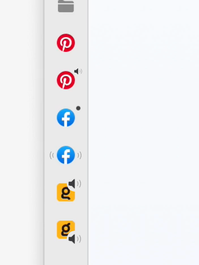
Vlad Just wondering what the implementation of sound indicator looks like with this view? My take is it either gets removed completely or the indicator gets it's own altered miniview. Here's me experimenting with what that looks like, but I can't say there's an obvious one that stands out as the best to me.

Vlad Well, I know y'all are a native Mac app and trying to respect the design paradigm, but if I agreed with all of Apple's design decisions I would just use Safari. Hover is perfect if I want to just quickly check what my icons are representing. Without Hover, I would need to do an absurd number of mouse actions to accomplish the same thing:
- Move mouse to the column
- Find the column edge
- Click and hold
- Drag to the right
- Drag back to the left
vs
- Mouse over the column
- Mouse away from the column
Maybe a compromise would be Expand on Hover (only if Option is held)?

minte I prefer the bottom Facebook icon with the "radio wave" effect.
ForumNinja404 I agree it looks cool, but the tough part about that is the click to mute feature - What would you click, and what would the muted version look like? At least for the other ones (with the speaker icon) it's straightforward in that you click the little speaker and the muted speaker icon remains the same as normal tabs.
- Edited

Vlad Isn't the mac setting to show/expand dock on hover an example of it being used? It's also present in Stage Manager, where if your window takes the entire screen you need to hover your mouse close to the left edge to reveal it.

i use the side bar a lot, however, at it's smallest it still takes up a lot of space, what i would like is a feature to be able to turn the side bar into just icons, removing the text, which would look something like vivaldi's tool bar. 

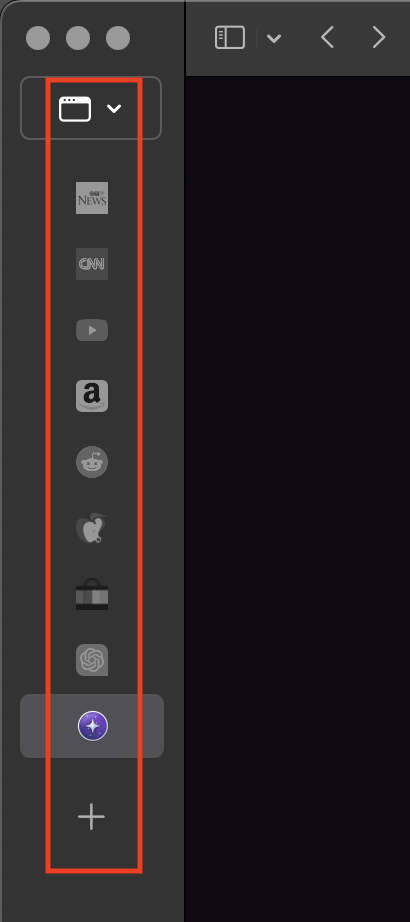
At it's minmum width, the vertical tab bar is about twice as wide as it needs to be. Traffic lights could be in the top bar, and then the vertical tab bar can be compressed in width much futher.
The drop-down arrow for the window selector could be moved from the right, to below the icon.
Yes, I'd also love a slim approach to this issue similar to e.g. Brave.
We further reduced the width of sidebar in the latest RC