A smaller width for the icon-only vertical tab would be great. Also it will keep the traffic light buttons not off centered.
A smaller width for the icon-only vertical tab would be great. Also it will keep the traffic light buttons not off centered.
also the arrow for sub-tab is really inconsistent
One option so that the traffic lights do not get in the way would be to do it like this:
all the toolbar icons would be on top, and the sidebar would not intersect with the toolbar.
a few problems - if this were to happen, the sidebar would feel more like a second-class citizen, as part of a webpage rather than part of the app. also, it would look a bit weird if bookmarks bar was enabled
I'd like to see that the minimum vertical tab bar width would be almost half the width of the current minimum, as its mostly whitespace as soon as the tabs shrink to their icons, anyway.
Also an option to auto expand the bar on mouse hover would be nice, to be able to read the tab titles e.g. when switching tabs
Addendum: I'd also prefer that the vertical bar has the same color as the top bar. I assume that you currently mimic the esthetic of other native MacOS apps like Preview, but for me the color difference intuitively indicates a "temporary" GUI element, that needs my attention and is unnecessarily distracting...
regarding ur "Addendum", i doublt this will be considered. just take a look at safari, finder, maps
Brief Summary
Orion's vertical tabs are resizable, and can be made fairly small and compact. However, Brave's new vertical tabs feature has a compact mode that's (IMO) significantly better:
In contrast, this is the smallest I can get orion's vertical tab bar to be:
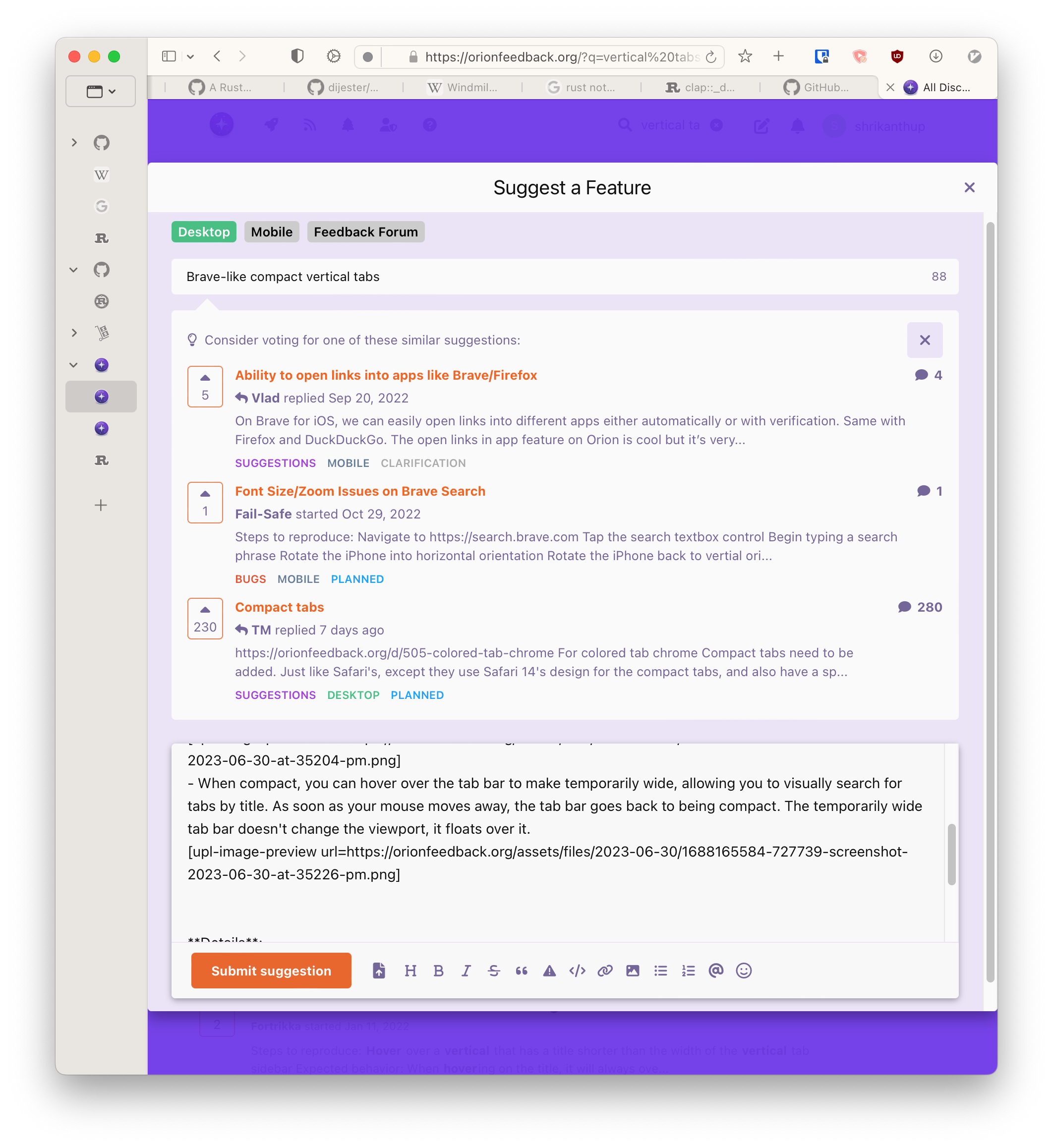
And hovering over the tab bar doesn't show me all tab titles, so if I have a bunch of tabs with the same icons (or worse, a deeply nested set of tabs), I still need the horizontal tab bar to visually search for the one I want.
I think this is a significantly better user experience than Orion's right now (and any vertical tabs extension for FF AFAIK), and I would love to have it in Orion so I can finally turn off the horizontal tab bar.
(For those wondering why my windows are the aspect ratio they are: I use yabai to tile my windows, so most times I have two split windows on my screen. This is yet another reason why I'd love to have the vertical tab bar be as small as possible while being usable on a narrow window.)
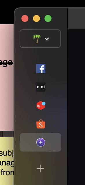
We now have an idea how this should look like, looking for feedback. Note this would flatten the tab hiararchy.
EDIT: OK, I'm leaving the original feedback below for posterity, but I need to clarify that I had no idea that you could drag the edge of the vertical tab bar in Orion to change its size. I only learned about it because my post was merged into this thread.
I wonder if there's any way to highlight that functionality... It doesn't exist in Brave (which I only reference a lot because it's the last browser I tried, and the first time I started using vertical tabs).
Anyway, now that I know we can already collapse the vertical tab bar so it only shows icons, my primary feedback would be: please give us the option to turn on Expand on hover. Thanks! <3
Brief Summary
I love vertical tabs, but they can take up a lot of screen real estate, especially when I need to have the browser side-by-side with another window. I think we should have an option to collapse vertical tabs so only the icons are shown.
Details:
I really like how Brave's options for vertical tabs, where you can leave them as icons by default, but if you hover the tab area, it expands to show full titles. (In Brave, Hover on expand is optional as well, of course.)
I will say, Orion's Tab Switcher makes it somewhat viable for me to leave the vertical tab sidebar closed most of the time, but I would still prefer to see the icons so I know at a glance what tabs I have open, without needing to pull up the Tab Switcher, which basically takes up the whole screen.
Oh, and this is possibly for a separate thread, but I like how in Brave, I have the option for a page preview to pop up on hover. It's not super necessary, just a nice little quality-of-life feature.
t
Image/Video:
Btw, the tab switcher is brilliant. Vertical tabs are great in general, but sometimes I don't want to look all the way over at the left side of the screen to navigate tabs. Being able to call up the Tab Switcher so I can see everything front and center is fantastic.
Vlad I like this implementation. What happens when you click on the parent of a collapsed collection of tabs? Does it expand and collapse as normal?
ForumNinja404 there are no tree style tabs possible with this as there is no room. Everything is flattened.
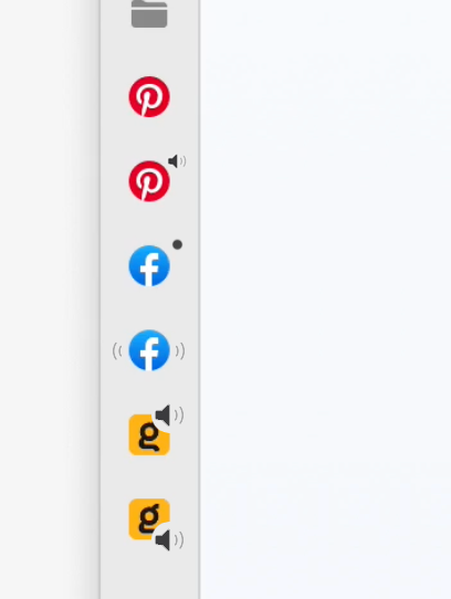
Vlad Just wondering what the implementation of sound indicator looks like with this view? My take is it either gets removed completely or the indicator gets it's own altered miniview. Here's me experimenting with what that looks like, but I can't say there's an obvious one that stands out as the best to me.