Reducing width of vertical bar

Folks; it’s okay if you don’t like it!
Just make it optionally auto expand/contract for those of us who do.
This is the reason why I use MS Edge over other browser right now.
It’s a deal breaker for people who want to focus on the webpage content and forget for a second that we have 20000 tabs open.
And if we’re talking about “MacOS design guides”, what about the auto hiding Dock? That’s not even minimized it completely disappears.
So suggestion: auto expanding sidebar on hover (opt-in option in settings)
MS Edge auto hide mentioned here too in recent comments:
https://orionfeedback.org/d/42-reducing-width-of-vertical-bar

dereck009 Exactly. Dock does that too. I also use MSEdge just for that.

Hi!
I love using vertical tabs and I absolutely love that they are available in Orion by default!
Currently, they're unfortunately taking up a lot of space while in use, which is slightly problematic on small laptops...
Would it be possible to have them minimize into a smaller sidebar with just icons and expand it when the user needs to see them?
This would allow users to still have an overview of their tabs while only taking up space with the full info when needed.
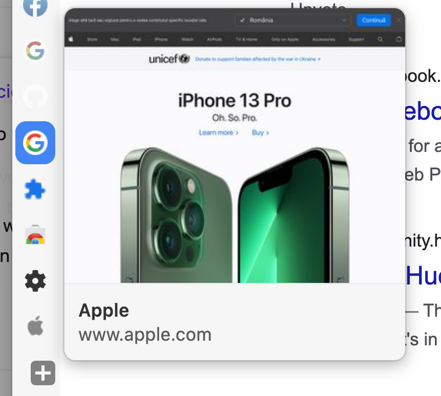
Microsoft Edge has a similar behavior to what I am imagining, I'll attach some screenshots.
Thanks a lot!
- Edited

I think this would be cool however, I'm not certain it's possible to make it float above the page. If it doesn't float, it will push the page and no one will like that.
I think an alternative solution would be to have the tab previews working. By hovering on the favicon you would have the thumbnail show up to the right and the tab title below in the same frame ( just like Vivaldi does it).
my cursor is hovering over the apple logo it's just invisible 
BotondKuti That would be a huge improvement over the current situation already, although it really wouldn't help with tab organization. I constantly see myself either manually expanding the sidebar or switching back to top tabs, which better tab previews would not really solve.

gitarero164 Expanding on hover is not a native macOS UI interaction and against HIG for accessibility reasons.
This was already suggested it would be nice if you locate the original thread so I can merge this.

The vertical tabs are a bit hard to use when the width is as small as possible. You get a list of favicons with a lot of padding on the side and that's kind of it.
Here's a question: which tabs are and are under the Google tabs?
Answer:
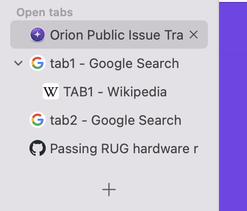
This hierarchy should be visible in this view. Sadly, Firefox' Tree style tabs don't really do this "minified" version so there's not some UX to make. I wonder what Apple's design guidelines would say about this.
- Edited

I have some ideas:
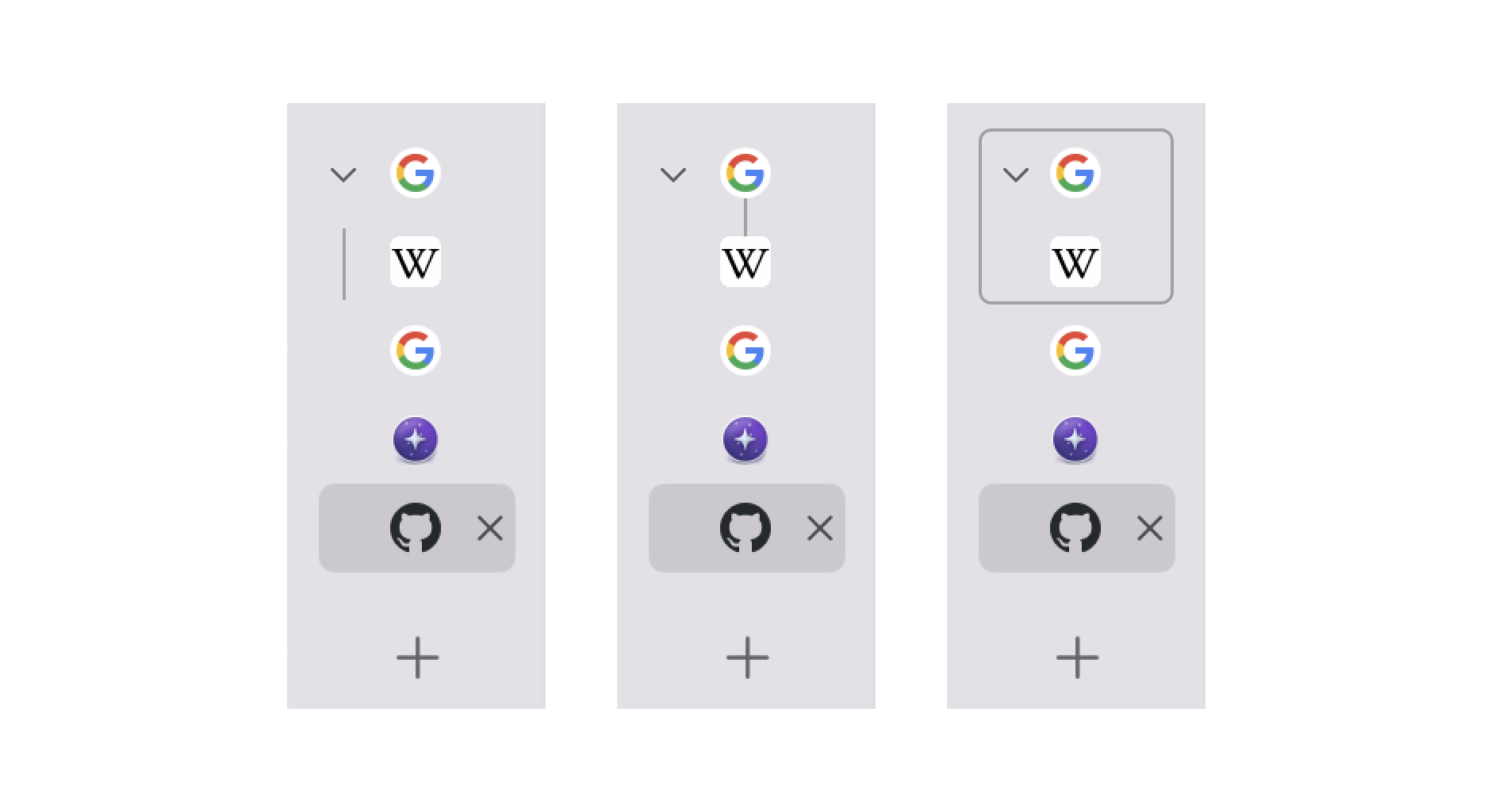
From left to right:
- Vertical line next to children of parent tab, similar to Microsoft Edge
- Connecting line between favicons (might be hard to see)
- Outline around tabs in group
I couldn't find much in Apple's design guidelines on handling this specific use case. Orion is trying to follow the sidebar guidelines. Maybe the design of tab views/segmented controls could be adapted, though I don't think the white rectangle with shadow would fit the rest of the design here.
How would they work in a scenario like this, though?
 vs
vs 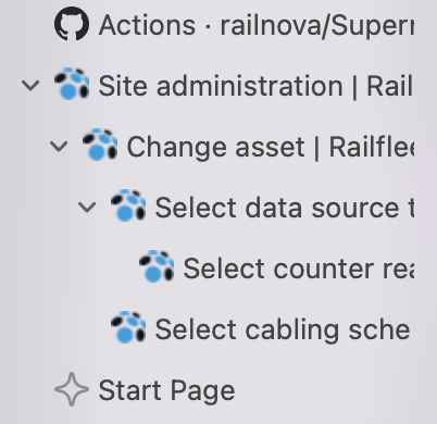
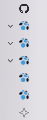
I'm not sure the width of this can stay constant if we really want to show the levels
I'm struggling to think of a solution that wouldn't look cluttered or ugly. If we indent the favicons the sidebar could probably get to 3 levels until we'd have to stop showing hierarchy due to space.
Another solution would be to take the vertical left-side line idea and add a parallel line per level.
I don't think either solution would look good though.
Good efforts! Waiting for you to figure out what "better" means
Had some more thoughts about this, and I actually think that lkhrs 's sketch n1 might work the best. An extra line could be added for every level to show the hierarchy.
I wonder how it would look like to have the caret next to the lines.
Adding lines will create a problem as this will require more space horizontally though, so there will have to be a cap
Alternatively, instead of lines, we could just add a number of dots that would stock vertically, capping out at level 6 or something?
I'm sure this could look a lot better in the right hands lol
- Edited
Suggestion:
Make vertical tabs bar auto minimize when not used and then maximize width on mouse hover.
Kind of like how Edge does it. It’s super convenient!!
Showing full width vertical tabs all the time is one of the deal breaker why I can’t use Orion as my daily driver now.
Also I’d like if tree/nested style were optional.
I always hated that feature in other vertical tab managers. Feels like I’m spending more time organizing that tree than doing actual work because it’s never intuitive to me what opens where.

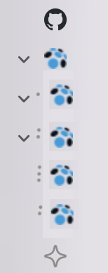
It would be nice to have an option for the virtical sidebar to be reduced to favicons, and automatically collapse and expand upon hover. Functionality-wise it's exactly like the sidebar on this post
ForumNinja404 this is a duplicate of another post, please find it so we can merge.
- Edited