When a favicon's color matches the color of the tab it's very hard to see what website the tab is displaying. This is implemented in safari.
Orion:
Safari:
When a favicon's color matches the color of the tab it's very hard to see what website the tab is displaying. This is implemented in safari.
Orion:
Safari:
Triduelist Observing Safari behavior, can you provide a ruleset for when thould this exactly happen?
Wanted to make a post about exactly this.
Safari has this thing where when in dark mode and a favicon is mostly dark colors it gives it a white background, so you can actually see it.
The way it could be done is having a check on the darkness of the favicon and if darkness is over a certain threshold white background is aplied. only in dark mode ofc
I disagree, the browser should not modify the appearance of favicons. Vivaldi adds a thin white border to them in dark mode, and it often looks blurry or worse than the standard icon. No matter what you do to the favicons, there will always be some with low contrast or a blurry appearance. The site owner is in control of what favicon was intended to be there, and it shouldn't be modified in any way.
Im not sure i buy the premises that its to modify the appearance of favicons, changing whats behind it. its bassicly just changing the browser chrome. so its inserting a background box
Safari and Orion allready does this multiple places, here is an example:
all of theese icons have transparent backgrounds so a bright background is placed behind to make them look clickable like other favicons:
Can you really tell which ones are "modified" and which arent?
Longely Fair enough.
Any thoughts on what and how do we do what is being asked?
thoughts on the "what"?
How:
The way it could be done is having a check on the darkness of the favicon and if darkness is over a certain threshold white background is aplied. only in dark mode ofc
exactly how that check should be done im not sure. im thinking overall rgb values or something. i can probably do a javascript code that does the check if needed
yeah the idea is it only works for icons that are too dark and dont take up the full frame/dont have background. (code wise you could do so it applies to all dark icons. and if they have background they just cover the applied background)
The reason for not having it on by default on all icons is firstly that it isnt needed on the majority of favicons with transparent backgrounds.
Its only to improve cases where you litterally cant see the favicon:
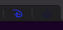
which is made even worse when the tabs are suspended:
Safari as reference:
So to sum up, from an aesthetics point of view it doesnt matter how a favicon looks, if you cant see it. and from a functionality stand point its not great when you cant navigate your tabs well, because you cant see what is what