Please implement this... I really loved the Cool Safari 16 UI.
294
Compact tabs

Leo_Edwards Safari 16 does not exist yet, that is for the future macOS 13 release.
Safari 15 does exist, and its iconic feature at first was it's compact tabs, but Apple reverted back to the normal separated toolbar due to controversy.

But its not removed and still available as option. Safari is not my default browser, but together with with the sidebar is nice. Anyway tabs on left and extension support is still better. ;-)
4 days later
Please implement this, I love the look and feel of the new compact tabs

5 days later

+1
3 months later

Added my vote to this. One of the things I didn't like about Safari was the tabs under the address/tool bar. When the latest Safari introduced the compact tabs feature, I loved it. It's very different, however I much prefer it to Safari's "hanging tabs" (which Orion uses also). I even prefer the way Firefox/Chrome implements tabs (above the address/tool bar, and small button-like appearance).
The downside to this is obviously it pulls you away from other, more critical features of the browser. That said, the form and function are important.

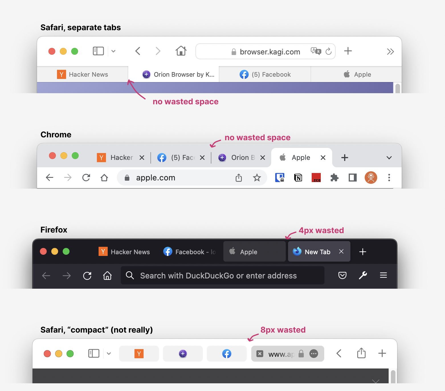
The toolbar in safari (osx) is innovative and one of the main reasons for using safari:
• combining tabs and URL fields
• matching toolbar color with website header color
Also, it takes less space, without losing information. I'd like to see something like this in Orion. Thanks!
Merged 3 posts from Safari style toolbar for desktop.
4 days later
Why not have the address/search bar, which sends me to what I want, be combined with the tab that contains the search/URL? Having one area display the URL, while another display a tab that ends up referencing the URL could be seen as unnecessary.
When browsers combined the search area with address bar, a similar thing happened there.
I also really like how the websites color the browser: if the browser is designed to exclusively display websites, then why should the browser contrast the websites so much? Similar principle a third time.
A few thoughts to consider 
We are aiming for a layout similar to this https://orionfeedback.org/d/92-compact-tabs/59
18 days later
- Edited
Vlad Thank you for listening to the users and developing the best browser for mac.
Most notable thing about Safari compact tabs (address inside tabs) is the similarity of it with mobile Safari (iPhone). In my opinion, Apple's approach in risking with such radical UX change would be guided by mobile-first approach, as most people in the ecosystem are mobile users and would feel home with compact tabs rather than having the tabs below address bar. Also, it saves space, even with the top and bottom padding.
This could be the reason behind more people liking and expecting compact tabs "as is" in Orion instead of the IE9 UX you guys are currently aiming for.
8 days later

My opinion on this would be that out of existing implementations, Safari 15 compact tabs are the best. They look elegant, function similarly to iOS tabs and save space.
As far as I understand, the only issue the dev team has with the Safari implementation is that only a small portion of the URL is visible, as per Vlad's post https://orionfeedback.org/d/92-compact-tabs/45. Orion's early adopters are presumably fairly opinionated power users, so appealing to everyone could only be done through deep customization, but as far as the general case goes, I think the URL bar is generally fairly unimportant for the following reasons:
- Examining the URL is useful for ensuring you're not visiting a scam page, e.g.
wlkipedia.netwhen you were looking forwikipedia.org. Even a tiny URL bar, like the one in Vlad's screenshot, is big enough to examine the base URL which is enough virtually all of the time. - One might want to identify the subpage they're on by examining the URL, but it's generally better to just look at the page title. Consider an arbitrary AP article:
https://apnews.com/article/science-australia-a9bdf5ada0b5fcf7b9b9b4689808295a. The URL provides very little info. All that I know is that it is related to science and Australia. The tab's title on the other hand is "World’s largest plant is a vast seagrass meadow in Australia | AP News" which, if I had multiple tabs open, would let me identify the one I'm looking for immediately and easily. Safari 15 compact tabs have a setting to make titles always visible, which I find to be the optimal solution for this scenario. Screenshot:

- A user might want to occasionally perform URL manipulation, but in the vast majority of the cases, it's a simple one, restricted to the beginning to the URL, such as changing
reddit.com/[..]toold.reddit.com/[..], so again, a tiny URL bar would do.
In addition to all the above, I believe it would be possible to have the best of both worlds by:
- Growing the URL bar to say, half the horizontal screen size, once the user clicks on it i.e. highlights the URL i.e. starts editing the URL.
- Making it so that scrolling sideways with 2 fingers on a trackpad while hovering mouse over the URL moves the URL, allowing the user to read it easily even with a tiny URL bar. This one might interfere with scrolling a long tab bar, as the same gesture is used for scrolling a tab bar when there are too many tabs to fit them in the bar all at once.
- Removing some of the icons, which - as Vlad pointed out - can take up a third of the URL bar space. In particular, reader icon is contextual only so doesn't usually appear anyway. Refresh can be tucked under the more options icon as most users use the hotkey anyway. Padlock is kinda useless and iirc Chrome has begun experimenting with removing it. I believe it would be far more useful to instead have a red, unlocked padlock on http sites and no icon for https sites.
And in the rare case that the user is performing a task that simply requires the full URL to be visible at all times, such as certain kinds of web development or pentesting, they could simply:
- Opt out of the compact tab view
or
- Switch to the vertical tab sidebar mode
In conclusion, I believe that both the mockup Vlad posted (https://orionfeedback.org/d/92-compact-tabs/51) and the IE9 interface (https://orionfeedback.org/d/92-compact-tabs/59) which he cited as a rough goal, would be a far worse option than the Safari 15 compact tabs for all but very specific workflows. While it would be great to see this available as an additional option, I personally would much prefer to have more tabs fit the tab bar at once than have more of any specific tab's URL visible.
- Edited
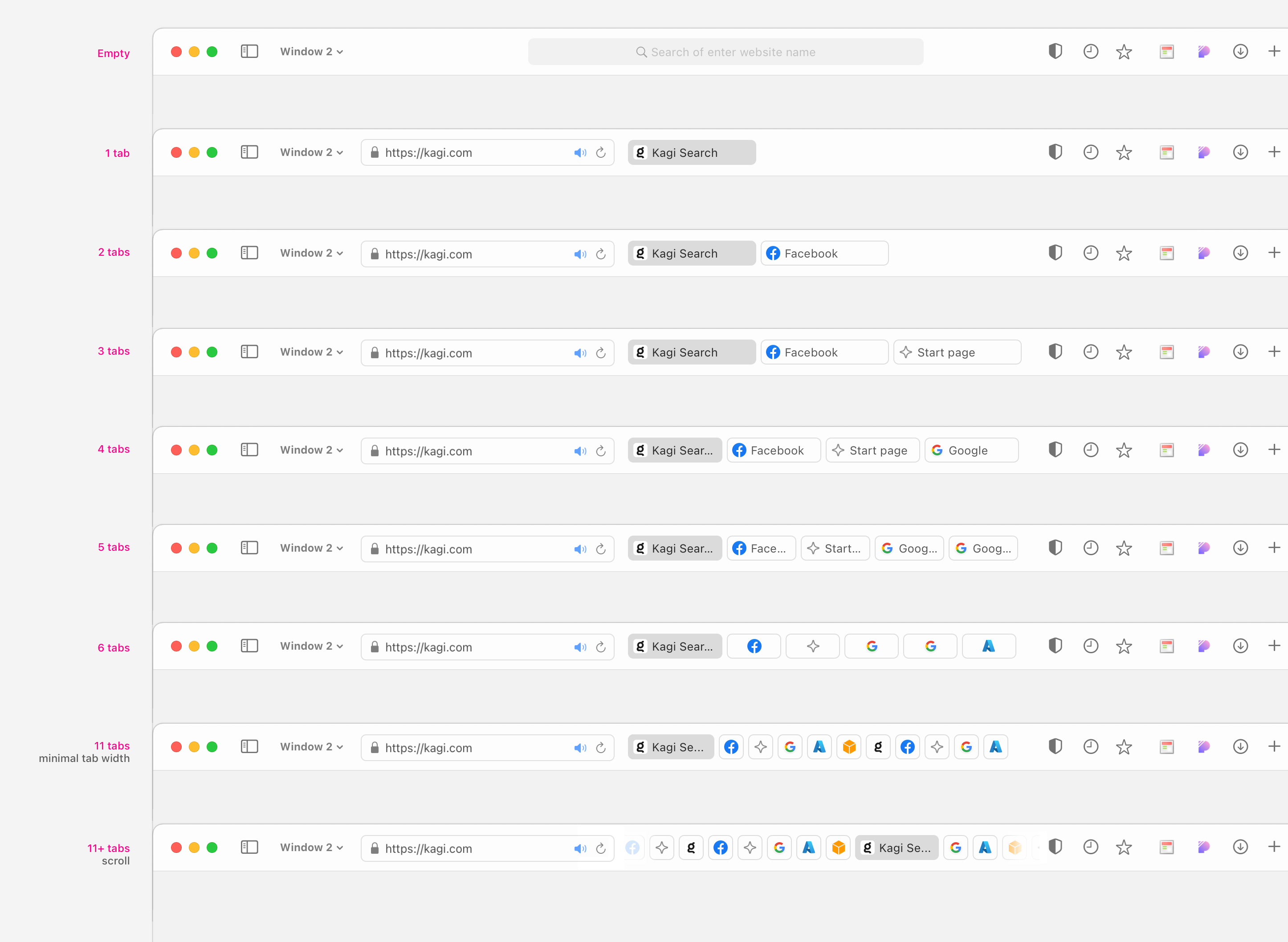
Here is our first go at Compact tabs idea. Our main idea is to remove 'jumping' around with address bar like Safari does it and instead have a fixed address bar while preserving space saving.
We are showing the worst case scenario here, where the user also has a lot of toolbar buttons. I am sure we missed something so please keep the comments going.
Given the amount of upvotes and apparent intersest I was hoping for more feedback
- Edited
Vlad I think that a compact mode in a browser is primarily about tradeoffs. You get more real space to show the actual page, but you need to give up some functionality of the top bar. When only 5 tabs are open, then your proposed solution is the perfect compromise, you get a static, visible URL bar and you can read titles of all your tabs too.
But quite often I have more tabs open. Because many of them have the same base URL, I can't differentiate them just by the icon so I check the setting to always show tab titles. In Safari that gives me 8 visible tabs on my Macbook Air.
I find this good enough. It lets me have a couple of github repos open, some docs and some stackoverflow pages.
Your proposed solution takes up about over a quarter of that space. I shrunk my Safari window to "simulate" it.
I get at most 6 visible tabs, which would be a serious hit to quckly switching to the tab I need. In return I can see more of the URL of the page of my currently active tab and I have URL bar that doesn't move around.
As per my previous post, I very rarely need to examine the URL past the TLD, so I gain negligible value here. And if my workflow did involve frequent URL viewing or editing, I still wouldn't be able to see the full URL in the bar you proposed for many webpages.
Safari, with its hybrid tab/url, let's me see 24 characters of the URL in this instance:
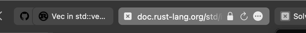
In your example, the URL shown is 16 characters long and the bar could probably fit twice as many, so 32. A 33% improvement over Safari (also, in your demo, 8 characters, so around a quarter of the URL bar, is taken up by the https://. Seems redundant given I can see the lock icon. Safari does not show it.). The website I'm on right now, https://orionfeedback.org/d/92-compact-tabs/82 is 46 characters, so I couldn't see the number of the reply, which is at the end of the URL, in either case.
The other benefit of your proposed solution is that the URL bar stays in one place as opposed to jiggling all over the tab bar. It's certainly nicer having it be static, but it's really not a big deal for me since I almost never click on it anyway, just CMD+W, CMD+T and enter the URL like that.
So yeah, your proposed solution does look really slick and I'm sure a lot of people would love it, but for me and other people with similar workflows, it makes a much worse tradeoff compared to the Safari 15 implementation when it comes to productivity.
Vlad
Safari 15:
+More tabs visible at once (with their titles)
-Moving URL bar that shows only around 24 characters
Orion proposed implementation:
+Static URL bar that shows around 32 characters
-Fewer tabs visible at once
Being able to quickly switch to the tab I want is important for my workflow, so having around 6 tabs visible instead of 8 is a major con.
Being able to see a URL past the TLD or being able to quickly click on the URL bar is not important to my workflow, so being able to see 33% more of the URL and having the URL bar be fixed in place is only a minor pro.
I hope that's clear enough, but I'd be happy to provide more feedback if needed!