Compatibility mode indicator icon or tab styling
Vlad Oh - I never noticed you could enable a badge for the Privacy icon.
It makes sense for Downloads and Privacy because you can click those icons and see a number of blocked items or list of downloads. So a number makes sense.
Yes, I see, the gear icon doesn't have an area to paint so just changing its colour doesn't do much.
The gear icon could have a numbered badge, number = # of non-default settings, as you suggested. Then in the popup when you click the gear, each setting which is non-default has an indicator - perhaps a small dot that has the same colour as the badge.
Is there anything in Apple's design language stuff for indicating that a setting is changed or non-default? I think macOS doesn't tell you at all, and most preference panels do not have a "reset to default" button either.
Cannabat I am not aware of anything in the design language to mark a non-default setting which makes second part difficult to implement. If we did that, we would also probably need to implement it on entire Preferences for consistency. Amazing how things quickly escalate
So still waiting for ideas here.
- Edited
I can quickly think of 2 options to call out custom / divergent settings for the current site:
1. Based on a numbered Website Settings button badge
Separate the custom / divergent settings into "Default" and "This site" (or domain?) headers, but this could be problematic in how much moving around and/or duplication of items (i.e. Extension permissions) would need to exist in both sections.
2. Borrow OmniWeb's solution
Add a small cancel/reset icon to each setting that deviates from default, such that clicking each allows you to selectively rest to default… and add a master "Reset" button to the Websites panel to return all to default at once.
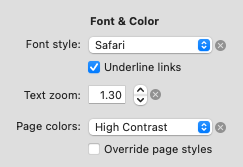
(1) is more immediately obvious, but might be confusing with options moving around (and have UI implementation issues, e.g. should switching between the sections be animated etc)
(2) is a little less obvious, but you could add tooltips and it's presumably much easier to implement.
In both approaches the numbered badge on the Gear icon gives context to what users see when they open the Website Settings panel, and in particular could help explain the subtler (2) approach.
- Edited
Vlad for now I’d think it best to restrict this just to the Website Settings feature — allowing individual reset of all preferences to default would probably take this too far, proliferating preferences with close buttons, and just end up feeling “too much”.
…assuming I understood what you meant!
- Edited
Vlad oh BTW turning on notifications for Privacy is a bit hidden — didn’t find it myself, I only learned from this thread.
IMHO just turning purple is too subtle for one of Orion’s marquee features (max privacy) so I’d suggest defaulting notifications on, and instead adding a checkbox inside the Privacy panel to let users disable if they find it too much.
How would you explain the inconsistency? One set of settings having a reset button and the other set of settings not having it?
In this case I'd argue Website Settings are conditional over-rides of the General Settings I otherwise want to apply more broadly. So, I'm resetting over-rides back to the General Settings, which are the "standard" that I've set.
If I'm resetting those standards I've set (General Settings) what state are they reset to? The state the app shipped in?
Yes, to the default settings.
IMHO, I don't think resetting to the browser's default/shipping features is necessary — but I guess I could understand if your perspective is that the ("your" ) defaults are carefully chosen to give the best UX.
In that case I could see a simple, singular "Reset" button per Preference pane might be a less "busy" option that appending the (x) 'reset' button next to each divergent setting.
…but, ultimately I guess in practice the (x) per divergent General Setting wouldn't be that bad, or overwhelming, as it's unlikely to be many individual settings, for anyone but the most committed 'configure-er'!
So, "yeah" in the end, could see it extending to all settings, which would be consistent across the app, and also give more clue/training to users, for when they first notice the reset on on Website Settings.
Currently, i believe the only visible change is that extension icons get greyed out. I think an indicator, a la the download counter would help.
I'm not sure what would be a good fit though.
Something as simple as a red slash through the shield/privacy report icon might be enough to indicate when compatibility mode is enabled at a glance.
- Edited
maybe just something simple as this, if something is changed in settings.
or this when compatibility mode is on:
i really like the check on gear one.
Good suggestions, although I think the icon should be placed on the tab itself, similar to the suggestion in this post. This fixes a potential issue for users (myself included) who remove a lot of the icons included in the default toolbar set.
Plus, I think this makes more sense design wise, as compatibility mode is a tab specific thing, in the same sense that suspended tabs are also a tab specific thing.
- Edited
I dont think you need to know if tab you arent using are in compatibility mode tho. it might also conflict with other icons or get crowded if sound icon is also on. the reason you can do it with a suspended tabs is because nothing else is on when suspended.
And in the case of someone editing it out of the toolbar i assume the arent using compatibility mode, no?
JunkBrunstoe compatibility mode is a website-specific setting, just like reader mode, camera/mic access, page zoom, etc. these settings are generally visible in the toolbar, not the tab itself.