- Edited

For reference this is what trimmed compact mode looked like (we were much more compact that Firefox compact mode)
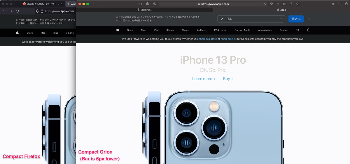
For reference this is what trimmed compact mode looked like (we were much more compact that Firefox compact mode)
Oh I absolutely love this! The address bar and tab bar height ratio look better and not cramped at all. I would totally go for this.
If you could push me an update with this, I can happily test it out.
I want a compact view in Orion that's EXACTLY like Safari (including same width and height).
Vlad That reminds me of Internet Explorer 9 which (iirc) was the first browser to adopt such design. It’s definitely better than Safari’s compact mode in terms of UX. If that’s your vision, we just need to agree on an optimal size for the fixed address bar or should it be user-adjustable?
adorabilis Yes that is the idea. Not sure how would we let the users adjust the address bar in this case.
https://orionfeedback.org/d/505-colored-tab-chrome
For users who want to upvote colored tab chrome instead. Perhaps can the title be changed to just "Compact tabs"? Remove the colored tab chrome from this post.
Vlad while I actually like the overloaded Safari 15 compact tab bar, I get it's controversial and indeed not perfect — irrational I know! "Hey, a new shiny to play with!" 
For me the slim approach you've shown here is the most user-friendly as it reserves maximum toolbar space to you know, actually grab and move the damn window! That's what IS sorely lacking in both the Safari 15 compact tabs and in Firefox's approach.
So, as much as the new Safari tabs are "fun" to be pragmatic I'd vote (fwiw!) for you to stick with your current approach and 'just' optimise via your "Compact Size" approach to balance space and keep maximum usability.
Whereas the IE-like "compact tabs with fixed position address field" feels like it could be a bit unnerving / confusing for a selected tab to 'jump out' of its previous tab order — when that tab order (by default) can give context as to when/where/how a new tab was opened, but only if default behaviour were to open new tabs next to their parent, instead of your current approach of adding them to the far end of the 'tab stack'.
Please implement this... I really loved the Cool Safari 16 UI.
Leo_Edwards Safari 16 does not exist yet, that is for the future macOS 13 release.
Safari 15 does exist, and its iconic feature at first was it's compact tabs, but Apple reverted back to the normal separated toolbar due to controversy.
But its not removed and still available as option. Safari is not my default browser, but together with with the sidebar is nice. Anyway tabs on left and extension support is still better. ;-)
Please implement this, I love the look and feel of the new compact tabs
+1
Added my vote to this. One of the things I didn't like about Safari was the tabs under the address/tool bar. When the latest Safari introduced the compact tabs feature, I loved it. It's very different, however I much prefer it to Safari's "hanging tabs" (which Orion uses also). I even prefer the way Firefox/Chrome implements tabs (above the address/tool bar, and small button-like appearance).
The downside to this is obviously it pulls you away from other, more critical features of the browser. That said, the form and function are important.
The toolbar in safari (osx) is innovative and one of the main reasons for using safari:
• combining tabs and URL fields
• matching toolbar color with website header color
Also, it takes less space, without losing information. I'd like to see something like this in Orion. Thanks!