
also if you wanted it to look even cleaner, you could adopt Safari way of doing it in compact mode where the favicon becomes close button:

so you avoid things like this:

so would look like this:

also if you wanted it to look even cleaner, you could adopt Safari way of doing it in compact mode where the favicon becomes close button:
so you avoid things like this:
so would look like this:
Another example with the flat apple design:

Ok last flat design example with comparison to Safari
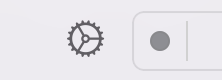
Removed the tabs counter and replaced it with Safari arrowdown to save space:
Orion sugestion:

Safari:

Sugestion removes dead space. The sugestion has 1 tab less. but an always there address bar that is as wide as Safaris and way more buttons
Small note. the text and favicons on the suggestion are a bit to close to the edges compared to Orion, since my start point was Safaris tabs and didnt borther adjusting each one

Apple's design is still a bit slow though, there could be a small bookmark star beside the three dots, their translate UI is weird. It sometimes shows in the tab, and sometimes doesn't. These consistency issues, are the only issues I have with apple's design. Maybe also the gaps can be reduced further to make it tidier.

Just a quick follow up on the above post with how the spacing wasnt orion. this is orion spacing in the green box, so just imagine that orange 

as you can also see theres some space to the left of the favicon that is used for the X to close:

I would remove that space and use Safaris favicon close:

So you can get more tab text/tabs as in my sketch
Longely I love this implementation and your mockups. I think this is how compact tabs should be implemented.
ForumNinja404 thanks
have some more ideas how to improve the space for the tabs, but want to see what vlad says first.. feel like i have posted alot hehe
Longely i really dislike the lack of contrast between the tab title bar. the actual tab is supposed to be actionable, as in u can drag that one tab around, right click on it, etc. the toolbar is usually considered a distinct part, and now, with it merged into the tab bar, makes confusing. it looks like as if the tab here is actually part of the toolbar, and not a tab
I really prefer the style of safari, or at least some sort of border or shading of each individual tab, so I know that they are distinct tabs.
I follow what you are saying.
It is suppose to become part of the toolbar tho. thats how normal tabs allready work in both Safari and Orion.
So its trying to follow that logic. The logic of inactive tabs getting cut off with no connenction to the toolbar and active ones merging with it:


But, yes obviously when the merge happens on the same horizontal line, its gets even more swallowed by it. especially with the flat apple design with color merge. thats kinda some of the things i was talking about further up
Here is one of the first examples without flat design and active tab in the middle of the tabs:
IMO theres nothing here that makes me think its less movable then a normal tab.. but when you move the tab to the end of the tabs list and add flat design on top of it, then yes everything becomes more unclear, but also way more clean and for some people nicer to look at. hence why i wanted to seperate the 2 conversations earlier. into the system and the appearance
Ps im assuming you are only talking about the active tab. since the inactive tabs have the same contrast to the toolbar as in Safari, colors are stolen from Safari on the mockups
Bassicly your critisism is more or less the same as I had above when talking about Apples flat design
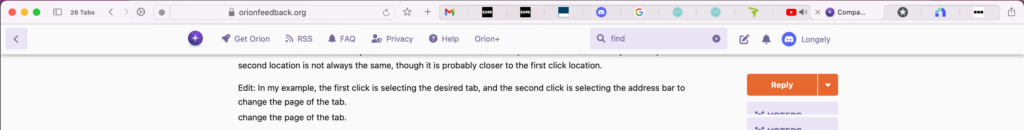
heres an example of old Safari with Skeuomorphic design
the advantages of Skeuomorphic design and the whole argument for using it was that it mimics real world things. making it super intuative when something is clickable
Here is new flat style:

Theres no indication to me that theese things are pressable. for all i know they could just be information.
But then i learn that everything is pressable and nothing is pure information. same logic is trying to be applied here:

one way i learn something is interactable in flat design is when i move mouse over something it darkens:

same would happen for the active tab:
not moving mouse above active tab:

moving mouse above it

and same would ofc apply for the none active tabs when moving mouse above them:

just like in Safari compact. with same colors and contrast
Small correction.. when hovering over the active tab it would propably only darken as much as the inactive ones:

Since thats how the buttons work:

Just a follow up to Eirks responds, i was reading the blogpost Vlad posted by JOHN GRUBER above
https://daringfireball.net/2021/10/the_tragedy_of_safari_15_quote_unquote_tabs
Its pretty interesting as he is kinda arguing the opposite:
"it’s almost a guessing game, a coin flip, when you want to determine which tab is active:"

"It’s even more ambiguous in dark mode:"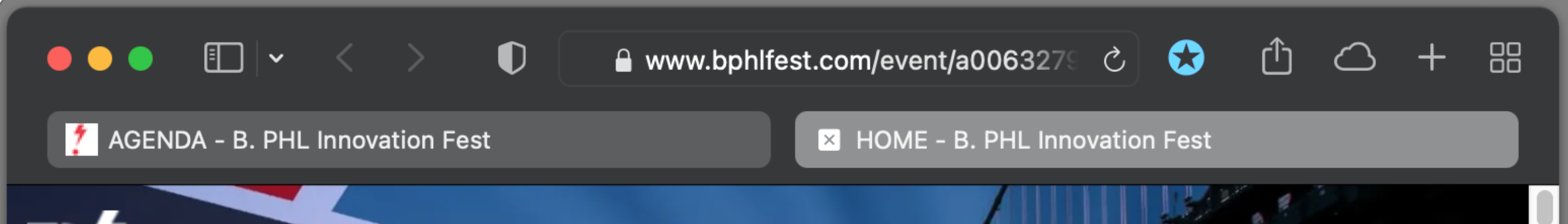
"In Safari 14 — as well as Safari versions 1–13, and every other browser I’m aware of — there’s never any ambiguity about which tab is active, in either light mode or dark mode:"

"There’s no ambiguity because the tabs are visually connected to the rest of the browser chrome"
So bassicly his argument is that the previous way of knowing a tab was active was the merging with the "browser chrome" or "Toolbar"
Which is kinda the logic i tried to implement above.
Its not to take anything away from your feedback. because i do agree it does make a difference when its on the same horizontal line with flat design and webpage merging on top of it
Just my opinion, but I think having the tab double also as the address bar, as in Safari really cleans up the UI and makes it much clearer which tab is active when trying to use the address bar.
After thinking a bit about it, and looking how Apple deal with it other places in the OS. maybe it should/could be done in another way that is more in line with that. as much as i like that it follows the logic of the normal none color mode and think of it as intuative, maybe it is more intuative to follow how they do it more generally outside of the browser.
Here is an example of how they do it:
so 4 items all part of the same thing with the active one having darker box around it. and the other options diveded by a subtle line (just like normal tabs in Orion).
Moving mouse over it:
in other examples the dark box linking all 4 items together is always visible, there isnt really any consistency in that.
so you could do either or, IMO Color mode is about imersion, so i would say as clean as possible is the goal so i would go without it permanatly there, but could be done both ways.
So would look like this:
with all the tabs getting connected when hovering above with mouse. as in the exmaple further up
Or this:
with them visually permanantly connected
Would you prefer something like this?
I think the visual ambiguity the John Gruber talks about happens because Apple has to show them both as seperate address bars and tabs. which kinda messes up there own design rules a bit, as they cant just follow what they do every where else. the way shown above is way more in line with that, and we dont need the "ambiguity" since its only tabs and nothing else.
Dark mode logic
This:

Or:
Just as a side note:
Firefox kinda do it this way as standard. and dont have a need for a permanent box surrounding all tabs. so in Color mode i really dont think it should be there, should only appear when hovering over with mouse. the subtle line divider should be enough IMO.


