100

twingeofregret The Kaktus browser was built by an individual as an experimental project. It hasn’t been updated in three years.
I think Vlad meant to test the find functionally to get an idea for what it looks like, not to take it as a final product.

Obviously the design isn’t stellar in that example, but we could definitely build off it and add better accessibility w/ voice over and keyboard navigation. (hence my suggested mockup)

In regards to your point about not having an always available button, this could easily be added as an option within Orion’s editable toolbar.

this coupled with the macbook automatically dimming its screen in some conditions makes the number (next to the 'x' circle) almost "disappear", any suggestion on making the default colour just a tiny bit darker tone of grey?

    18 days later
    Merged 2 posts from Dim number for find-count field?.
      25 days later

      Brief Summary
      It would be nice if when you search for something using Command + f, Orion would tell you what the index of the current highlight is.

      Details:
      In other browsers, for example Safari, when you search for something using command + f, you are told for example1/44 or 20/44 so you know where exactly you are. It could be displayed as {index}/{number of matches} like in chrome or '{index} of {number of matches} matches' like in safari.

      Image/Video:
      Safari

      Orion

        Second this, I was almost ready to suggest the exact same feature.

          Merged 2 posts from Show the index of the highlighted find match.
            3 months later

            Having find be built into the address bar is a cool idea. Just throwing this out there, would it be possible to have it only take over part of the address bar rather than the whole thing? Kind of like a nested bar or maybe a temporary split until they exit find or go to a different site by clicking on the "smaller" split adress bar. Might be a way to work around some of the issues pointed out while still making good use of space and have a cleaner design.

            • Vlad replied to this.

              Vlad

              This is a VERY rough idea of what I had in mind (my first time putting together a mockup so please forgive any design discrepancies):
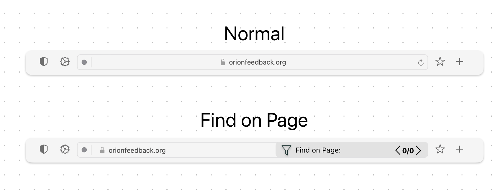
              I think the area that find takes up from the address bar can be dynamic based on what is typed in, that way it could extend or reduce in size. I think the filter option from @ForumNinja404 is a clean option so I included the icon in this one too.

              Alternatively, instead of nesting the find bar into the address bar, the could share the same area like in the mockup but just be in their own separate bars, side by side if that helps with usability and clarity.

              Hopefully this makes sense 🙂

                Vlad Although there isn’t much practical benefit, I think it would help users realize that the find box is still distinctly different than the address bar. My original mockup may confused people as to why they are typing in the address bar. This half-width mockup has the same space-saving benefits as my initial idea, while clearly separating the url and find inputs.

                13 days later

                I like Arc's way of doing it, with a floating bar. Maybe with some extra features:

                • Toggling case sensitivity
                • Going up and down through results
                • Indicator of which result number the user is currently looking at (e.g. "4/80")

                  oup_oup_andaway I like this mockup, it doesn't take up "more" space. it's clean and effective + all the filter options are still available. The user can see both the web address and the find query.

                  At this point we should start with something. This post has 52 upvotes and any implementation would be a step up from what we have currently.

                  12 days later
                  a month later

                  oup_oup_andaway Vlad Is there a timeline for this to be implemented? It’s one of the most upvoted requests on the forum, and anything is better than what’s currently available.

                    In orion, when searching for an item, the total number of items is given like so

                    It is helpful to know which result is currently highlighted - whether it is 1/3, or 3/3.
                    Firefox implements this

                      2 years later
                      Merged 2 posts from Add result number to find in page.
                        5 months later

                        interesting discussion!
                        The searchbar was the first thing in Orion that had me confused: it's indeed too wide and too narrow, and for some reason, easy to miss on a big display - I was thinking: I pressed Cmd+F and now that I'm typing, is it actually happening? am I searching or not at all?"
                        My first expectation was to look for a textbox on the right of the screen - something pronounced/highlighted
                        Regarding the idea of an omni-omnibar I have no grievance, however as a user I'd like to be able to easily tell apart what is a search taking place in the page context, and what is in the browser (internet, other tabs etc).
                        Another thing I'd like is to be able to have a search on-going in specific page, and without losing my "search progress", be able to switch to another tab or open a new page. I believe that is also the main reason people so far have avoided unifying the searchbars and opted for separate inputboxes, floating boxes etc.
                        I like floating boxes aswell as the beforementioned split approach oup_oup_andaway
                        this way if you start editing the text in the url section, the "find" section gets hidden