28

Tinholoco

to replicate: pin some tabs, select one of them which cannot be the first in the top left, close the app (not necessarily quit), open the app and that last pinned tab you were on will now be the first of the pinned tabs.

Can you upload a video of this?

May I ask why did you not post these steps to reproduce in the original post but you are leaving us to guess what you meant?

    a year later

    I'm looking for the pinned tabs to be larger and actually show the window title-more than just an icon.

      Putting in my vote for making pinned tabs in vertical mode a little bigger! They're so small, I keep accidentally clicking the mute icon when I'm trying to click on the pinned YouTube tab.

        They were bigger, then users asked to be smaller. Now they are standard icon size.

          2 months later

          Putting my vote for something like this.

            eirk changed the title to Larger icon/show title for pinned tabs .
              7 days later

              With the recent Arc issues, Orion is getting a lot of mentions. I think adding this could bolster the userbase more than you'd expect.

              I think what OP was trying to describe was the large Arc-style buttons as pinned tabs. If you can implement these, I'll definitely be moving here.

              Please add the option to make pinned tabs into buttons, perhaps with a slight dimming when the page is unloaded. Up to 12 icons, resizeable.

              Thanks

              • Vlad replied to this.

                arcmover What is the benefit of having large buttons, and still same size of favicons as Orion already has? Seems like just a bad design choice, that is also reducing the size of content that can fit on the sidebar.

                  Vlad

                  I am not just saying that icons should be bigger, but mostly saying that they can have title like:

                  Benefits for me, easier tab management, knowing content etc. I guess it can always be in options for user to select size/hide title but that is totally up to you.

                    25 days later

                    Vlad

                    The benefit is that having a large clickable button is quicker to switch between frequently tabs. Logos are recognized by the brain quicker than text. And a large square button is easier to click than a thin invisible bar.

                    Also, are more choices ever a bad thing? Allow for a toggle switch on and off.

                    Please and thanks!

                    • Vlad replied to this.

                      arcmover

                      Also, are more choices ever a bad thing?

                      Yes if your entire dev team is 4 people 🙂 (and we have 2000 open issues, mostly bugs, to deal with). Adding more choices/settings means more work and more code to maintain and it explodes exponentially quickly.

                      Afaik that behavior is not native on Apple, and if you have an example from a native Mac app that does this (Arc isn't one) in any similar way we would like to check that.

                        Brief Summary
                        It might be nice to add a subtle border and background change for pinned tabs favicons. This would make some icons much easier to see when using Orion in dark mode.

                        Details:
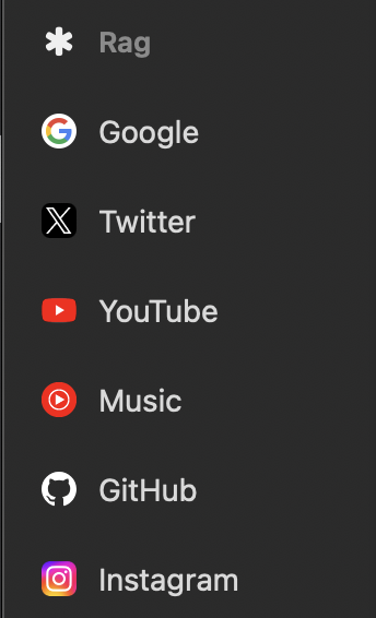
                        Currently when you are in dark mode, some favicons are either really hard to see, while others are completely invisible (Github's when window is out of focus). When the browser is not in focus, like when it is on a 2nd monitor for example, the color dims making most dark favicons completely invisible so you just have to go off of memory on where the favicons are for each site. Even with Orion back in focus you have to squint to see some dark favicons in dark mode for pinned tabs in the sidebar.

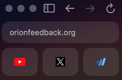
                        See Arc's for an example of how they add a little bit of padding, a background color shift, and a border to pinned icons to make them visible no matter what background color the user is on.

                        Image/Video:
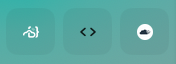
                        GitHub icon being invisible with dark mode Orion out of focus. There are two icons here, one is almost invisible while the GitHub one is completely invisible (at least to my eyes lol)

                        Arc for example of how we could implement something similar (but Orions is always better =P)

                        Edit: okay actually even when focused sometimes the sidebar is so dark that GitHub and other favicons are invisible, not sure why sometimes it lightens up a little bit

                          a year later
                          Merged 1 post from Border and background color for pinned tabs favicon's in sidebar.
                            Vlad changed the title to Larger icon/show title for pinned tabs in sidebar .

                              Looks like a lot of users coming from Arc want to have this feature. I would really want to understand the main reason behind the need (is it visual/aesthetic only or there is functional?) so we cna better understand the need.

                              • 8pxl replied to this.

                                Vlad hi, just made the switch! i like to pin many tabs of the same website (google docs, amazon, documentation, etc), and I need the titles in order to distinguish between these. also, it can be difficult to recognize a pinned tab based on just the favicon alone, especially when pinning unfamiliar websites.

                                slightly unrelated but the drag to pin feature is missed 🙁

                                • Vlad replied to this.

                                  8pxl Ok so it is mainly about if there are two pins of the same website, it is not clear which is which. And making them larger so that titles would show, would solve that?

                                  I just tried Arc, and it appears the icons are just larger with no additional text or distinction?