I’ve been designing user interfaces for 20 years now, and information-dense apps are my secret passion. I tried all major Mac browsers, and I switch them regularly, to force myself rebuild my web browsing habits.
I’ve been super excited about the new Arc browser, it looked very promising on videos… Until I actually installed it. Despite many interesting features, my general feeling after using it is disappointment. It feels to “designed”, too elite maybe.
It is also clearly made for much larger screens than my modest 13 inch Air. Compare the numder of tabs in Arc and Orion:
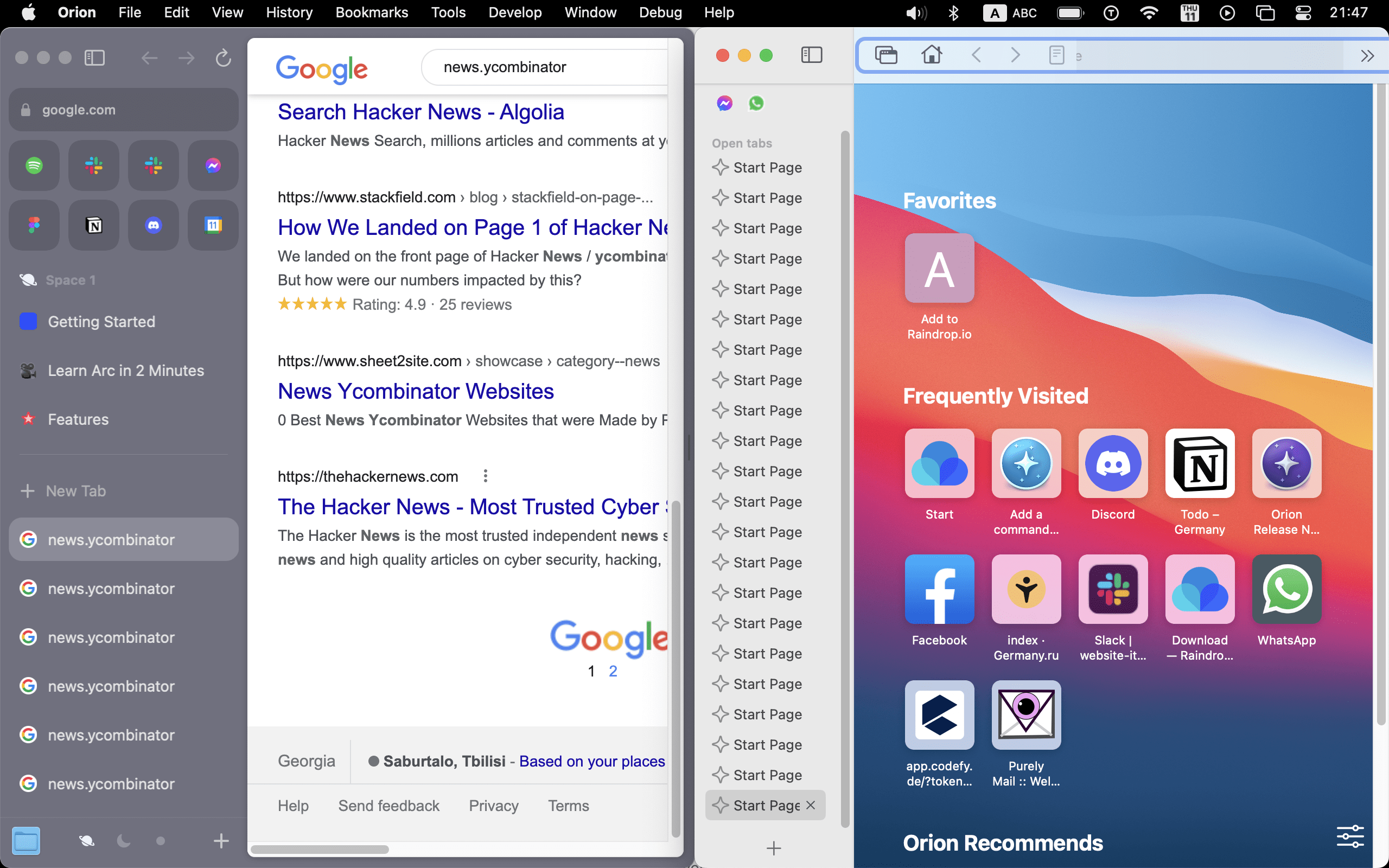
And I have no option to make interface more compact. Sorry Arc, my browser is a work tool. It needs to be productive, not just fancy.
Another example: Archive page. And no, it won’t let me zoom out.
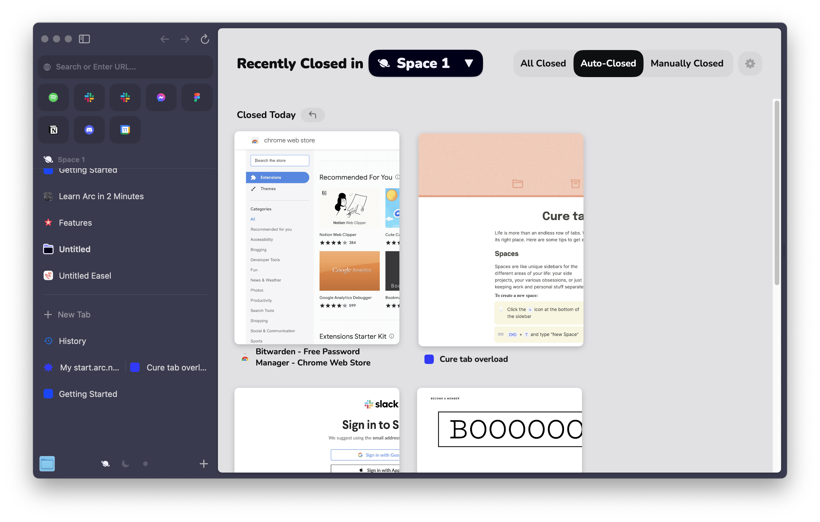
Also bad
No new tab page – makes me think that a new tab is actually useful!
Instead of “new tab” concept, Arc offers an all-in-one “command palette”:
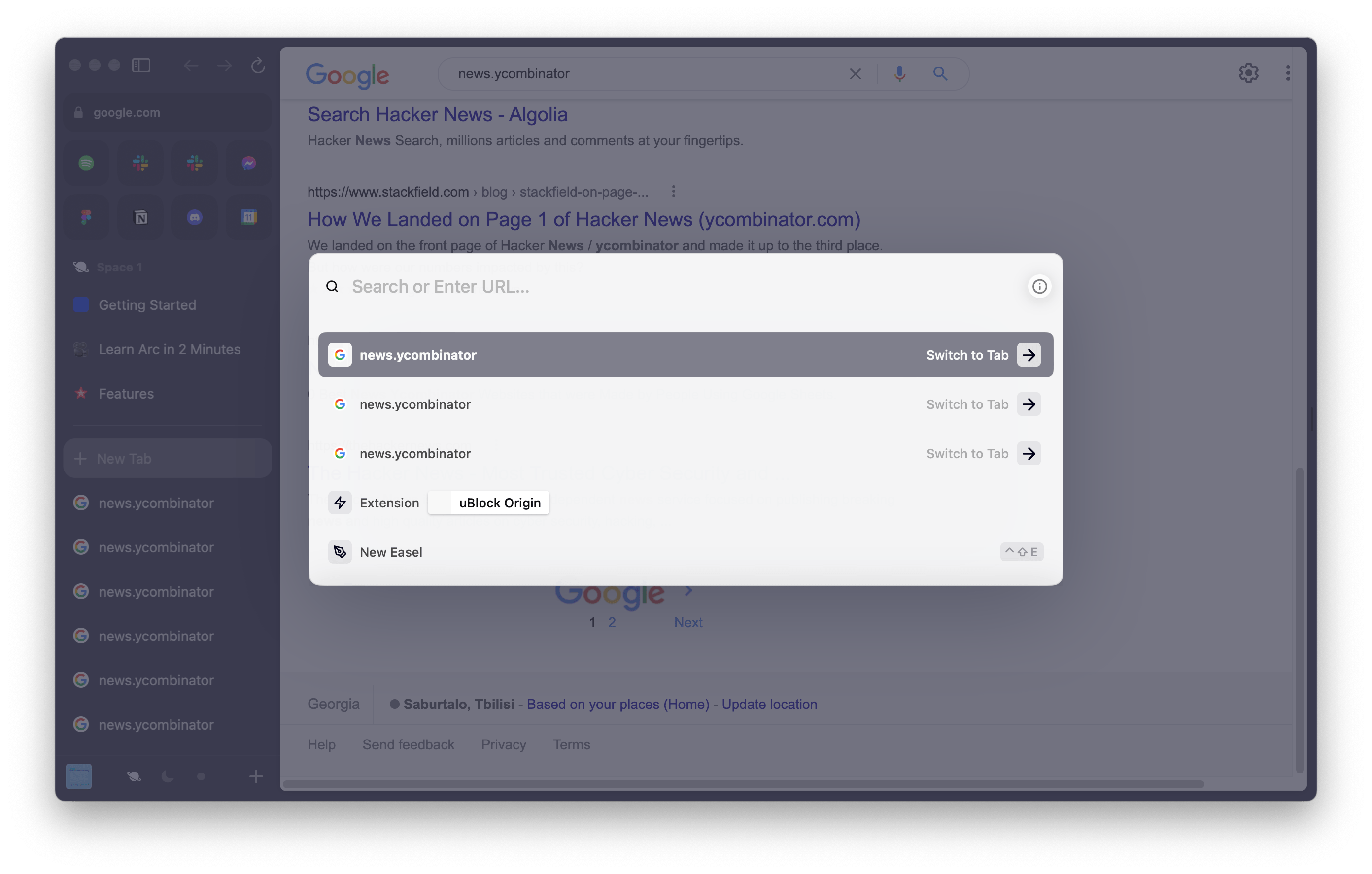
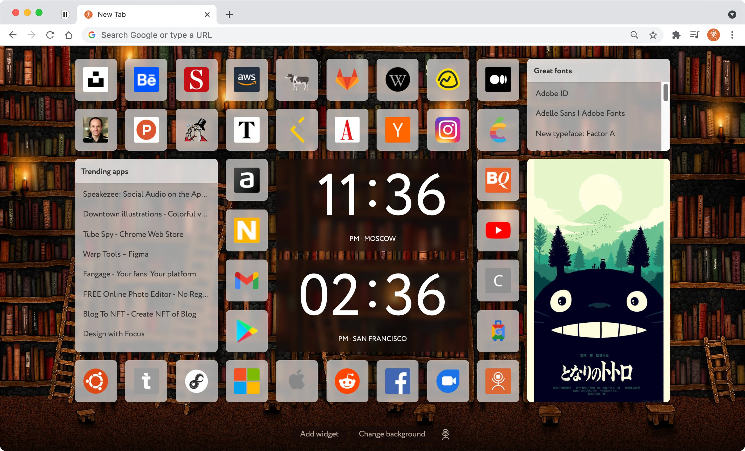
Well, turns out – having a permanent collection of often-used links is so convenient, I have to abandon Arc and switch to any other browser. I actually developed a New Tab extension, that’s how much I like the idea:
Auto-closing tabs. Don’t touch my tabs!
I think I understand the reasoning behing this decision. Well, I am capable of organizing my stuff, I just need the tool to make it as easy as possible. The system that comes in and messes with the structure I was working with – I just don’t see how it can be working for anyone.
Extras
- Why does every app wants to also include notes?
- And a whiteboard?
The good
- Spaces are fancy tab groups, with icons and background colors. The selector on bottom works well, the ability to swipe spaces with keyboard shortcuts is nice.
- Split view is well done. Not much to say.
- Hiding extensions into a menu. That’s actually brilliant. This is my Chrome’s top-right:

and I never ever need to look at any of these icons while I work. Arc moved them inside a menu:

And now, some
Random thoughts on tab management
Tabs were an incredible invention. Problem is, there is so much more we now do in our browsers. No one seems to have yet figured out the interface to manage this amount of structured information, good enough for a grandmother to use.
(We, nerds, have tens of extensions installed, with Workspaces, Collections, Bookmark Organizers.)
So far, the best solution is some sort of splitting tabs into groups:
- Tab Groups in Chrome and Safari
- Windows (a.k.a. Tab Groups) in Orion
- Spaces in Arc
- Stacks in Vivald.
You can use tab groups to separate your work projects, personal topics of interest, etc. That is, until you click a link an email, then another one in messenger, and before you notice, your tab bar is full of unorganized tabs again.
Is this hopeless? I believe it is :-)
However. I’ve been thinking of other, more experimental ways of showing groups of tabs in a ways that’s easy to interact with.
One idea that just struck me is: Kanban board! (e.g. Trello). Take a look at this interface:

There are some lists, each list containing some cards. Well, tabs are cards, and lists are groups. I imagine this kind of tab management would be easier to work with than this:
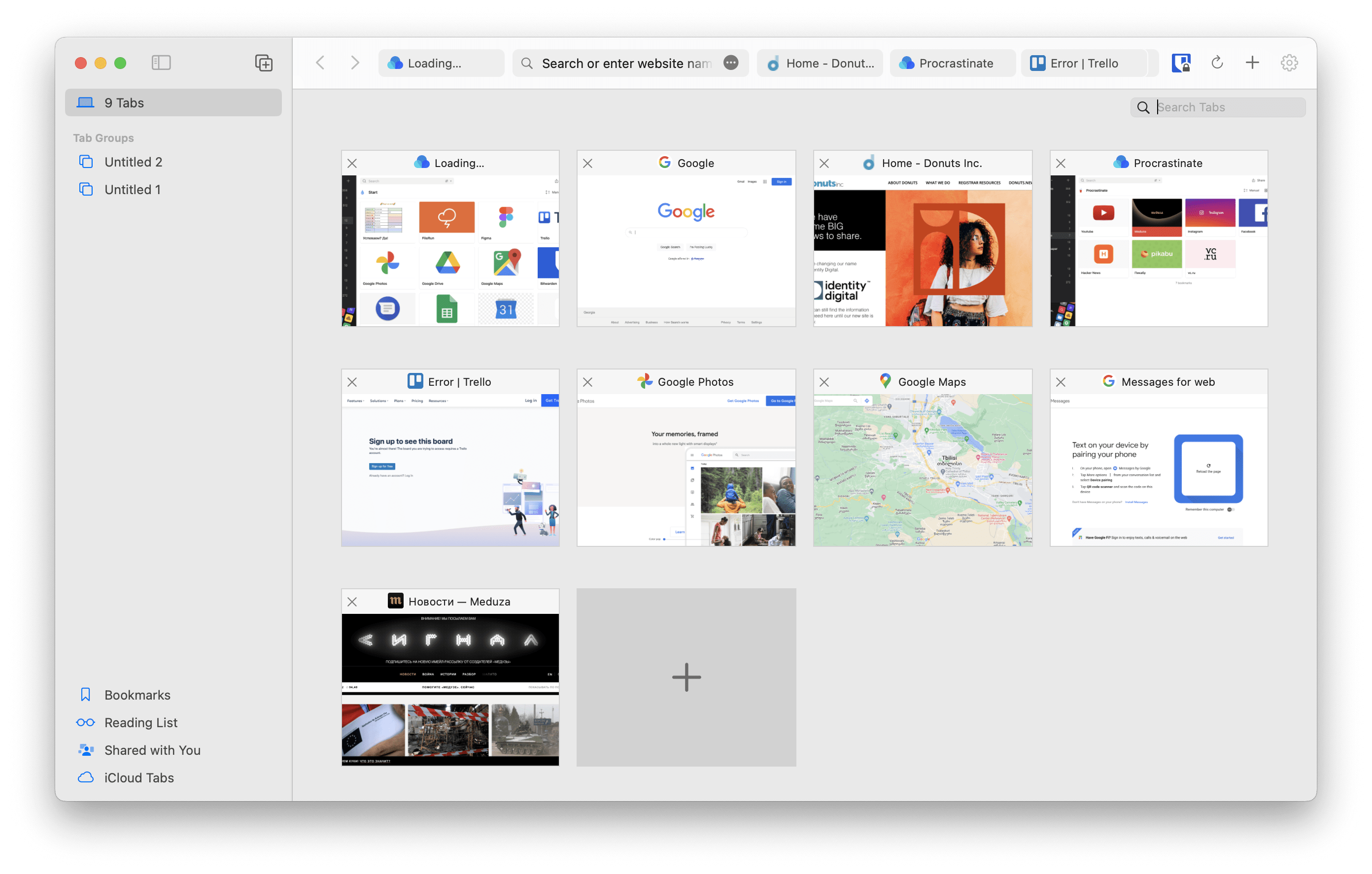
I have a theory that website thumbnails do more harm than good: they are too detailed. You cannot memorize them and recognize later. Favicons are much better for recognizing a webpage quickly.
Look at Trello again:

Imagine this is a list of groups of tabs. What’s great about this interface is that it gives you a coherent visual representaion of ALL your webpages. All your browsing experience becomes a canvas, you can grasp it as a mental “picture”.
As if it was not enough :-), here is the quick Figma prototype:
https://www.figma.com/proto/p3DJVYwrHvHzbQ4JELj5fp/Kanban-like-tab-management?node-id=2%3A344&scaling=min-zoom&page-id=0%3A1&starting-point-node-id=2%3A344
Click [][] icon to see what I mean.
Video
I’m not suggesting it as a feature for Orion, just sharing my thoughts!