105

Vlad

this looks pretty good. However, I'd like to see the name of the windows instead of icons only.

Could we have double sidebars? or substitue the current window design (vertical strips) to a list of window names but enable auto-hide?

or we can just go back to switch widnows independently on sidebar like it is done now.

and is it possible to move the bottom buttons to get to differnt views to the top since I am worried that the bottom will require the users to travel too much ditance to click them an that while using a browser we are natually drawn toward the upper-left corner.

7 days later

When using vertical tabs, I found that it's difficult to see my bookmarks and reading list. This button is so small and I need to click it very carefully. I'm thinking that maybe we can make this button bigger or have a better way to toggle between these lists.

Maybe we can have a button like "[ Tabs v ]" rather than "[ v ]".

    10 days later
    Merged 1 post from It's difficult to toggle between tabs, bookmarks, and the reading list..

      Currently, displaying the vertical bar on the side will change the size of the webpage being displayed. I think it would be better to display the side bar on top of the page.

      1. That is what the user cares about because they are going to it
      2. The size of the page changing is really annoying

      Arc has the ability to pin the side bar for people who want it displayed all the time and want it to affect the page size.

      9 months later
      Vlad changed the title to Changes to Orion's Sidebar / Vertical tabs handling .

        The URL bar on the sidebar when in vertical tab mode would look much better than the current implementation where the tab bar is still taking up room.

        This would allow maximal viewport space and wouldn't affect any current user

        Every bit of screen real estate in a browser matters -- the sidebar isn't really good UX in comparison to the other two since it limits the viewport space proportional to the window size a lot more than the other two do.

          Merged 2 posts from URL bar on side when in vertical tab mode.
            6 days later

            Hey guys, I like Arc, and I’ve been using it since it was invite-only, but I don’t think that we need to build a clone here. Some things like swiping left/right for tab groups and search bar in sidebar do work, but IF the browser supports vertical tabs ONLY. In Orion, we need to think about how it would all work with horizontal tabs, as well.

            Another thing is that Orion, like Safari, has a customizable top bar. You can’t do such a thing as user customization with such a specific layout that Arc has. And being so specific is actually what Arc’s problem is — user either gets accustomed to it or not. You CAN NOT customize the layout. That’s why they’re calling it “niche browser” now. That’s why they’re building another browser. 

            And some screenshots in here are literary Safari-painted Arc.


            Look at Chrome, Firefox, Vivaldi or Safari setup of a three different people. Chances are that they’re going to have different buttons for different functions in different places. Look at the Arc setup of a three different people. Chances are that they’re going to have different background colors, that’s it.

            I agree with everything being said about screen real-estate, I just don’t see it in Orion’s DNA. Maybe I’m wrong. 

            I do like the idea of topbar autohide, like in SigmaOS (also a niche browser). That could be cool. But then again, both Arc and SigmaOS don’t actually have traditional URL bars, it’s more like a command bar, like Spotlight, ⌘T at the center of a screen. So autohide could just as easily not work in Orion.

            The Panel

            All of that being said, I agree that some of the UX flows in Orion could be better, see The Orion Panel thread for suggestions. Here's a little preview:

            Tab Grouping

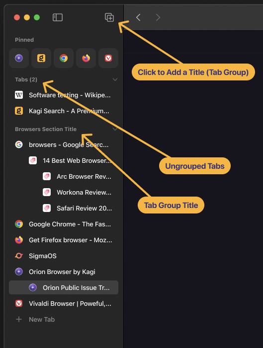
            Now, for tab grouping, it could be so (visually) simple: just add a subtitle, like macOS already does in sidebars. For horizontal tabs, do what Chrome Tab Group does. For compact tabs, do what Opera Tab Island does. And that’s it.

            You sould also be able to select multiple tabs at once (which you can't right now) > right click > create tab group.

            Here're quick and dirty sketches of the idea:
            Pinning

            You can also see my attempt at pinned tabs here, but I'm not sure if I like it. They're somewhat in between the current Orion Pinned Tabs and Arc Favorites. What do you think?

            Disclaimer: I’ve recently started a thread about Vertical Tabs, and while searching for similar threads, came down to this one. This is not a rant, although I’m aware it may sound like one. Please take these opinions with a grain of salt, I’m not a hater, I promise 😃  Just thinking out loud, trying to solve the same problems as you do.

            “If I Had More Time, I Would Have Written a Shorter Letter” - Blaise Pascal

              milos

              Hey Milo,
              I really like your ideas and initial mock ups. It looks clean and not too cluttered.

              What do you think about the bookmarks location? You reckon it would still work if you can place your bookmarks on the vertical sidebar on the left and have them as a tab group essentially so you can expand/collapse them? They would in essence act as pinned tabs similar to in Arc and as you've shown.
              As for bookmarks in the horizontal tab bar, they would act as pinned tabs and open the webpage in place rather than opening in a new tab.

              This was discussed in the below thread:
              https://orionfeedback.org/d/5377-larger-iconshow-title-for-pinned-tabs-in-sidebar-favorites-in-sidebar

              I feel like these two threads come hand in hand, hence why I am mentioning it.

              What are your thoughts?

                Niko I find tab nesting/indentation in Orion much more useful than pinning and folders in Arc. Also, suggested "Tab Groups" will essentially give you folders. And, as a cherry on top, you'd still have your bookmarks in the panel, which could be managed separately. It could help to declutter sidebar, but still keep everything at hand. I feel like it could be the best of both worlds, but, of course, I have no data to back that up.

                When you say "bookmarks in the horizontal tab bar", you already have them (⌘+⇧+B). So, basically, I think that trying to clone Arc's features and terminology into Orion would just create unnecessary confusion. It's a specific mental model, that resonates with a narrow user group, and that whole browser is designed around it.

                When I say "terminology", even just using words in the discussion that you linked creates confusion, not to mention mockups. Imagine how it would look like in production then. Here's what I mean:

                ArcOrion
                Daily TabsOpen Tabs
                FavoritesPinned Tabs
                Pinned Tabs-
                -Bookmarks

                On top of that, Orion even has "Favorites" too, in the "Bookmarks" panel.

                Another thing regarding the discussion you linked, somebody was talking about differentiating two pinned tabs from the same website (e.g. Google Docs), but he was essentially talking about renaming tabs, not pinning them. That's another topic.


                TLDR;

                I don't think that mix & match of tabs and bookmarks would work and feel intuitive in Orion.

                  @milos I really like your design. I like how you're maintaining that Orion is not, and should copy the same UX that arc has with regards to tabs

                  Just a few things:

                  I suggest removing the tab groups mockups and reposting over here: https://orionfeedback.org/d/3295-tab-groups-similar-to-that-of-google-chrome/8

                  Just to clarify:

                  • bookmarks: all saved websites
                  • favorites: bookmarks that are displayed on the start page
                  • bookmarks bar: bookmarks that are displayed in the horizontal toolbar

                  all other bookmarks are located under Bookmarks->
                  (In safari, bookmarks shown in start page and in bookmarks bar are the same)

                    Giving my two cents her regarding @milos mockups: I have to say I am against this new concept of tab groups. We already have a lot of group structures in Orion (Profiles > Windows > Tabs) and this just seems to add another level of complexity on top, while being a less flexible version of the already planned tab folders.

                    The idea of having the all the sidebars other than the vertical tabs one on the left side is a good idea ane I am all for it. This will also give a solution to all the problems regarding how to handle opening/closing of a sidebar while in vertical tabs mode.

                      eirk can you elaborate why you don’t want Orion to follow Arcs sidebar UI? I think it’s THE reason that so many users flocked to or kept using Arc instead of Orion.
                      I think that the concept that @jannisborgers created in the other thread https://orionfeedback.org/d/5377-larger-iconshow-title-for-pinned-tabs-in-sidebar-favorites-in-sidebar/47 would make working with Orion on a daily basis more ‘in the flow’.

                      • eirk replied to this.

                        janpeeters regarding just the UI, ie the sizing of stuff/icons, it's fine to change. it's purely a cosmetic difference

                        But, Arc's novel sidebar implementation with tabs and bookmarks combined into one concept is indeed the reason why a ton of people flocked to arc, but it's also why a lot of people choose not to use arc. The average user uses apps with zero learning curve, and arc has a decent learning curve. I do appreciate the ingenuity of arc's implementation, but I don't see exactly how it benefits everyone. I think the existing concept of the browser with bookmarks and tabs as separate concepts should be maintained

                          laptudirm I agree, sorry I wasn't clear enough. If Tab Groups are to be added, Windows should go. So it'd be Profiles > Tab Groups > Tabs. That's if there's a concensus that Windows are hard to understand, and Arc's folders (which are essentially Tab Groups) work better.

                          I didn't know about Tab Folders and that they're Planned - and I quite like the UX Study shown there. It's looking good! I'd probably just remove chevrons all-around. Somebody clearly gave it more than 10 mins of thought 🙂 That's it, no need for tab groups then. Thanks for sharing.

                          @eirk Thank you! Regarding laptudirm's comment of what's already planned, I feel like there's no need for a repost.


                          On a side note, some of the stuff that Arc has that I love to already see in Orion:

                          • ⌘⇧C to copy link
                          • ⇧+Click to open a link in Peek (Preview) window

                            milos Given that your alternate sidebar idea is not a part of the main statement of this issue, I encourage you to create a new feature request asking for it, as I also believe it to be an improvement.

                              eirk I understand your point. I do hope though that the new implementation will provide something like pinned bookmarks/bookmark folders in the left sidebar that open websites 'in place'. And have a location that you can return to. That way you can have a folder for News, Science, Tech so that often visited sites are easily accessible.
                              Below this section there could be a section for open tabs in tree mode. But even tree mode is a complex feature for users that like it easy, "why are my tabs indented"?

                              I like @milos design where the bookmarks and other useful things like history,some websites are in a expandable right sidebar. It's how Vivaldi 7 does it and works great. I would love something like that for Orion!

                              The left sidebar can then be used for:

                              • Pinned tabs and Pinned tab folders (or call it bookmarks as suggested before)
                              • Below that (in another section) open tabs.
                                It would forgo of Arcs favorites but that could be easily replaced by pinned (compact) tabs.

                              I do agree that a lot of users find Arc too complex. But that can be easily circumvented by making features opt-in. Even Orion is a niche browser. Most people just take Safari, Edge, Chrome because it's preinstalled. It's a challenge to make people download another browser.

                              • Vlad replied to this.