Compact website mode
First is this. Decreases about 5%?
Second is this. padding: 8px
As for the last, I don't know but the "like" button for the comment can be placed on the left below the profile picture, and the "reply" can be placed also below the profile picture to remove that gigantic <ul> element.
Reduce the padding again from 8px to zero, warranting the following changes below to make it not look glitched.
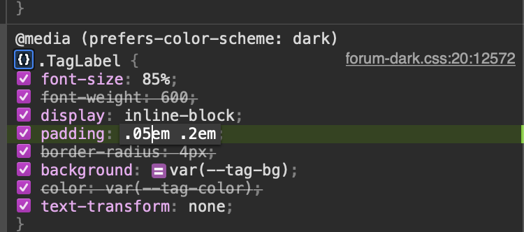
Reduce the "NOfix tag" vertical and horizontal padding:
font-size of the tag icon(the one beside the
becomes 1em.
margin-top: 4px; added to make it down a bit more.
Margin bottom of above is reduced to 0.
Margin of this element reduced to zero.
.Button--link {
padding: 0px 8px;
}
Now very compact.
- Edited
Finishing touch to remove the bottom.
Change to .CommentPost.votesAlternativeLayout.votesUpvotesOnly
min-height is now 104px to account for the two unordered list elements below the main paragraph.
- Edited
I may have changed a few things on top of the website unwittingly, so preferably all of these should get their own separate class names.
- Edited
Here is how it looks in complex discussions. Took around 15 minutes to get this working…
- Edited
.CommenPost.votesAlternativeLayout.votesUpvotesOnly {
min-height: 104px;
}
.CommentPostPostAlternativeLayoutvotesUpvotesOnly {
padding: 8px;
}
.PostStream-item {
padding: 0px;
}
.TagLabel {
padding: .05em .2em;
}
.icon fas fa-tag EventPost-icon {
font-size: 1em;
margin-top: 4px;
}
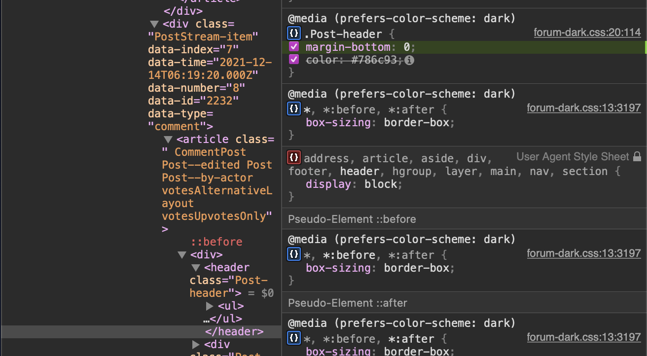
.Post-header {
margin-bottom: 0px;
}
.Post-body p {
margin-bottom: 0px;
}
.Dropdown-toggle.Button.Button--icon.Button--flat {
padding: 0px;
}```
- Edited
Please add this:
.Post {
padding: 0.5em 0 0.5em 8em;
}
i.icon.fas.fa-tag.EventPost-icon {
font-size: 1em;
margin-top: 4px;
}
.Button--link {
padding: 0px 8px;
}
.Button--link:hover {
padding: 0px 8px;
}
.CommentPost.votesAlternativeLayout.votesUpvotesOnly {
min-height: 0px;
}
CommenPost.votesAlternativeLayout.votesUpvotesOnly {
min-height: 104px;
}
.CommentPostPostAlternativeLayoutvotesUpvotesOnly {
padding: 8px;
}
.PostStream-item {
padding: 0px;
}
.TagLabel {
padding: .05em .2em;
}
.Post-header {
margin-bottom: 0px;
}
.Post-body p {
margin-bottom: 0px;
}
.Dropdown-toggle.Button.Button--icon.Button--flat {
padding: 0px;
}
/*Below are some tweaks because some class names are also used for the heading, so now I am centering them again.*/
.Header-controls {
margin: 0px;
padding: 0.5em 1em;
list-style: none;
}
.Header-controls-search-bar {
display: inline-block;
vertical-align: middle;
margin: 0;
padding: 0.1em 1em;
}
- Remove the .icon fas fa-tag EventPost-icon class entirely, it is a mispelling and is replaced by the reiteration above. ul.Header-controls-search-bar is a new class only for the search input bar and username+notifications button in order to center it.
- .Header-controls-search-bar is a new class for the search bar and profile icons on the top of the website.
The only glitch is that on the tiniest zoom setting the top heading-controls are slightly off-center.
Hello? Any updates. The above is the revamped, remove the old one and add this one back.