minte ForumNinja404 I agree it looks cool, but the tough part about that is the click to mute feature - What would you click, and what would the muted version look like? At least for the other ones (with the speaker icon) it's straightforward in that you click the little speaker and the muted speaker icon remains the same as normal tabs.
WindWalker Vlad Isn't the mac setting to show/expand dock on hover an example of it being used? It's also present in Stage Manager, where if your window takes the entire screen you need to hover your mouse close to the left edge to reveal it.
Demonic i use the side bar a lot, however, at it's smallest it still takes up a lot of space, what i would like is a feature to be able to turn the side bar into just icons, removing the text, which would look something like vivaldi's tool bar.
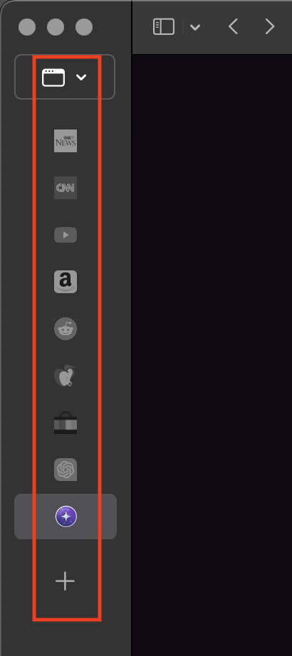
SerViette At it's minmum width, the vertical tab bar is about twice as wide as it needs to be. Traffic lights could be in the top bar, and then the vertical tab bar can be compressed in width much futher.
SerViette The drop-down arrow for the window selector could be moved from the right, to below the icon.