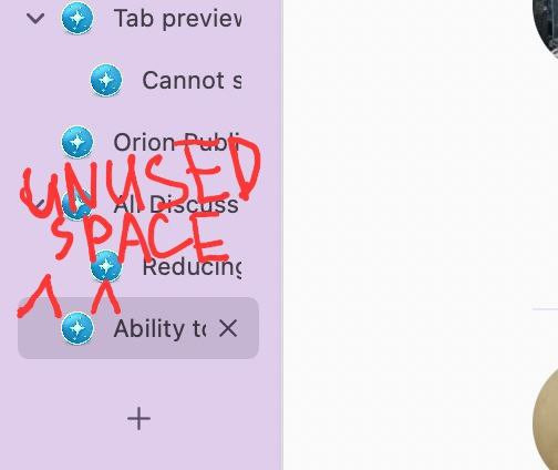
I feel the vertical bar has a lot of wasted space when one is viewing only icons -
It's alright when I am viewing the names of the web pages.
I feel the vertical bar has a lot of wasted space when one is viewing only icons -
It's alright when I am viewing the names of the web pages.
Comparing to other browsers orion takes a lot more space with its vertical tabs
can you please add a compact vertical tabs mode
It's unnecessary to use the space that you do just for a small favicon. you could make it less wide
thanks
Alternatively, it could be nice if larger siteicons could be shown, but of couse in the wild many/most are likely to just have the 16x16 'old' standard, vs larger site icons offered for mobile browsers to "save to homescreen".
I feel like in the expanded view with visible titles there's also a lot of unused horizontal space
Vlad
Possible solution to this may be displaying the arrow above the favicon, the way it's done in Firefox's Sidebery:
And don't display it for expanded tree at all, since the indentation of child tabs already indicates the tree:
Or use VS Code-alike lines to highlight the tree structure – like in TreeStyleTabs with custom extension:

But I'm not sure, how well it would fit the Orion's design.
But any gains in space this way will be lost by the request to increase the title font from the other card
Which means, there will be no information loss if the font size gets increased 
I like the MS Edge implementation where you only get the icon of the site and when you hover it you get additional controls like close button etc. Unfortunately the vertical tab bar in Orion right now is too fat for me to use it.
+1 for the MS edge implementation
It’s the most useful and I got hooked on it instantly!
saves space and it’s design that “doesn’t get in the way”
(With the only addition to be able to disable nesting altogether as a user preference)
I've been using the following implementation of the sidebar alongside Firefox for the past few years.
I believe a collapsible sidebar would be beneficial for smaller screens - as sites are easily identifiable with the sidebar favicon, and full page titles are given upon hover.
This would be a welcome addition for the vertical tabs people. As long as the hover duration to expand the sidebar isn’t an eternity like Microsoft Edge’s version, I vote for it.
Auto-expanding UI elements are not advised by macOS guides, according to Vlad. Better to have something similar to what safari has with it's spaces bar that activates from shortcut and mouse
Small amount of shameless self promotion
https://orionfeedback.org/d/378-way-to-hide-vertical-tabs-in-full-screen-mode
Folks; it’s okay if you don’t like it!
Just make it optionally auto expand/contract for those of us who do.
This is the reason why I use MS Edge over other browser right now.
It’s a deal breaker for people who want to focus on the webpage content and forget for a second that we have 20000 tabs open.
And if we’re talking about “MacOS design guides”, what about the auto hiding Dock? That’s not even minimized it completely disappears.
So suggestion: auto expanding sidebar on hover (opt-in option in settings)