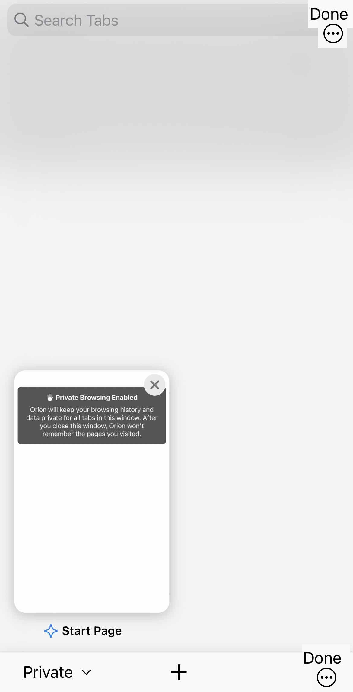
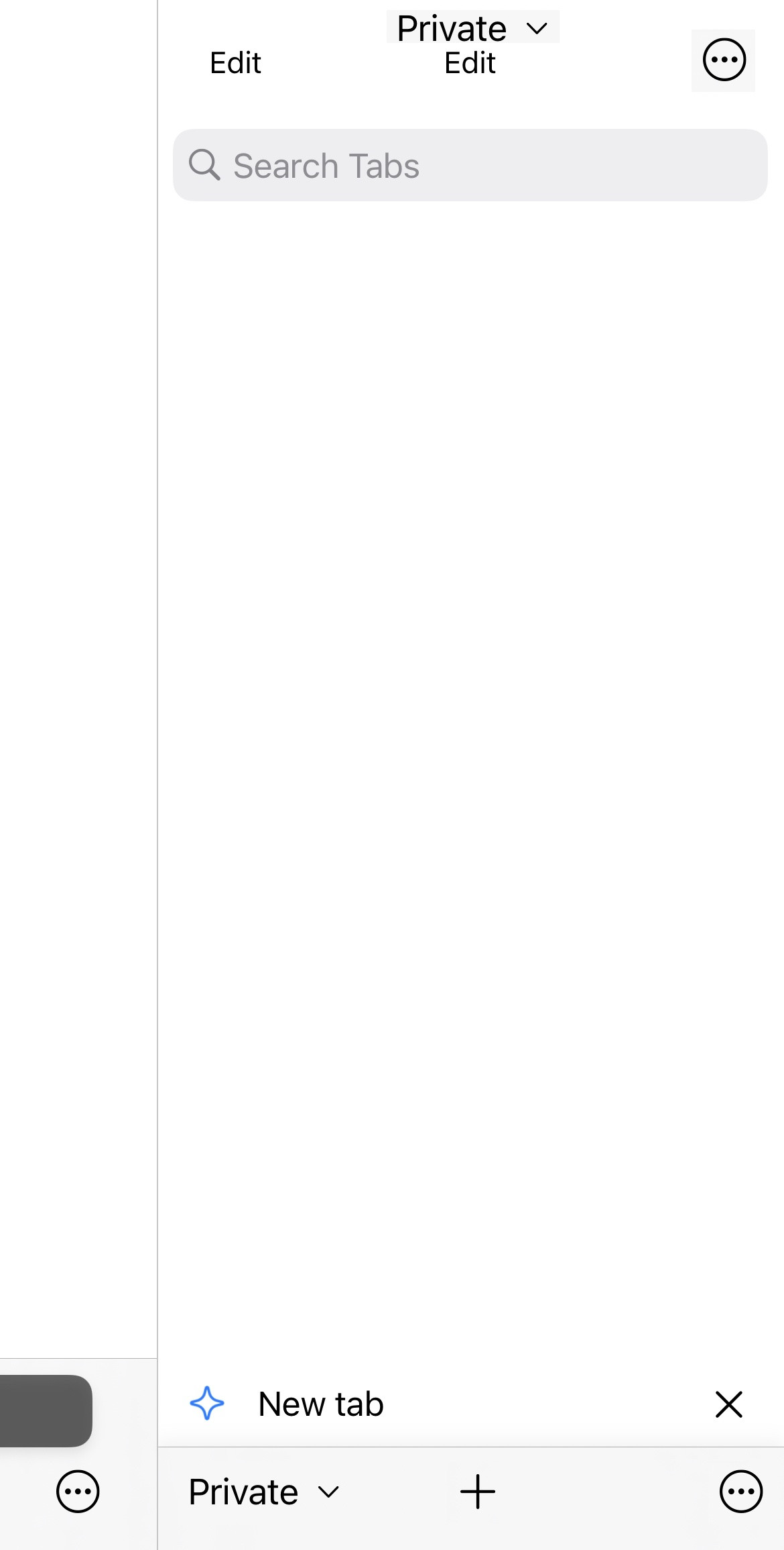
Vlad I didn't see these elsewhere, but maybe I missed them. Made some quick mockups of easy ways to move the settings button to the tab switcher. Some locations I placed 2 labels because some things were interchangeable.
Grid: 
No reason the search bar need to take up the whole space. I've never used it, but obviously having the option is nice, and i'm sure some people use it. The ideal space for "Done" is up here I think, with the "Settings" button being moved to the bottom-right to make it easily accessible. Move "New Tab" to the middle since it's the second most accessible location on the screen, and move Tab Switcher to the bottom right because it doesn't need to take precedence over New Tab, and it's easily accessible via gesture.
The main point here isn't the overall rearrangement, it's that "Done" can be moved to the top and "settings" can bump new tab over.
Sidebar∶

This one is a lot easier because of how many redundant buttons there are on this view. "Close All" should be moved into the editing view after pressing "Edit" (it can keep its spot). That opens up the top-right for a button. "Back" (in the bottom left normally) is also redundant, as swiping back as well as tapping the previous area on the left takes you back. This follows a similar set of rearrangements as the ones I made for the Grid view, with the whole bottom row being shifted left after the redundant button is removed, and settings being placed in the right.
Regardless of these ideas, hoping to see the settings moved out of the way so we can finally use switch tab there on the bottom row . I honestly wouldn't mind if settings was just moved to the Tab Groups view even. I'm just tired of struggling with why a Settings button is on the main toolbar of a mobile browser (although as has been stated, this mistake is not at all unique to Orion)