9

What does your feature entail? What is it for? How will it affect existing workflows or user experience?
Orion is superfast so I'm wondering if it's still necesarry to grey-out tabs in the sidebar to inform the user that tabs are inactive/paused. When I click a greyed out tab icon it loads instantly.

If not greyed out it would be much easier to the eye differentiate the various icons. It would make my browsing experience faster.
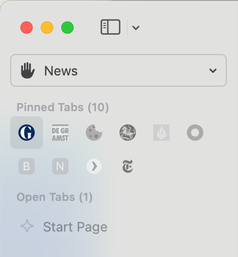
What are the exact ways that you see a user using your proposed feature? Please go into as much detail as possible, and provide examples of how other browsers/apps implement this feature, if applicable. If your feature suggestion adds on to an existing feature, how would it work into it to extend its usefulness?
In the future all tabs in tabgroups are fully visible (not greyed-out). Pausing tabs is a default way to save CPU resources but can be handled in the background. Users don't need to see this in my opinion, curious what others think of this.

  • eirk replied to this.

    Graying out suspended tabs was explicitly asked here few months ago and we delivered 🙂

      Vlad Hahaha so many users so many preferences. I can't see the use of it with the speed of Orion. Is it possible to add a toggle in settings?

        janpeeters instantly

        This doesnt always happen, and some websites may require a few seconds to load, so this is why the grey indicator is there - to tell users that the site is suspended and may take few seconds to load after clicking it

          eirk Must be my speedy computer and connection ;-).
          The greyed-out icons make Orion look like an old machine to be honest. It doesn't fit.
          I've been thinking about another visual solutions but I'm afraid greyed-out looks most suspended.
          I could do without so I hope a toggle will come.

            8 months later

            Vlad Is it possible to implement a setting where a user can choose to also have suspened (pinned) tabs in full colour. I find it hard to differentiate the small favicons when they're so dimmed. I can understand that people asked for this but accessibility-wise it's not a great choice. I hope this can be considered even if only through a 'defaults write' command line command. Thanks.

              Merged 7 posts from Ungrey-out tab icons.
                21 days later

                I prefer version 1 in @bg-d mockup. The solution from Chromium as @MrFrank posted also suits me well. As long as the favicons become clearly distinguishable again. Color makes up for a large of being easily recognisable.

                  19 days later
                  13 days later

                  Dang, looks like I missed the conversation on this one :/ (new Orion user)

                  I know you're unlikely to change this soon as it was just modified, but I personally much prefer the second option provided by bg-d, as it fits better with Apple's design guidelines which place a focus on simplicity, in my opinion. Since this didn't get a large number of votes, I'm curious as to how the average user feels about this change.

                  • Vlad replied to this.

                    DR Create a new thread and get some upvotes please 🙂

                      No one is typing