Changes to Orion's Sidebar / Vertical tabs handling
Dhuv People who want the bar on the side have enough horizontal space and looking to trade it for vertical space.
Not everyone. I am happy with compact URL bar and sidebar tabs specifically for tree style tabs and being able to read the tab titles at any moment. Much of the web has a lot of horizontal padding especially when using content blockers, hiding the sidebar is slick but on a lot of web pages doesn't really yield more than extra blank space. Vertical space is plenty good enough with current sidebar/compact URL
I would like for us to approach a concunsus here. We can not make this an option. So we have to decide which direction to take.
There are 55 people who upvoted this, I'd appreciate an opinon from at least 1/3
The latest proposal was
Do we really need button to close sidebar?
could be used to add functionality allowing for showing the sidebar only when mouse hovers on the left side
here are too many buttons here. why are there two of the
Vlad I really like the whole concept. I think it’s come super far in the past few weeks and become what I was personally looking for initially.
Vlad I just don't like it. Can't see full URL. It's going to look cluttered with more than 4 or 5 toolbar controls (I currently have 10 plus an overflow menu). Takes up far more space than the compact toolbar ever did. Will make Orion really impractical to use in split screen mode.
Someone above suggested autohiding the url/toolbar and that seems like a much more practical and inoffensive way to save vertical space.
Keep the row of buttons at the bottom of the sidebar though, that's great.
My concern about this auto hiding is that it may cause some UI elements, especially in the sidebar, to jump around.
If the toolbar is hidden, then the content in the sidebar all moves up to fill in the gaps, vice versa. If that happened too often when scrolling up/down a page, I'd get quite annoyed.
On mobile, this is fine because its simply the address bar being shown or hidden. It isn't the entire bunch of vertical tabs moving a centimeter on the screen.
TheOtherKai That content in sidebar is not tied to the toolbar at all. nothing would change there?
- Edited
Another way to treat the entire thing is to add auto-show to focus mode.
Shown here in sigma browser
I am trying to identify do people want more space (which this provides) or they want urlbar in sidebar (and if that why?)
- Edited
@Vlad That is a great question, do people just want the space or the URL bar in the side.
For me, I just want the space, I love the focus mode that Orion provides where I see only the page itself. The auto hiding of the URL bar is great and tabs hidden in the sidebar is perfect when I need that.
I hope this helps. I am curious about what are the other reasons for wanting the URL bar on the side? Maybe accidental triggering when interacting with elements at the top of the page?
Vlad I personally prefer having the urlbar in the sidebar because it allows the website's top navigation bar to be at the top of the browser window, giving website more space vertically. While focus mode is a great option, it's not meant to be open all the time. I believe some people like Arc-like design because it provides more space for website and allows for both urlbar and top navigation bar to be at top simultaneously without any extra cost or additional mouse motion or shortcuts.
- Edited
A few thoughts:
I'm torn between a URL in sidebar solution and URL bar on top of the page.
I think the people that are designing Arc browser have found a way so keep things rather clean and I have been thinking if this could work for Orion.
They only show the URL, no lock, no refresh icon. On mouse-over more info is revealed. You can pin your favorite extensions in the URL field and the rest is shown in a sub window.
I made a mockup of something similar but with the extensions below the URL bar. The icons in the URL bar show up on mouse-over. Below the URL bar is a user customizable area where you can place extensions or action buttons. Or the forward/back icons for that matter.
I'm curious what others think and what I might've missed in my thinking.
Regarding the proposal that @vlad did for hiding the top URL bar in focus mode.
Even for non-focus mode I would like a setting to auto-hide the URL bar e.g. when scrolling down a page. The URL bar shows again when the mouse pointer comes close, when you've scrolled back to the top of the page or you type a shortcut.
janpeeters I agree, the URL in sidebar is just too much. Between not being able to see the full URL, the additional buttons appearing on hover, and the increased clutter, I say forget it.
Go with Sigma OS and keep things simple. Keep those buttons at the bottom of the side panel though, that was a great idea.
ForumNinja404 I’m not against the URL in the sidebar. It could work just fine.
What I don’t find useful though is that there is a URL bar when bookmarks or reading list are shown. That gives two input fields (one for URL and one for search) in one view and that could be confusing. In most use cases I think that people go to either one of those sections to find a URL or article and click it to visit the respective site or article.
I would probably leave the URL bar out of those views and switch back to the tab view after clicking a bookmark or article.
My $0.02 regarding the ability to view the URL.
I am an Arc and Safari user. When I want to see the full URL, I press CMD + L. In Arc, it does not show the side bar for that, they have another UI element and in my opinion, works really well.
- Edited
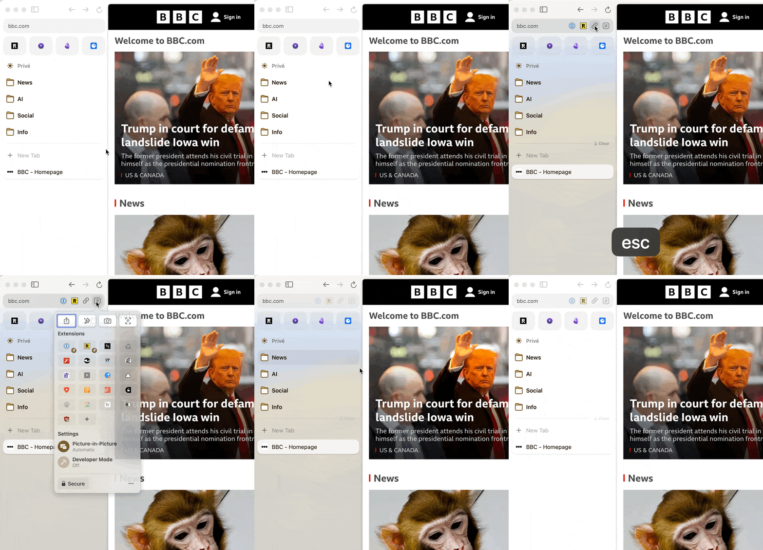
New concept.
Focus mode on toolbar - same as current focus mode but also enables toolbar and sidebar auto-show on mouse over.
And new concept to show both widows (vertical strip) and tabs in the same sidebar. How does this look? THe alternative is to switch widnows independently on sidebar like it is done now.
Vlad I like this. Autohiding and a focus mode toolbar control is an excellent idea, I'd definitely use that.
The window strip is a good idea too though I think it should maybe be a different colour or have some sort of other border demarcation so that it's not contiguous and flat with the rest of the side bar. And probably needs to have a show/hide toggle in that menu.