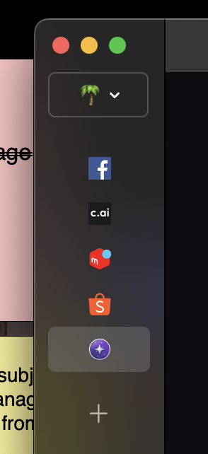
I'd like to see that the minimum vertical tab bar width would be almost half the width of the current minimum, as its mostly whitespace as soon as the tabs shrink to their icons, anyway.
Also an option to auto expand the bar on mouse hover would be nice, to be able to read the tab titles e.g. when switching tabs
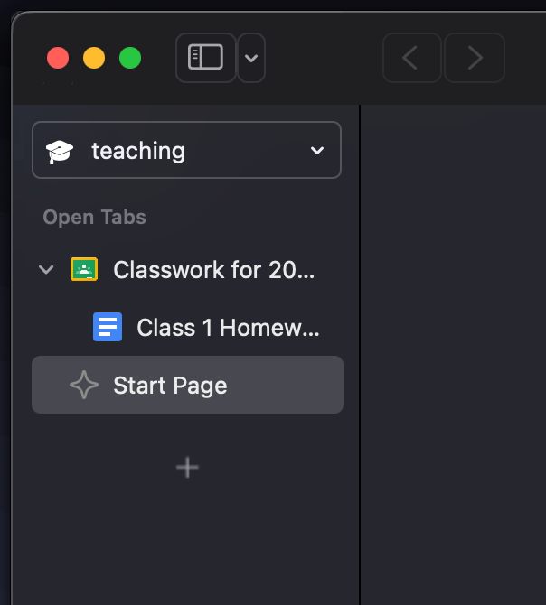
Addendum: I'd also prefer that the vertical bar has the same color as the top bar. I assume that you currently mimic the esthetic of other native MacOS apps like Preview, but for me the color difference intuitively indicates a "temporary" GUI element, that needs my attention and is unnecessarily distracting...