ForumNinja404
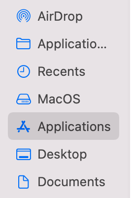
"the active tab looks disabled" that really depends on what you compare it to, if you compare it to anywhere other then browsers in Mac OS it looks identical to other active items.
here an exmaple:

and heres the tabs:

When i made the sketch for option 6 the idea was to follow the logic of active tabs mergin with the toolbar as normal mode does. But with a flat design needed for "color mode" to look good, that approach IMO doesn't make that much sense, because thats not how flat design works anywhere else in the OS.
which is also why i really wanted wanted to split this up in 2 different options, as mentioned alot earlier
So you would have:
Normal expanded mode (without flat design and no color merge, so like it is now)
Normal Compact mode (following the design of normal mode, so no flat design, folowing how normal mode looks and works, that would be something like option 5 or little like 6 but without the flatness that the figma sketch has)
and then you would have a "Color option" applying a flat design to BOTH compact and expanded mode. made some sketches further up of color mode ON/OFF. would most likely look like option 1 as thats the most native, or 4
The team seems to be set on not having the same design logic for compact tabs as for normal tabs which is a shame IMO, since i dont think its intuative it works and looks different (when you still have an addressbar). and people who like flat design and imersion would still be able to get it by turning on "color option" and they would be able to get it in there normal mode aswell (not only compact)
ps, the reason why Safari looks different in "compact mode", is because it WORKS differently. thats not the case here, theres still an address bar, It could seem like people might be forgetting this a bit when voting for Safari style out of familiarity