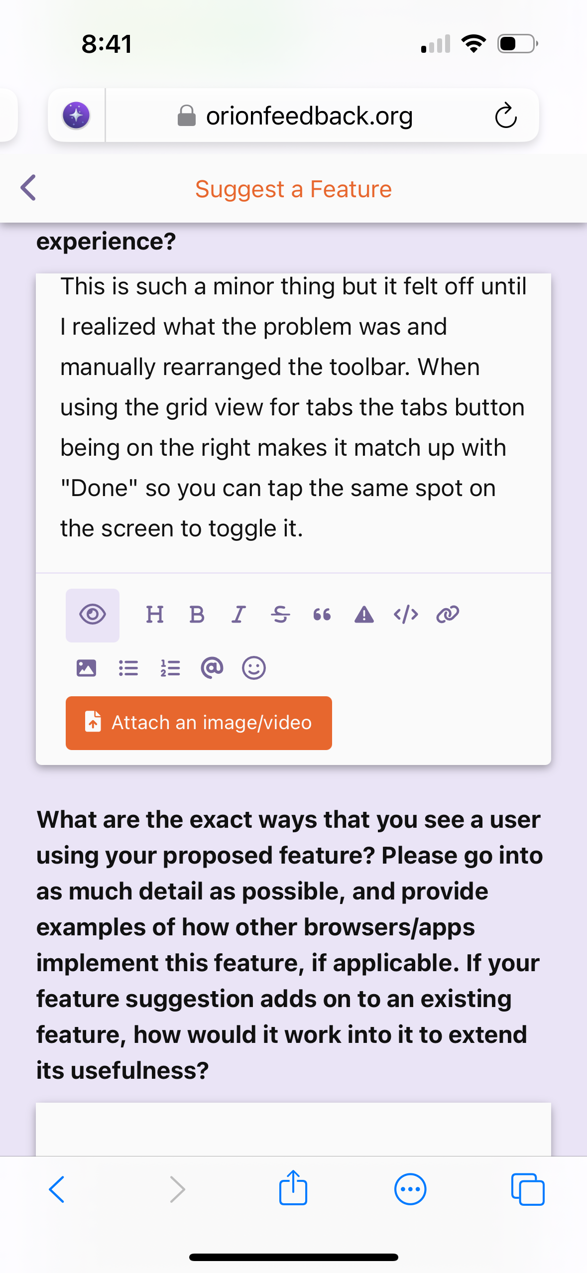
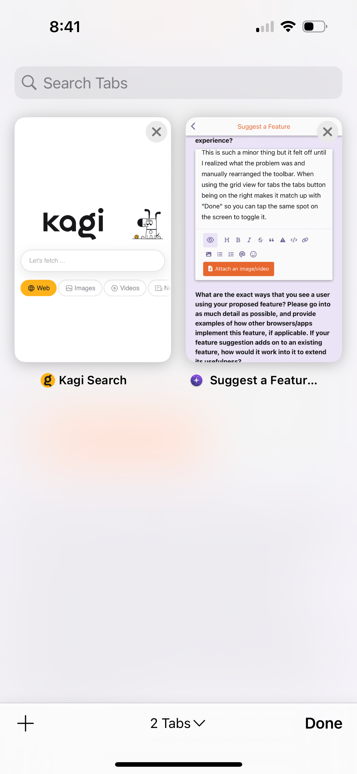
This is such a minor thing but it felt so off until I realized what the problem was and manually rearranged the toolbar. When using the grid view for tabs, the tabs button being on the right makes it match up with "Done" so you can tap the same spot on the screen to toggle it. I didn't even realize until Orion how much this little thing affected the feel.
So I guess the feature suggestion would be if the user has the default toolbar and switches to the grid move the tab button to the right? Or maybe just have it there by default normally? I bet every Safari user already has the muscle memory for it anyway. I just tried the sidebar view with it and I think that feels better too, or at worst a neutral change.

