Hi!
I sometimes find the compact nature of all the UI elements a bit unpleasant to use, especially on high resolution monitors.
Maybe increasing the padding of these elements along with an option to increase the font size (possibly independently from the rest of the browser) would be quite useful.
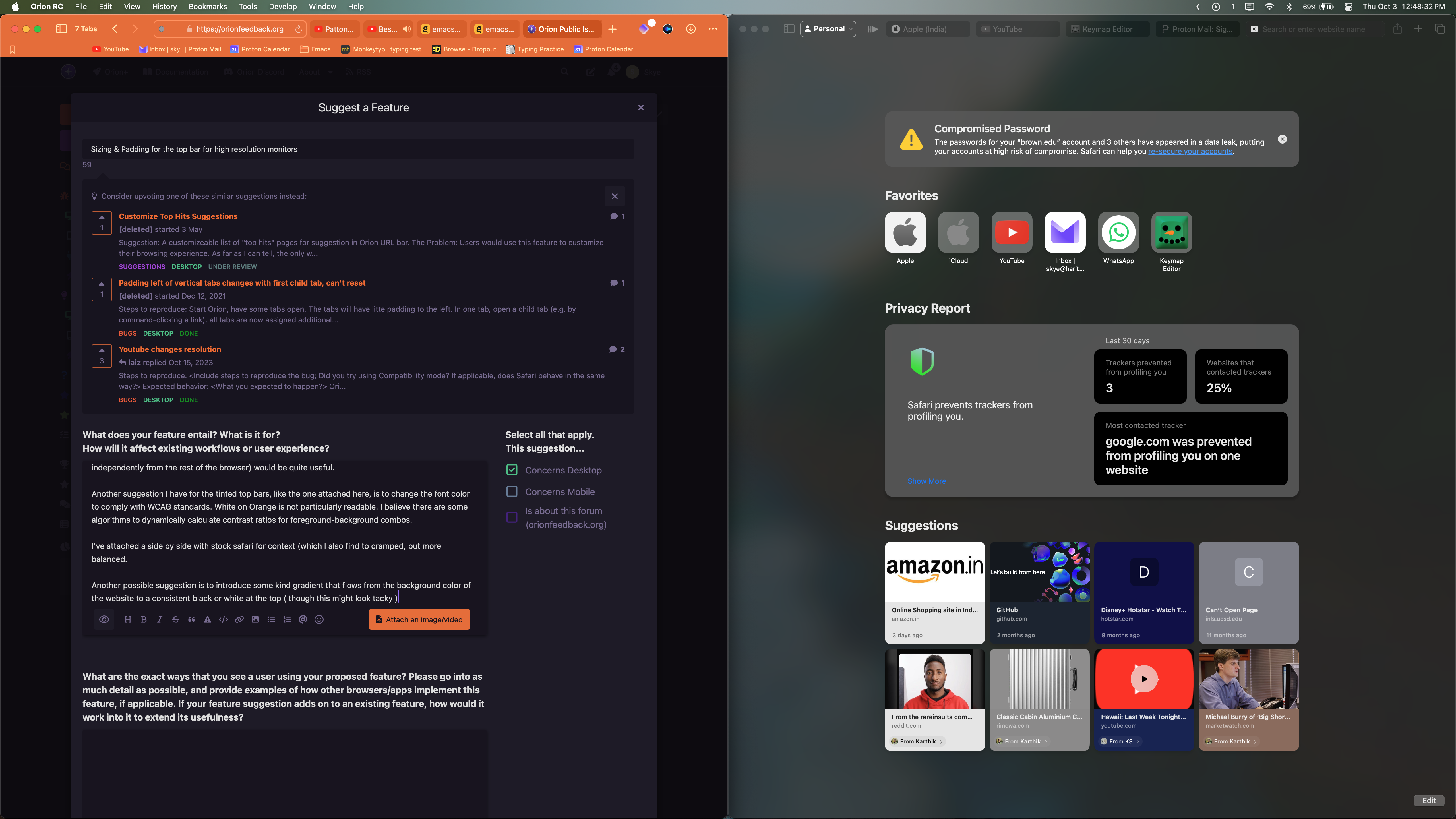
Another suggestion I have for the tinted top bars, like the one attached here, is to change the font color to comply with WCAG standards. White on Orange is not particularly readable. I believe there are some algorithms to dynamically calculate contrast ratios for foreground-background combos.
I've attached a side by side with stock safari for context (which I also find to cramped, but more balanced.
Another possible suggestion is to introduce some kind gradient that flows from the background color of the website to a consistent black or white at the top ( though this might look tacky )

WCAG calculator for reference: https://accessibleweb.com/color-contrast-checker/
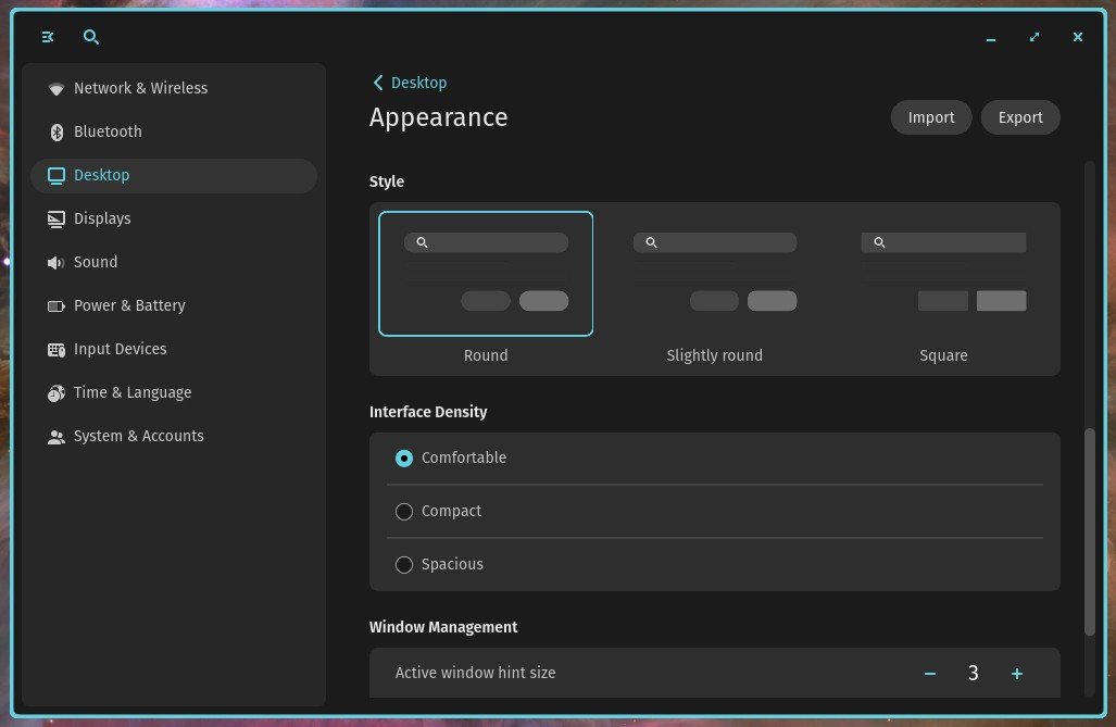
the ui padding could be a toggle between 3 options (like it is in say mail interfaces or cosmic de from the linux side of things) - compact, comfortable, cozy (like we already have in the tab style selector)
The foreground background contrast should be a default throught the UI and calculated for the user.
