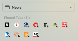
In this thread: https://orionfeedback.org/d/7564-greyscale-suspended-tab-icontitle-is-bad-for-accessibility the moon icon was introduced for suspended tabs.
This is much better for accessibility, than a greyed out favicon, but for people with many pinned tabs the new moon icon over a favicon can cause visual distraction (see screenshot).
Also, on many modern systems in broadband areas suspended tabs load so fast that there is no reason anymore to know if a tab is suspended. Not for me anyway. I'm curious to read how others feel about this.

So I propose a setting that would deactivate visual indication of suspension. It would provide for a cleaner interface for those who don't care to know if a tab is suspended.