In general, it just to beatify a bit icons when creating new web apps.
Comparison with Safari, YouTube icon:
Safari:

Orion:

Safari by default added white background and some kind of box shadow. To my mind, Orion's version of the icon is too plain, and I had to look for a better icon on Google.
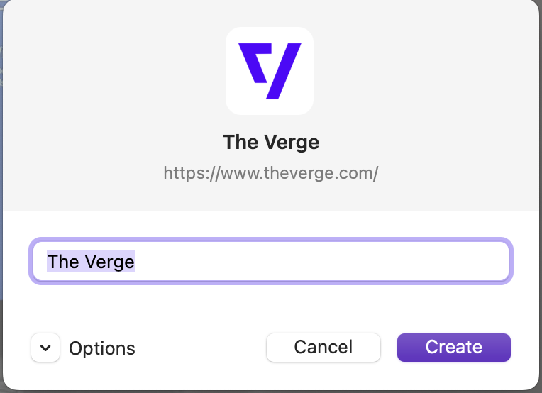
And one more comparison, but with "The Verge" website:
Safari:

Orion:

Here Orion worked better, but I guess it's due to the website's default background, but without drop shadow still it looks plain.