6

I’ve found myself enjoying the iOS Safari design a lot. It’s got a very nice tab bar interface and Orion replicates it quite well, however I find the way the URL bar looks quite ugly due to its lack of padding. It almost looks like a compact version of Safari’s tab bar. Maybe it’s an option to keep this as the default then enable a more Safari-like look?

Also I would love the ability to rearrange the bottom bar and enable/disable icons such as the share sheet and such.
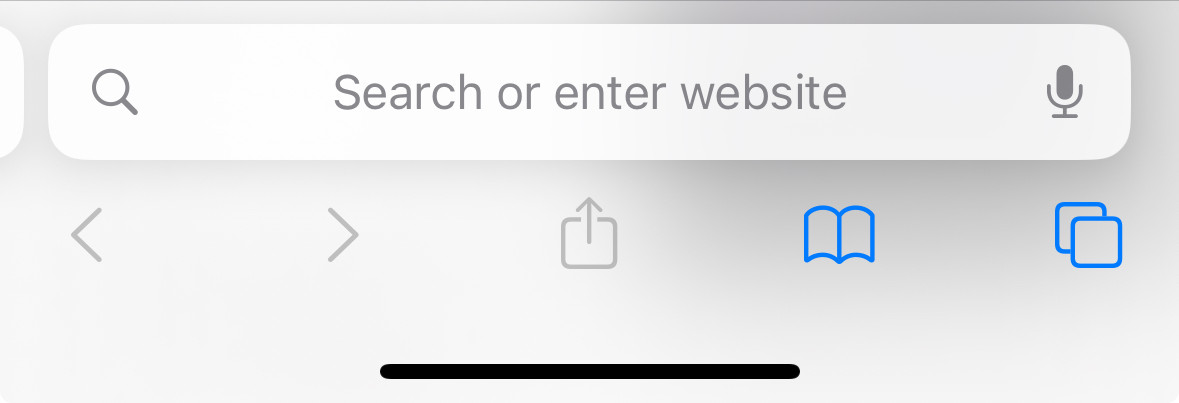
Safari’s tab bar for reference.

I doubt this would have any positive or negative impact on a users workflow, but some may enjoy the experience more despite this being a nitpick.

  • Vlad replied to this.

    The width of the URL bar can also be an accessibility issue. Targeting and gesturing tabs is harder with a smaller hitbox.

    4 days later

    areynolds

    however I find the way the URL bar looks quite ugly due to its lack of padding.

    Can you explain what you mean by this?

    It almost looks like a compact version of Safari’s tab bar.

    Orion URL bar is smaller in height to preserve screen space on mobile where it is precious.

      I did finally get used to the streamline URL bar after a week. Now the Safari bar feels unnecessarily thick.

      This still could be a good feature to make the transition from Safari smoother. Every day, make the URL bar skinnier by a few pixels until the user is fully acclimated.

      • Vlad replied to this.
        No one is typing