Steps to reproduce:
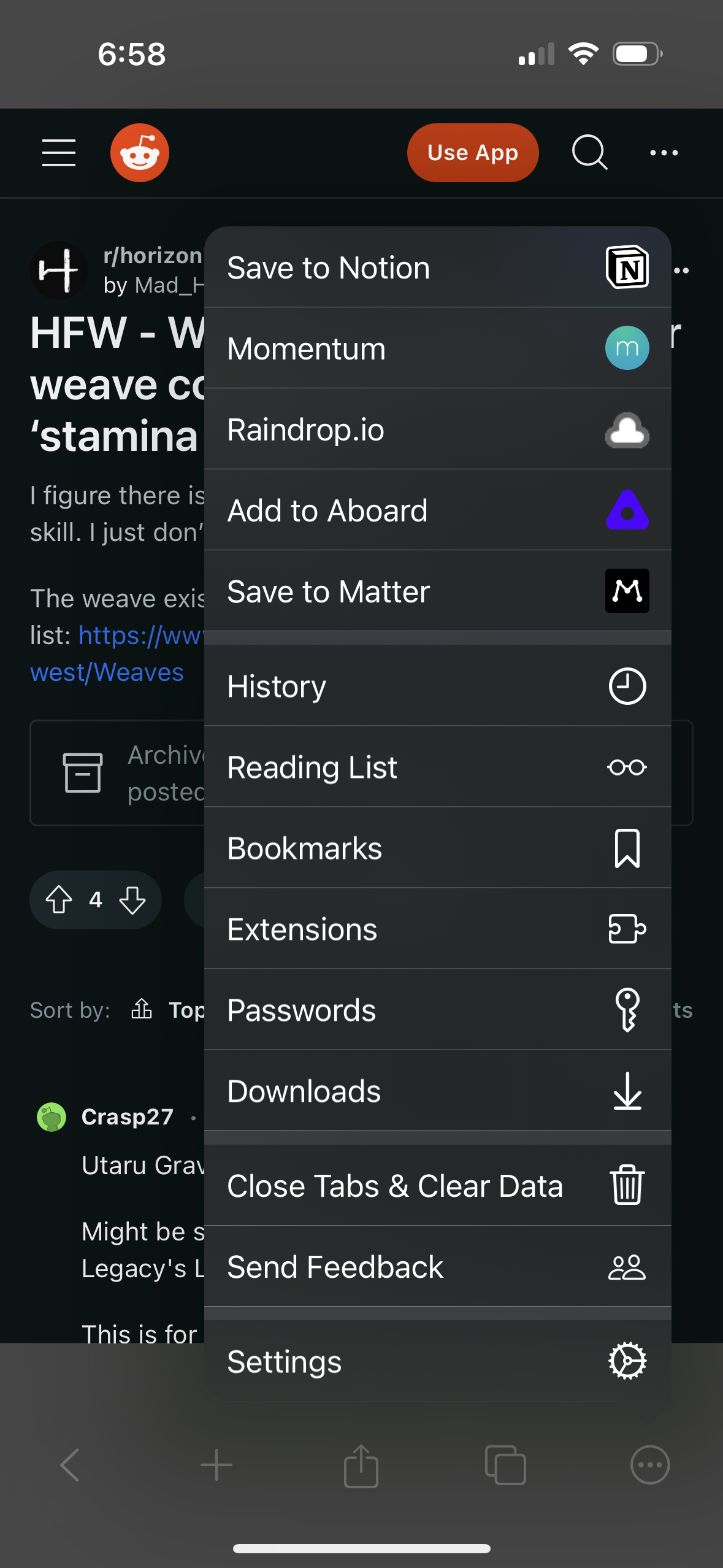
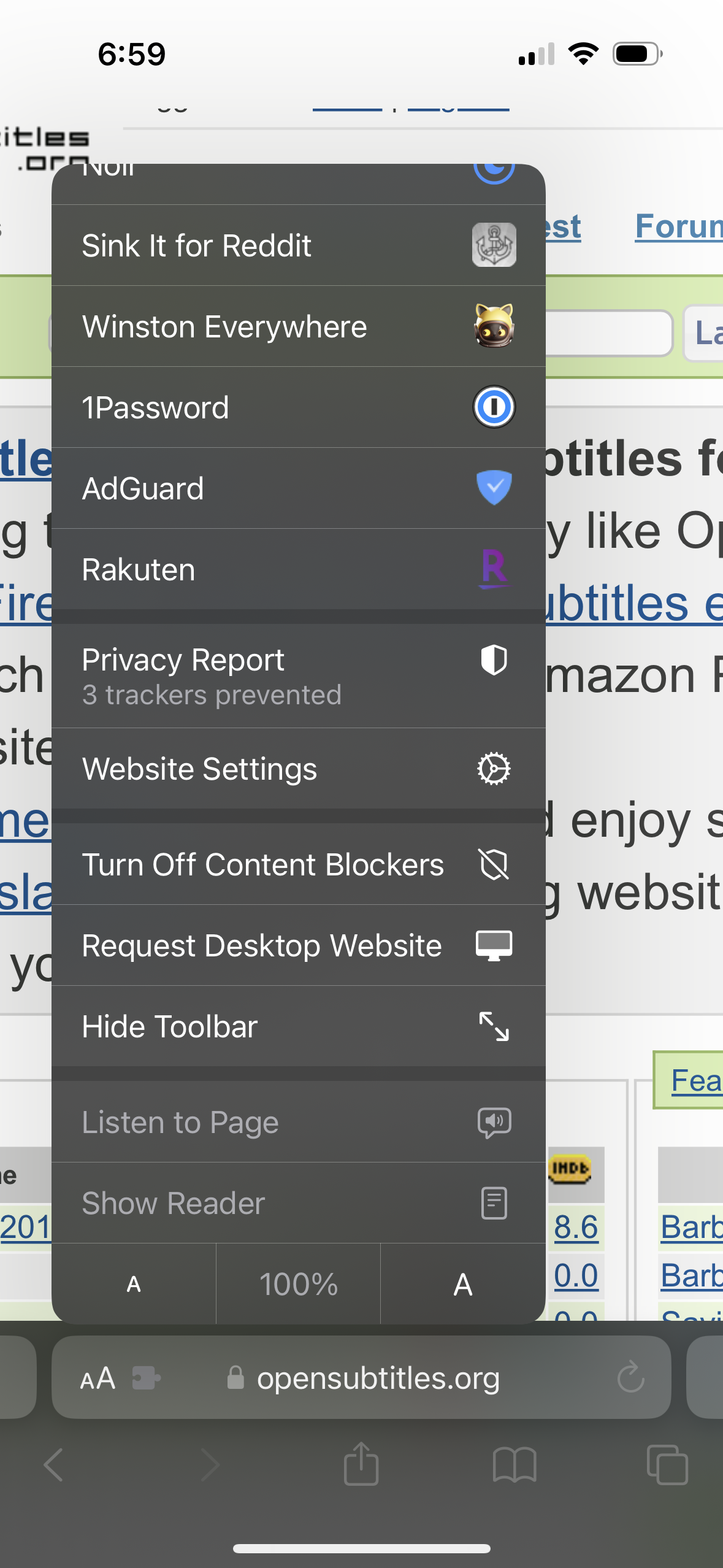
It would be great if menu separators matched iOS's standard. See attached screenshots of Safari and Orion for comparison. Orion's are more prominent as they're lighter than the rest of the menu which make it more difficult to scan, and aesthetically make the menu seem less integrated with the rest of the OS.
Orion

Safari
