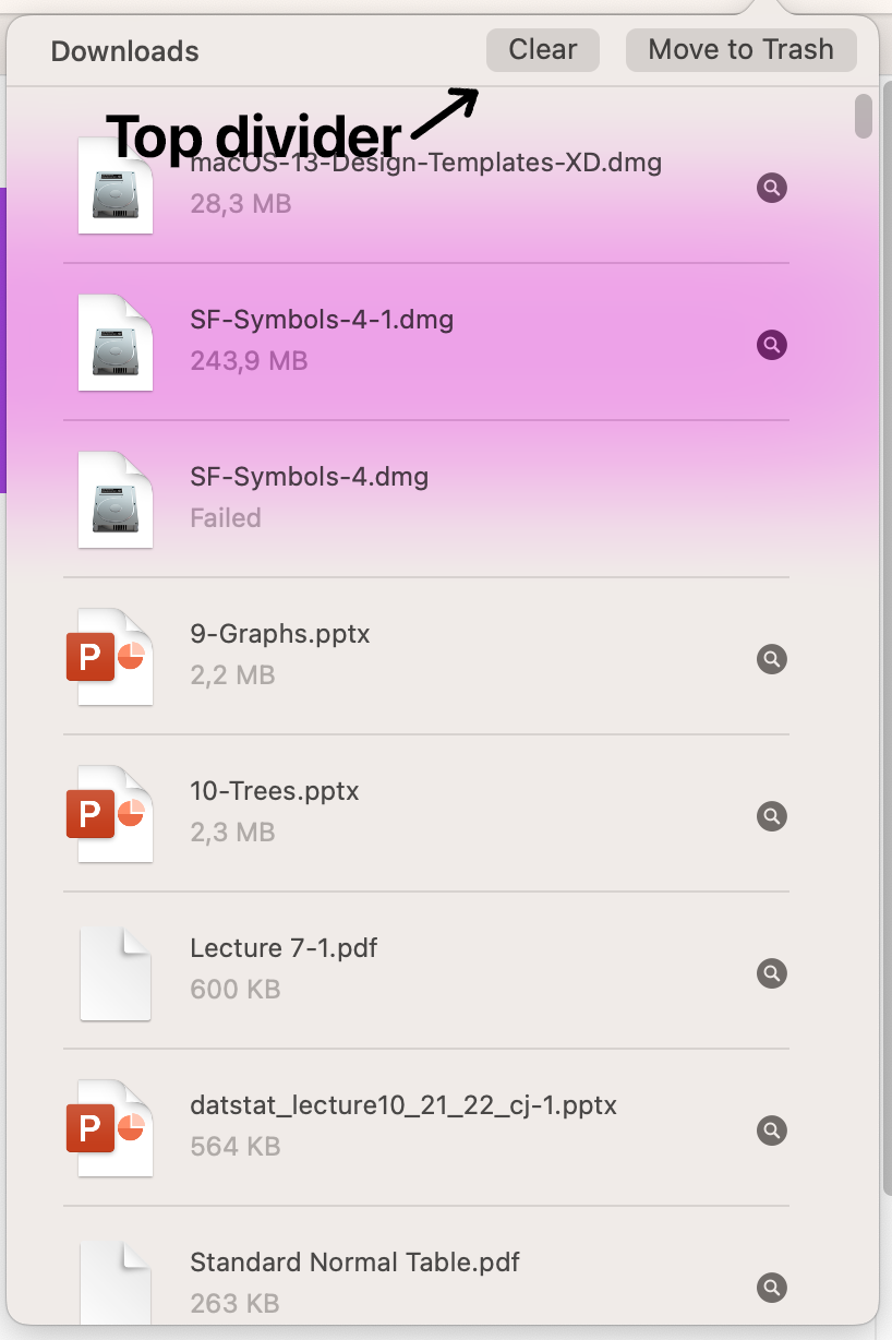
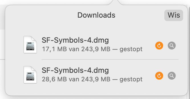
I think the download menu/popup (when you click the download button in the upper right) can be a little cleaner. First, remove the top divider and when scrolling, show a little shadow (I think that is also how it works in Safari). Secondly make the dividers between download a little shorter like in Safari (see screenshot, cut a part from the left). Thirdly when hovering on the "Show in Finder" icon and "Redownload" icon (new feature) show "Show in Finder" or "Download again" text instead of the size of the file text (exactly how it is in Safari), that way the user knows what the buttons do (I think it is quite clear now but still).
Top divider:

Safari design:
