14

Been using https://arc.net for a bit these days and it sure looks pretty. Would love to see some of the design elements in Orion. The current UI works, but isn't very appealing looking

Both side by side, with 2 open tabs and 1 pinned tab (Fastmail)

Arc sidebar:

Orion sidebar:

  • Handling of pinned tab is better in Arc IMO
  • Vertical spacing for tabs give it a bit more style
  • Spacing between logo and tab name

Maybe allow adjusting of spacing by user settings to accommodate different preferences

    We have adjusted the spacing a bit in the next release how does this look...

    Note that most users of Orion are power users and they prefer as much content fit there So we have two opposing forces at play 🙂

    10 days later

    Thanks for the update, it's a little nicer now!

    It could be overkill, but how about having spacing adjustable in a low-level config somewhere? (Does Orion even have about:config / chrome://flags?)

      ZebraMatch If you would not ask that for Finder or any other native app, it is an overkill 🙂

      • phy replied to this.

        Vlad not sure I understood the double-neg reverse positive in your statement but hopefully you mean that you agree with the idea?

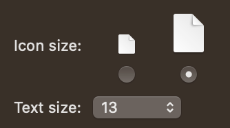
        Finder does have basic settings to adjust spacing, which I find much nicer than the default cramped list view:
        As an Arc user atm, I would love to see some more sugar around Orion. I like that it is native as Arc feels out of place on macOS — little too much Fischer-Pricer bling-ring.

        • Vlad replied to this.

          phy Please open a seperate post for this.

          • phy replied to this.

            Vlad I was chiming in for ZebraMatch comment on having spacing adjustable in config is all; should that be a separate post?

              phy Yes because it needs to be specified - where in settings, what the setting looks like, what wording to use etc..

              • phy likes this.
              No one is typing