Not a. major suggestion, just something small. These two very related pieces of info should be located together in some way on the UI. When you open the tab panel, you currently have your tab group selector on the bottom right corner of your screen and another tab group label at the top left. If you‘re looking at your tab group, realize you need to change to another, and open the bar…then you have to go to the other side of the screen.
7
On iPadOS, the current tab group label is in the top left. But the tab list pops out from the right.

Vlad added the Clarification tag .
4 months later
Concrete suggestions for the tab bar:
- Move the sliding tab bar (sidebar) to the left of the page and make it much less wide. This better matches the ergonomics of essentially every app in the Apple ecoystem.
- Nice to have: give it a look and feel that is more native. See: Safari sidebar, and I (think) the Orion sidebar on desktop
8 days later
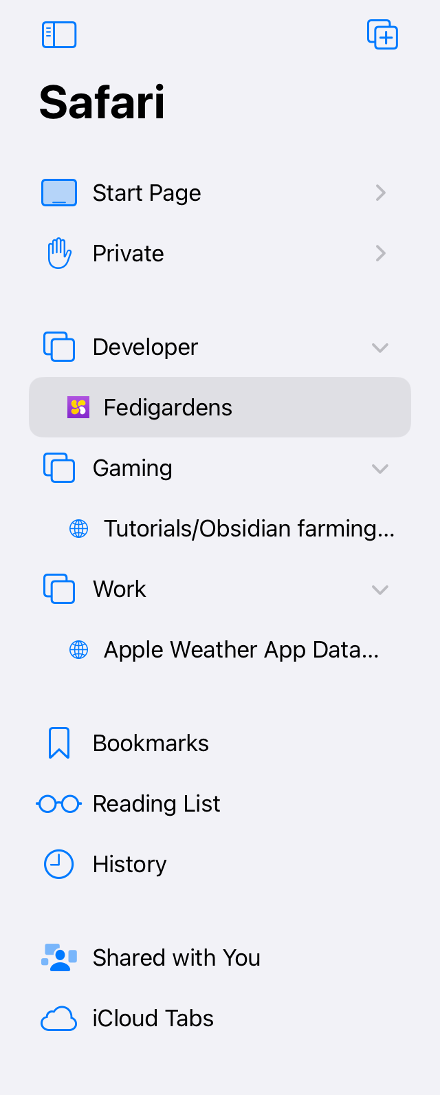
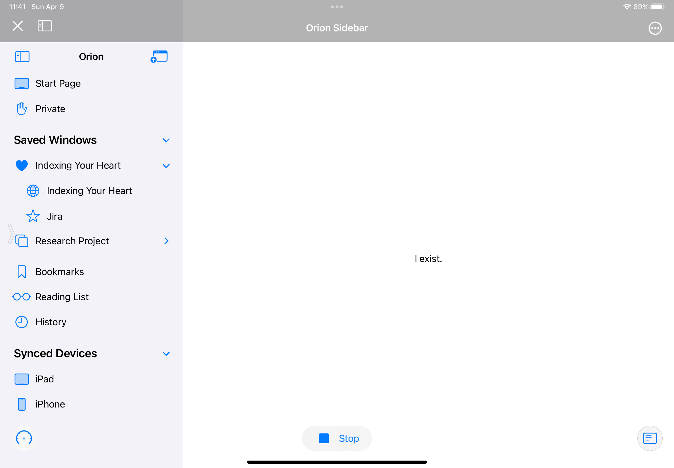
Not very good at mockups, but here are some pictures. The ideal Orion tabs would just match the same style as Safari. it's basically just a suggestion to make the tab bar on iPadOS match Desktop Orion as opposed to iPhone Orion. The pictures:
Orion tab bar:
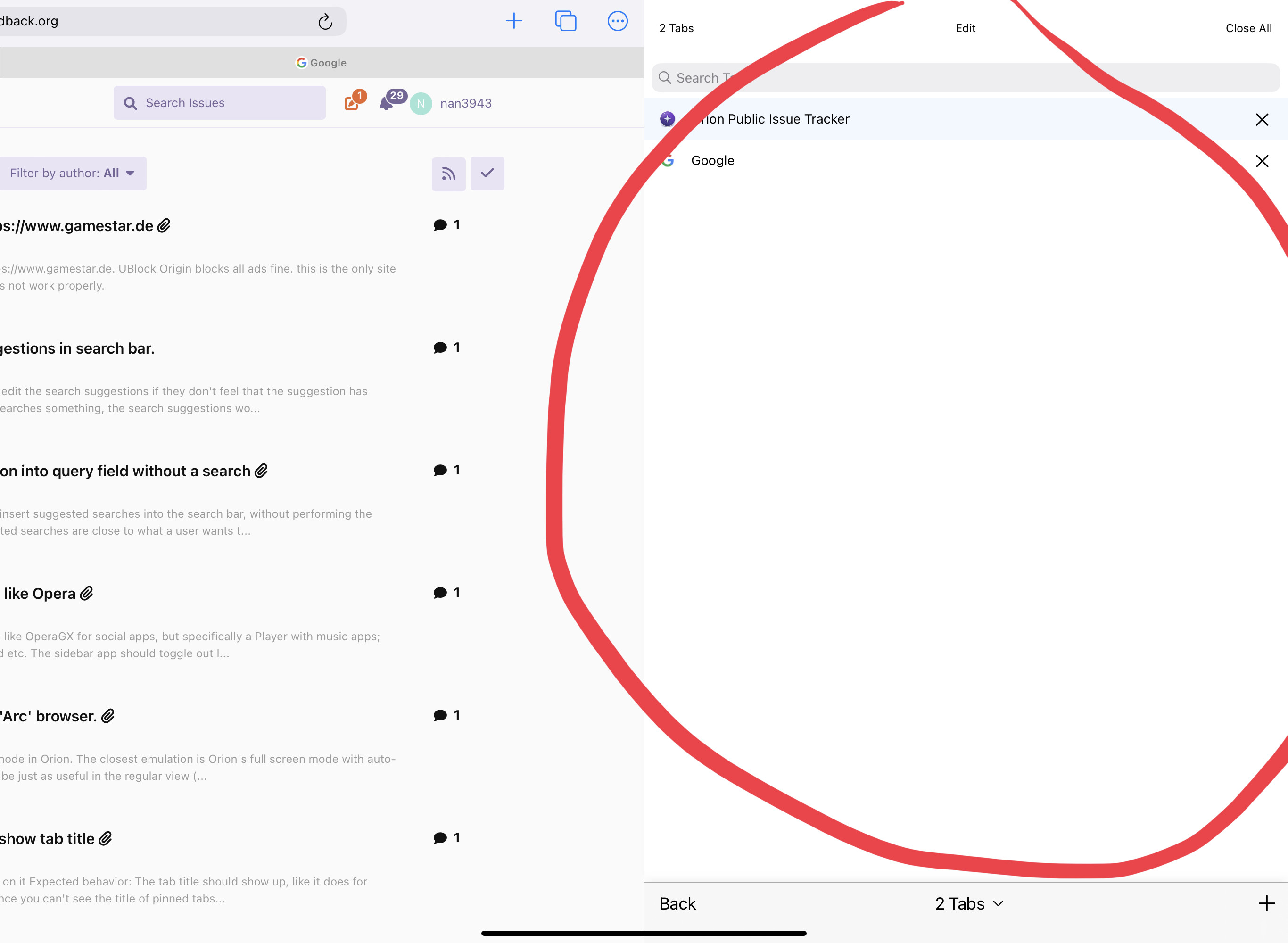
Safari tab bar:
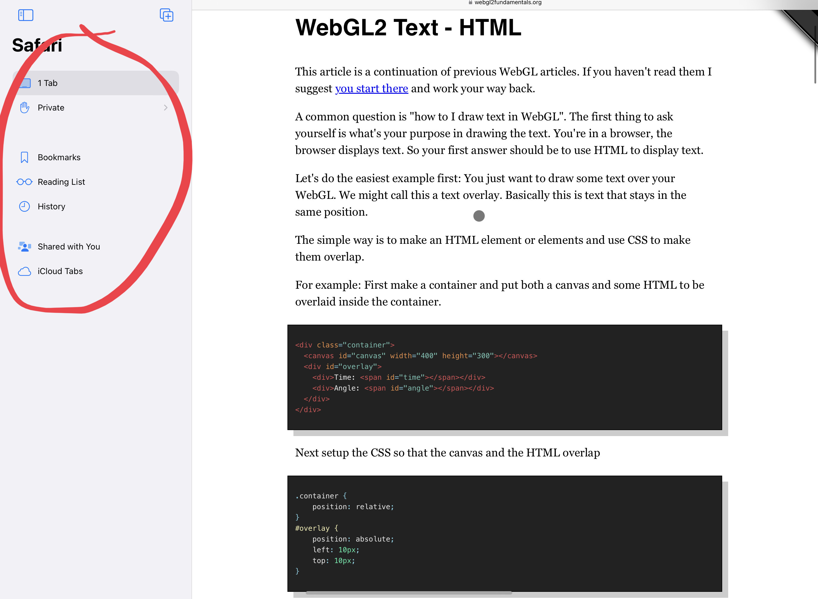
In both cases, the label showing your current tab group is in the top left. For Safari - this groups it with the tab bar. For Orion - it's on the opposite side of the screen.
Yes, we need to work on the sidebar on iPad.

Brief Summary
I would love to see a design/redesign of the sidebar in Orion on iPadOS that better matches what's available with other iPadOS apps such as Safari, Mail, Notes, etc. While the current tab view style in Settings > Tab View Style > Tab is fine, it seems to fit more for iPhone than iPad.
Details:
I'd love to see something that combines the design of Safari's sidebar with what we have in Orion on Mac:
I'll see if I can create a mockup later, but this would be triggered with a sidebar button in the toolbar (like other iPadOS apps that support collapsible sidebars). I haven't seen an iPadOS app that allows for a more flexible sidebar like in Orion on Mac currently, and that might need to be explored, but I think for this first iteration, it could be closer to Safari's with a static, structured system.
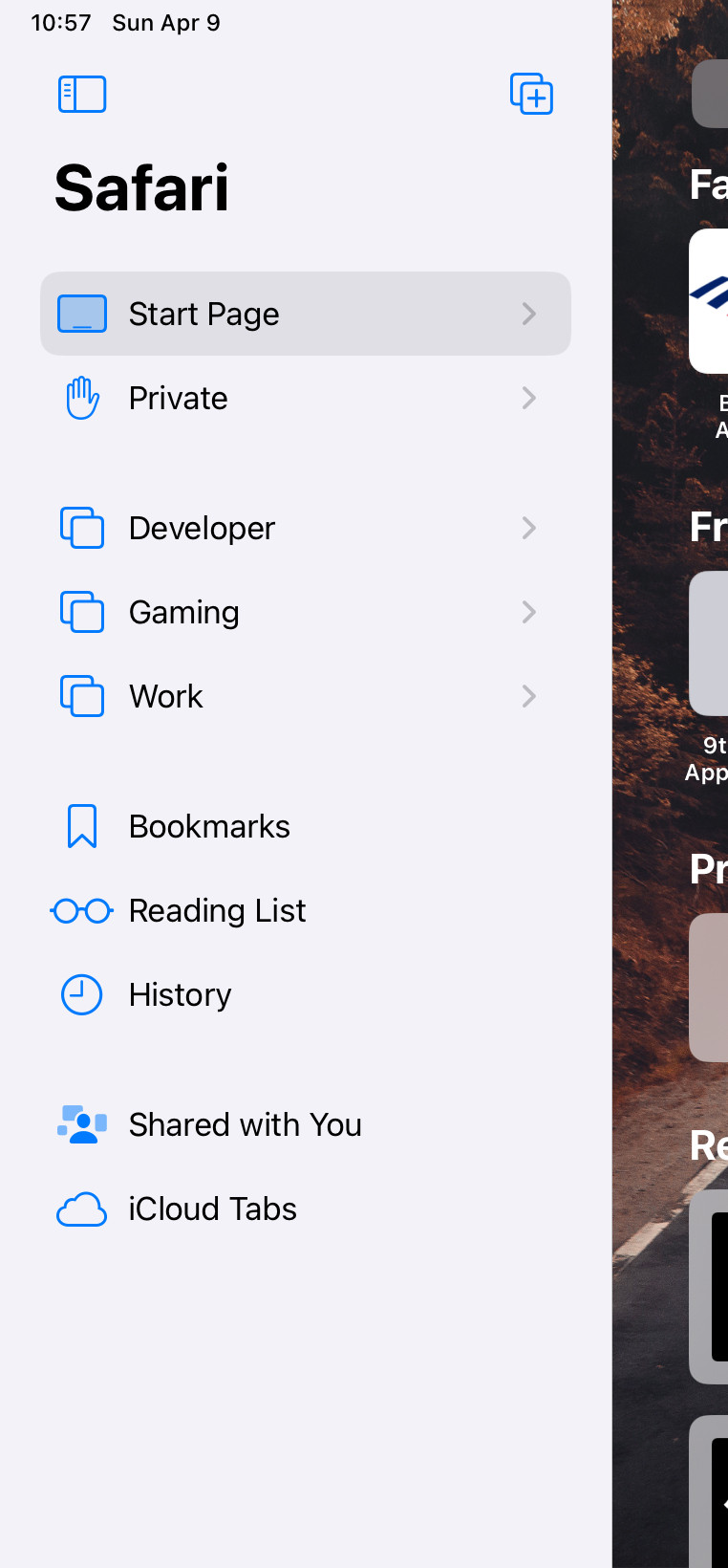
Update: I have made a quick mockup using Swift Playgrounds for how this sidebar could look. I tried my best to combine what's in Safari and Orion on Mac today.
alicerunsonfedora Thanks we will have our designer have a go at this.
a month later
Merged 3 posts from Have a sidebar consistent to other iPadOS apps.
No one is typing