5
  • Private Tab and Normal Tab are indistinguishable in dark mode

  • BugsMobileDone

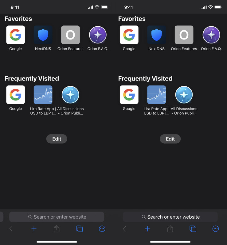
The color of the search bar for Private Browsing is indistinguishable from that of Normal Browsing when in dark mode. The Private search bar is very slightly darker, but you cannot tell unless you put the two search bars side by side.

This means it’s impossible to know which browsing mode you’re in without opening the tab manager, and you might accidentally switch to normal browsing mode without realizing.

Attached is a side-by-side screenshot of normal and private browsing in dark mode.

Please dramatically increase the contrast between the private and normal search bars in dark mode.

  • Vlad replied to this.

    Vlad here is a photo of the normal and private mode side by side during the day

    Screenshot

    • Vlad replied to this.

      When dark mode is enabled but the webpage itself is white, there is still a noticeable difference between Normal and Private. Here is a screenshot of a white Google page with system dark mode enabled.

      Screenshot

      But when the webpage is dark, the search bars between Private and Normal become impossible to distinguish.

        The original screenshot didn’t show the issue fully since the Normal page was slightly lighter than the Private page. So I’ve attached another screenshot of the New Tab page with the same background color.

        Screenshot

        As you can see, the Private search bar is almost exactly the same shade as the Normal search bar.

          shebg626 Can you show Safari in dark mode, side by side normal and private

            17 days later

            The current solution for this issue has too much contrast and used in wrong place.
            It is probably better for normal tab groups stay as they were before
            (Their current state)

            And instead, change incognito bar color to black just like in Safari

              snuser I would like to state that I agree with the message content of snoser and would like to have the new change reverted to how it was before. Snoser has shared some excellent feedback on how it should be, I very much agree with this.

              I’m very happy with the recent update. It makes it much easier to distinguish between normal and private browsing, and the search bar is still very legible and clean.

                We are having conflicting asks here? Orion should be same as Safari now?

                  No one is typing