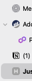
When using vertical tabs and Tree View is enabled, if there is at least one tab with child tabs, adding the tree carat to the left of the parent, all other non-pinned, non-parent tabs receive left padding to keep them aligned with the parent tab (screenshot).
I propose a preference that would allow the user to toggle this alignment off, allowing non-pinned and non-parent tabs to use more horizontal space. The benefit is a few more characters for the tab title on those tabs. In my work, a few characters can make a big difference, so I take them where I can get them! 😅
Orion could default to their preferred UI decision - the current state - or the user could choose the alternative alignment if they prefer.

