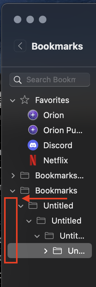
Fortrikka The indentation is completely unnecessary, especially since it's the last folder in the list. Even though arguably it's ability to be expanded has some uses, the indentation that serves as an indicator of the content being in a hierarchy simply reduces the amount of screen space that we have to see the titles of the bookmarks entries. So the removal of the indentation would serve better for clarity.
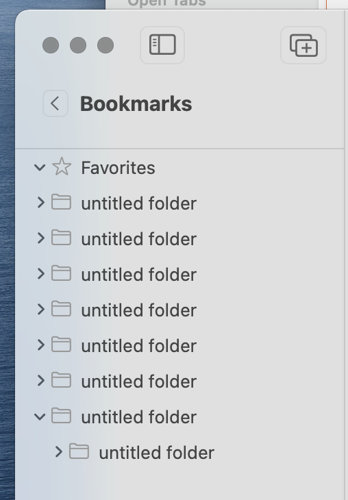
Fortrikka Vlad The problem is that the indentation takes up space, and the "Bookmarks" folder itself should be hidden. Here is how Safari looks like.
Fortrikka One solution could be to make the "Bookmarks" folder invisible and just one pixel in height, and unselectable. Not sure if it would cause confusion although.
eirk Why is this necessary? This doesn't take up a lot of space, and the current way doesn't cause any confusion. In Orion, there are only three top folders for bookmarks: Favorites, Bookmarks Bar, Bookmarks.