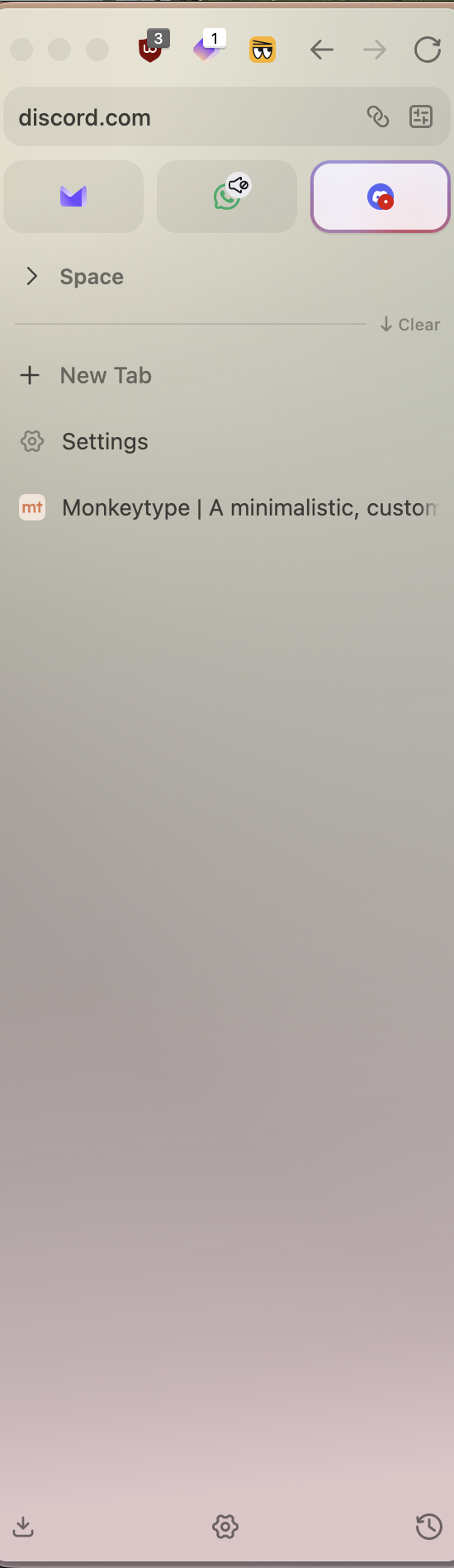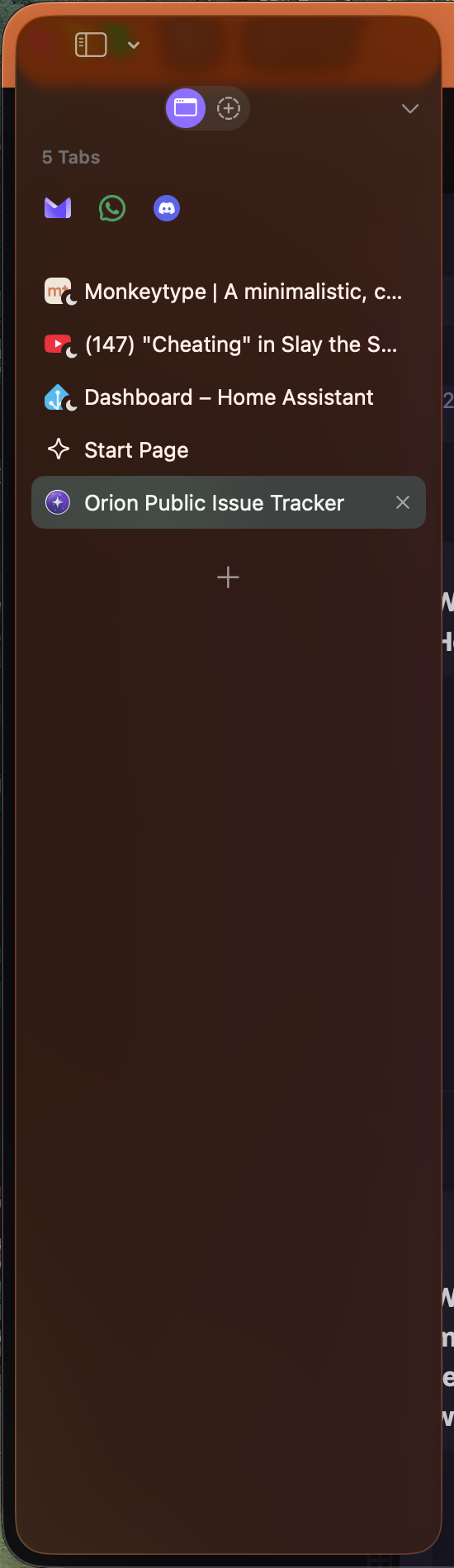
See attached image - the pinned tabs are to the left. I don't have enough to fill the width and visually it looks bad. If there was an option to centre these, it would look better. The same applies to the tab menu button.
It shouldn't effect anyone greatly, just be a small change to make the menu look more polished.
It's a cosmetic change to increase visual polish. Zen browser does this very well with their pinned "essential" tabs. You can see the behaviour done well there. The buttons even scale to look more pleasing.