Right now, the "Close All Tabs" button sits at the very bottom of the menu when you long-press the tab icon. It’s way too easy to hit by mistake when you’re just trying to navigate the app. I’m suggesting moving it to the top of the list, just like Safari does. This would save users from the heart-sink moment of accidentally wiping out all their open tabs just because their thumb slipped.
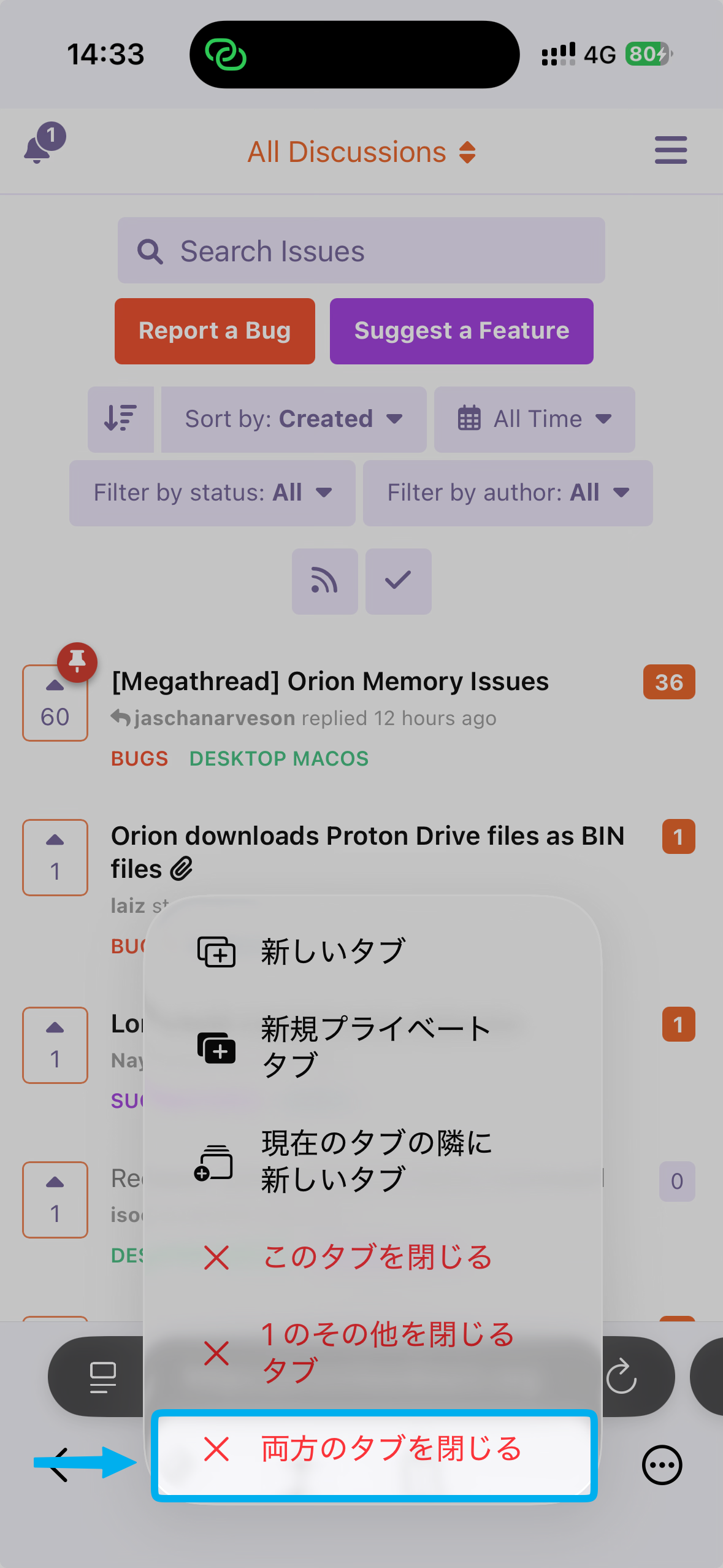
Ideally, when I long-press the tab button, the most "dangerous" option (Close All Tabs) should be the furthest away from where my thumb naturally rests. Safari nailed this by putting it at the top.
Currently in Orion, because "Close All Tabs" is at the bottom, it's right under your finger the moment you let go. It feels like a trap! If you move it to the top, it requires a conscious, intentional reach to click it. This simple flip in the menu order would make the browsing experience feel much more secure and stop those "oh no" moments where everything disappears in a second.
