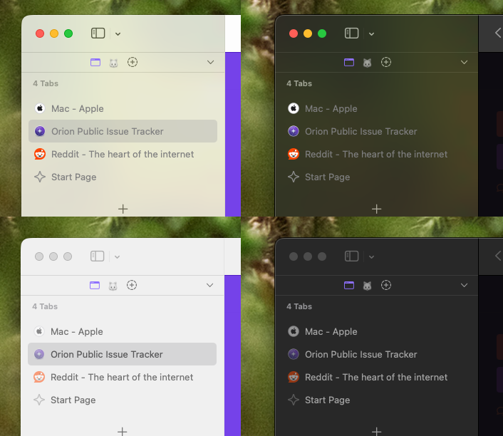
This is how tabs looks like in both light and dark mode, notice that the tab title is less readable in active-window compare to inactive window:

I think the tab title can be more opaque for better readability, while suspended tab can be less opaque as it is right now.
For comparison, here is how Safari looks like (sorry for using Safari in macOS 26):

Version 0.99.135.0.1-beta (WebKit 622.1.15.19.2)
Tahoe (26)