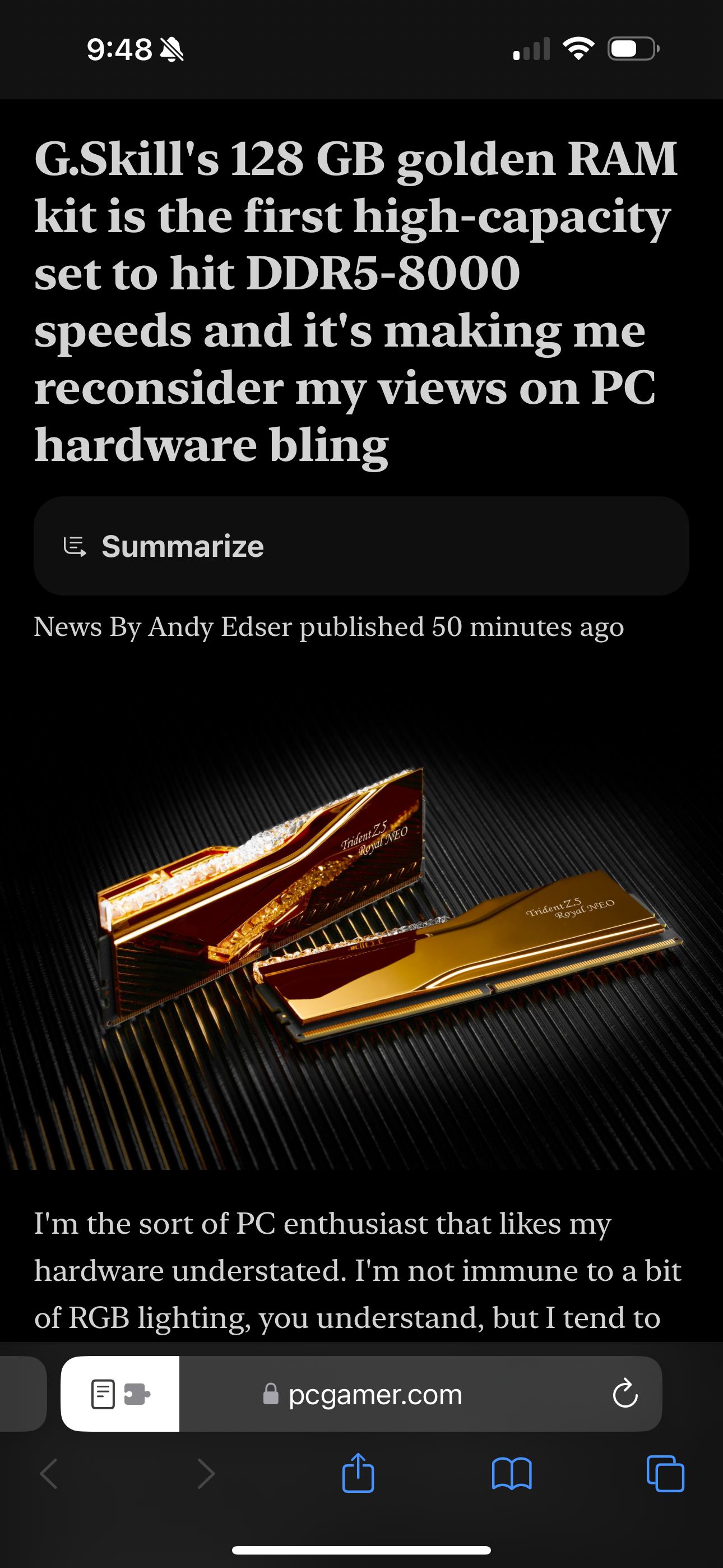
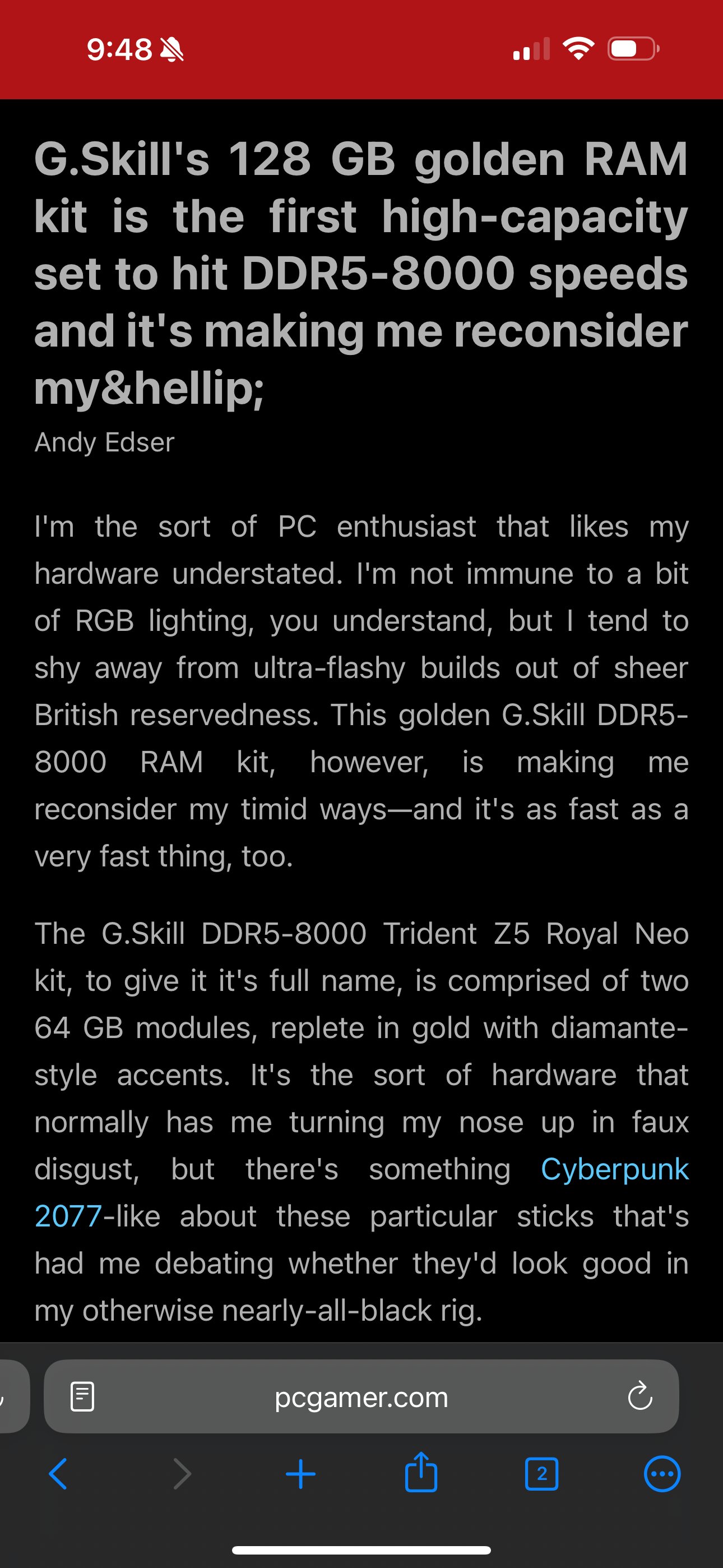
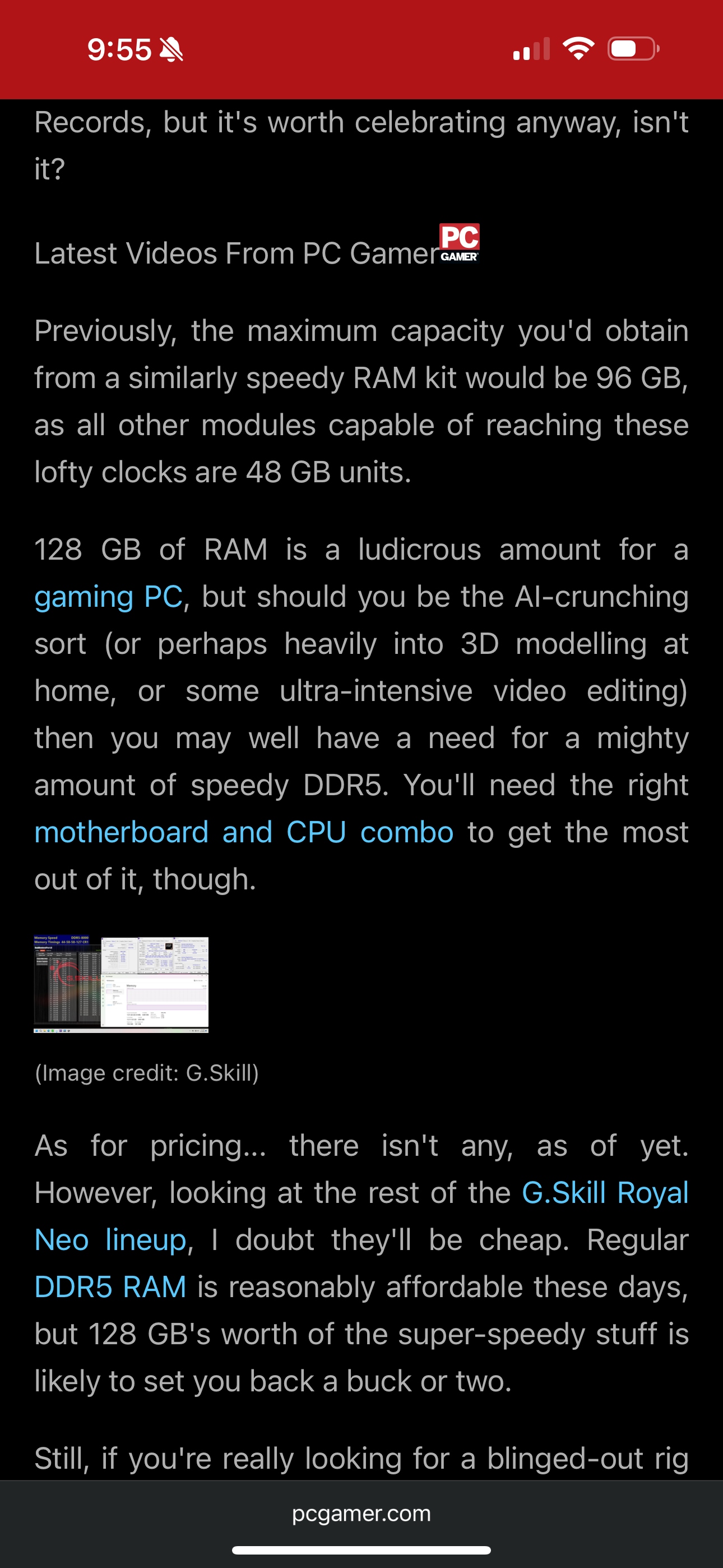
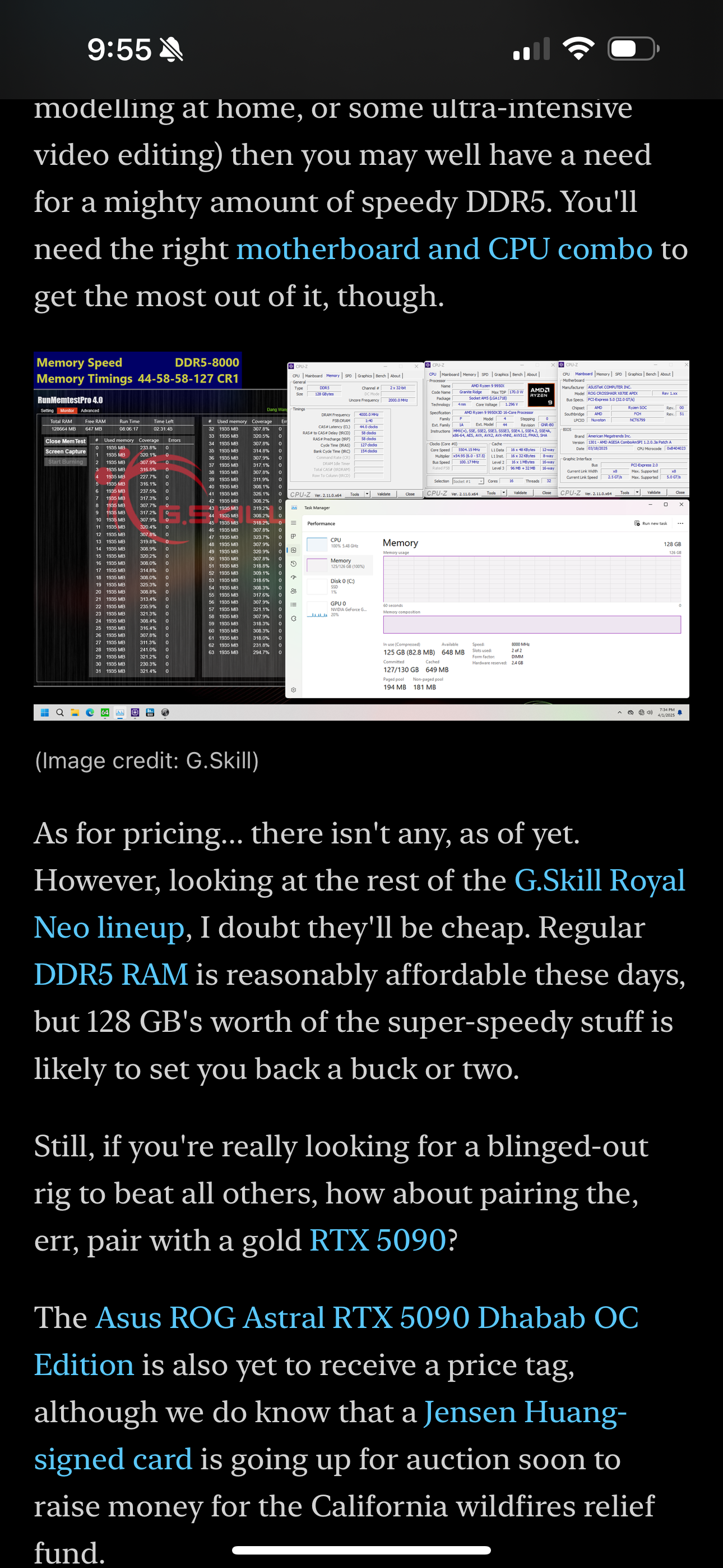
When opening reader view, there are a lot of noticeable improvements that can be made to the experience. Especially when you compare to Safari. For example:
When looking at the start of the article, Orion cuts off the full title due to formatting errors. The article image is also missing. Safari also offers a helpful AI quick summary and offers a listening option in its reader view.


Throughout the article there are formatting issues where the photos are not correctly sized. The navbar is also completely absent when scrolling down on Safari, giving the user a better viewing experience for seeing more of the article. Additionally, the top header colour isn’t a consistent color, so you can have a bright colour even if you use a dark reader view. The header should go to a consistent color based on the reader view color.


Finally, Safari as a long press to quickly toggle reader view on the navbar icon. This makes switching between views very quick and intuitive. This would be a great thing to add to Orion.
These changes will make the reader view a more enjoyable experience while also adding additional intuitive functionality to the browser.