As new tabs are made, they are pushed up so the oldest tabs remain on top. This makes more sense with the ergonomic toolbar style option since all UI controls are situated at the bottom edge.
Align tabs near the bottom of the screen
adorabilis Do you suggest bottoms-up approach only when ergonomic is enabled or always?
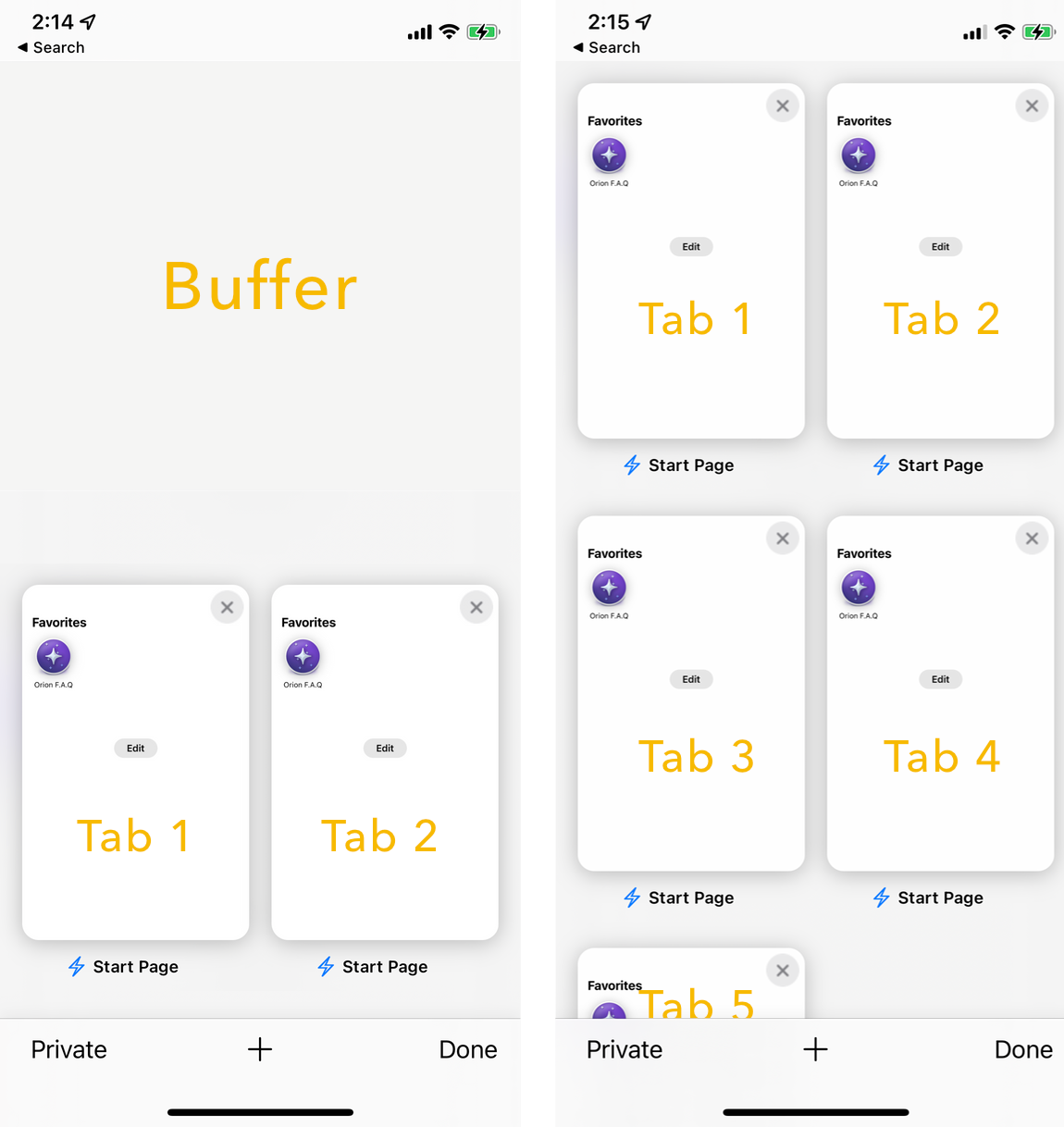
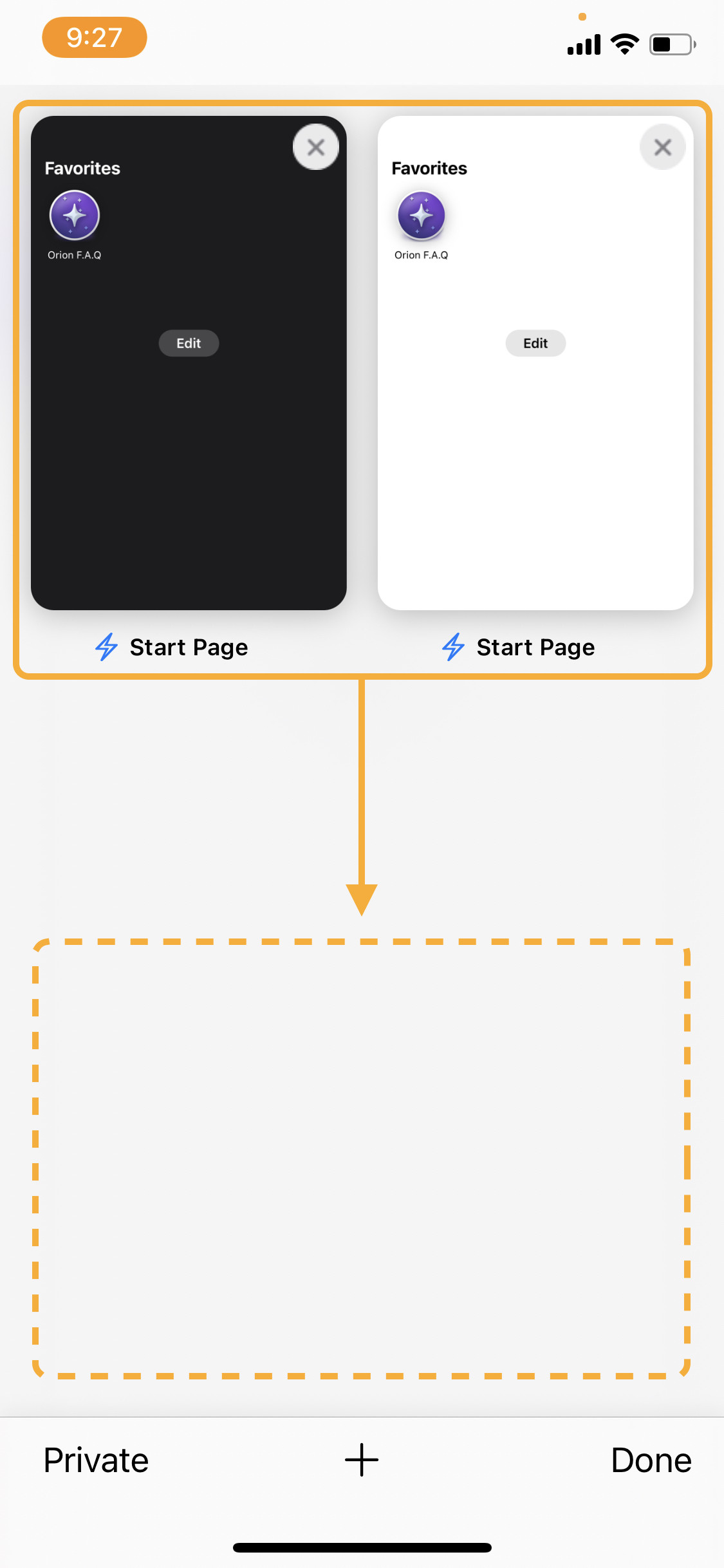
To avoid introducing an extra toggle in settings, it should be on when ergonomic is enabled since it’s not the convention though it is better UX ergonomically. No major browsers on iOS put their tabs in thumbs reach but they also all have their address bars at the top.
To clarify, this is what I’m suggesting:
adorabilis Ok that makes sense.
May I ask why do you prefer grid view over Orion's default tab view, which is ergonomic in this way ? Any ideas how we could further improve it?
The sliding side panels feel disorienting to me but it’s mostly a habit from years of using Safari which is still my default browser. I like to have a visual view of the open tabs. I prefer being able to go back or forward with the edge swipe gestures. I love the natural swipe-up animation that tracks my finger. It makes Safari feels that much more alive. This is why I’m a huge fan of the pull-up drawer design which may or may not be coming to Orion.