Problem:
Having to click an arrow next to the sidebar button in order to get to the Bookmarks, and then when you double-click to open a bookmark, you don’t see (or know) where your tab actually is. So, you have to click the arrow again to go back to tabs. That’s not a good UX.
Proposed Solution:
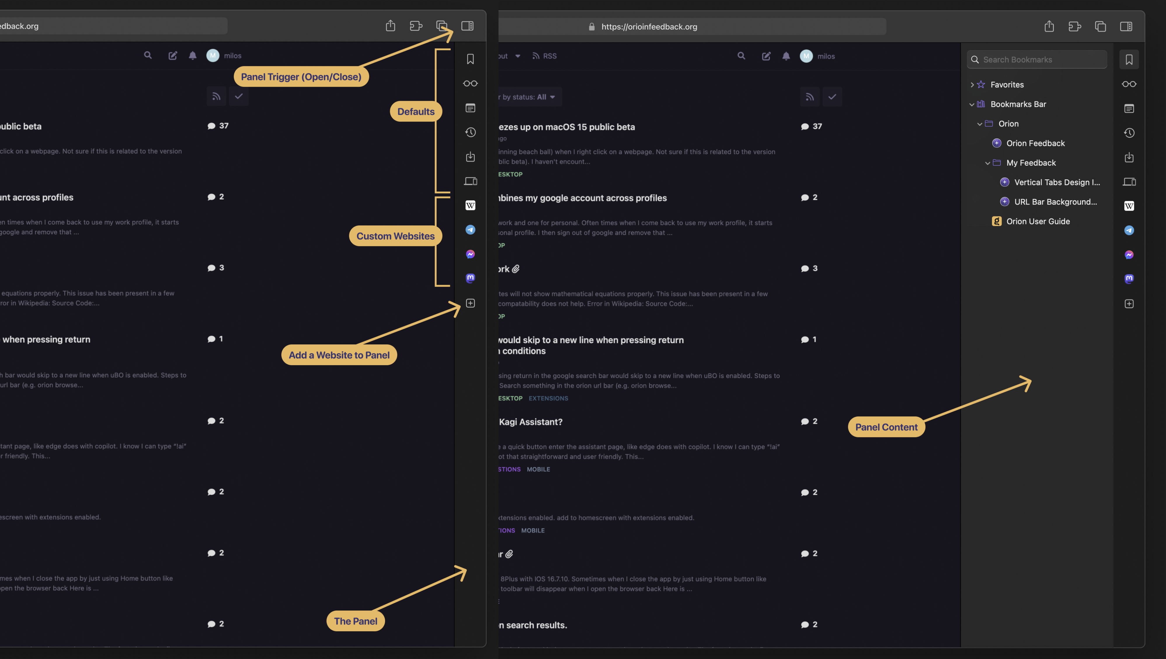
The Panel. It’s another UI element, that works in both Vertical and Horizontal tab modes.
- Unobstractive: It’s in or out of sight per your wish.
- Helpful: You can still access the features with two clicks at most, sometimes less.
- Feature discoverability: It’s a home for your Bookmarks, History, Reading List, Downloads, Notes... At a glance, you can see what the browser has to offer.
- Flexibilty: It hosts mobile versions of the custom websites that you check out periodically. It’s useful for messaging, wikis, sport scores, AI chatbots, live analytics, social media timelines, and a lot more. All while not disturbing your browsing session.
- Tried & Tested: Some other browsers like Vivaldi or Opera have something similar, so it’s proven to work.
- Futureproof: It can host more items in the future, so no need to redesign the browser and move the things around every time a new feature idea comes up.
Anatomy:

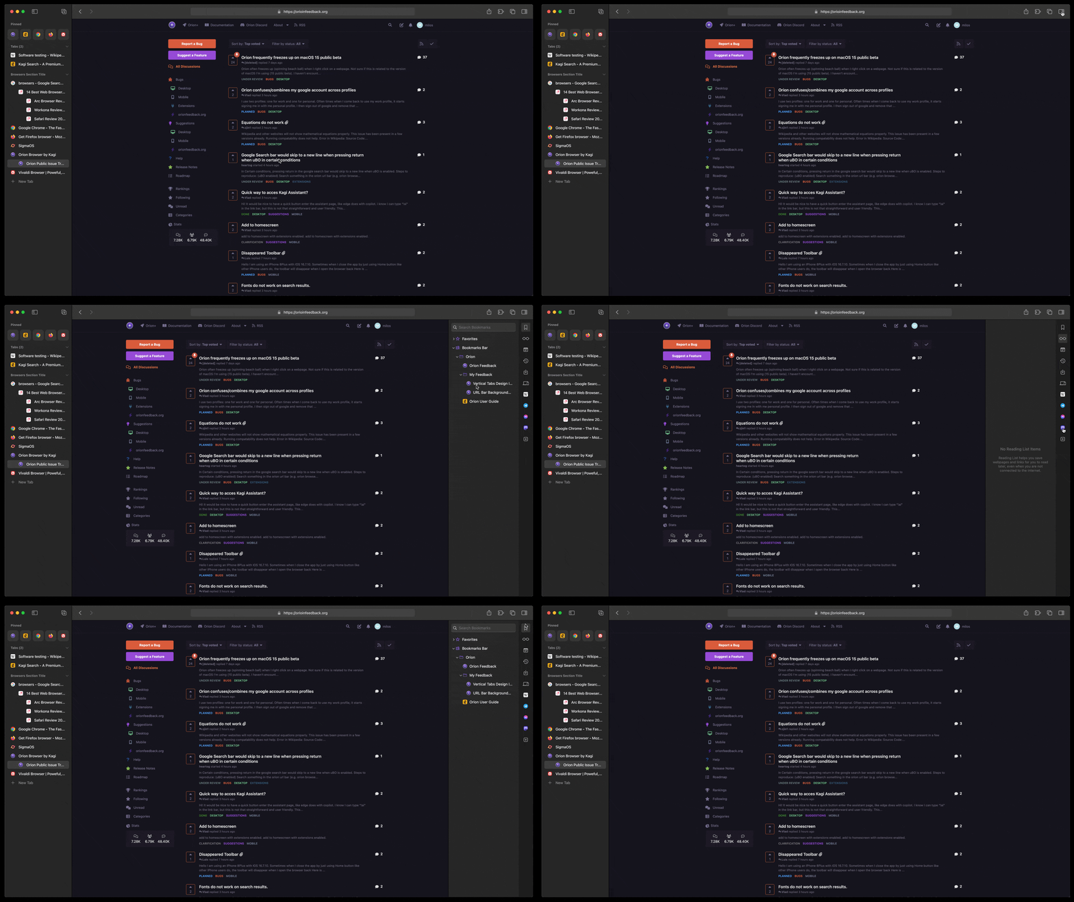
DEMO GIF:

Some other options may be considered, like user-customizable position (left/right), a keyboard shortcut, and the ability to resize the panel. It's like a drawer with your favorite stuff at disposal, anytime.
What do you think?