My Position - Summary
Orion should either completely copy Safari's compact tabs layout or create a more unique compact tabs layout. Of those options, I think Orion should go with the former (copy Safari) both for ease of implementation and for user satisfaction.
Many users are used to Safari's compact layout and have switched to Orion for its similarity to Safari. This would also obviously be easier for the Orion team to do. They should then move on to other work, which is likely more worthwhile.
Explanation
At this point, I think it is obvious to all that we are not satisfied with the current compact tabs layout offered by Orion. I think the problem lies in not properly identifying, ordering, or addressing the goals of a compact tabs layout. The first goal, as always in UX design, should be an intuitive interface. The second goal should be to compact the URL bar and tabs as much as possible. I think the current compact tabs layout in Orion fails to meet both goals. I will address each of these goals in turn.
Intuitiveness
Design guidelines and principles exist to provide an intuitive experience for users. Therefore, the paramount consideration should be intuitiveness, not adherence to design principles. I think the two are being somewhat conflated.
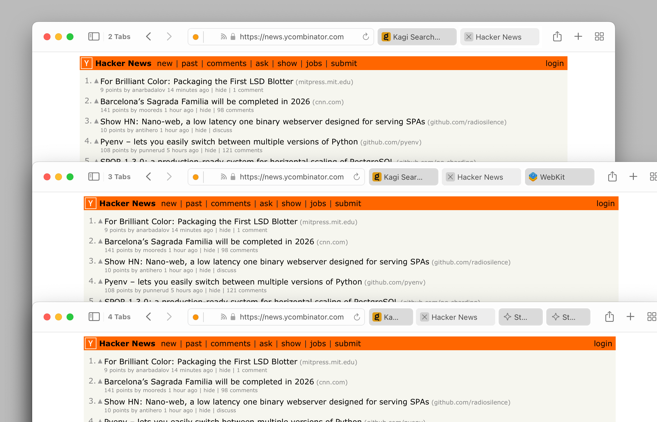
I think the primary issue the Orion team has not properly considered or addressed is that the Compact layout, as it is designed in both Orion and Safari, makes the appearance of the URL bar and the tabs almost identical.
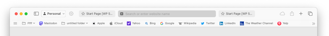
- Safari solves this by simply combining the URL bar and the active tab. When a tab is selected it expands and its URL can be edited "within" the tab. Because the URL bar and the tabs are integrated in this way, the fact that they look identical does not cause confusion.
- Orion attempts to provide both a large, fixed URL bar and the same design for tabs used in Safari's compact layout. This causes confusion because the URL bar and the tabs look similar, but function differently. To put this problem very simply, it's like having two buttons that look the same but do something different.
The solution to this problem seems obvious to me: either completely copy Safari's compact tabs layout, or create a more unique compact tabs layout. I think @Hybrid 's suggestions are steps towards the latter.
Compacting the Toolbar
A compact layout's secondary goal (other than intuitive control) should be to compact the toolbar as much as possible, both vertically and horizontally. Comparing Safari's and Orion's compact tabs layout with a focus on compactness immediately provides a clear winner.
It is possible the Orion team is focusing too much on vertical compactness, whereas I think many users consider horizontal compactness just as important for things like providing more room for toolbar extensions/buttons, and simply providing a cleaner, more spacious interface.
As a final point, I will add that users who prefer having a large, detail-rich URL bar simply wouldn't choose the compact layout. Those with that preference are better served by the standard or vertical tabs layout.
To reiterate, my suggestion is that Orion should either completely copy Safari's compact tabs layout or create a more unique compact tabs layout. Of those options, I think Orion should go with the former (copy Safari) both for ease of implementation and for user satisfaction.
Many users are used to Safari's compact layout and have switched to Orion for its similarity to Safari. This would also obviously be easier for the Orion team to do. They should then move on to other work, which is likely more worthwhile.
I hope the points I've made here are helpful and will lead to a better Orion.